Why The Color Purple?
One of the most crucial parts of any business is branding. It contributes to the formation of a company’s identity and distinguishes it from its competitors. Color is an important aspect of branding. The colors used in a company’s branding can have a significant impact on how people perceive the company and its products. Purple has recently emerged as a popular choice for organizations trying to develop a distinct and memorable corporate identity. In this blog post, we’ll look at how purple is used in branding and the psychology behind it.

The study of how colors affect human behavior and emotions is known as color psychology. It is a broad study that examines cultural, historical, and personal associations with colors. distinct colors can elicit distinct emotional responses, and these responses might vary based on the setting.
Purple has traditionally been associated with royalty, grandeur, and sophistication. Purple dye was incredibly rare and expensive in ancient times, and only the wealthiest folks could afford to wear clothing created from it. Purple has long been associated with wealth and rank, and it is still regarded as a color of luxury and exclusivity.It is a color that is generally associated with creativity and innovation, in addition to its association with riches. Purple is a popular color in the artistic and creative professions, and many businesses that want to portray themselves as innovative and cutting-edge utilize it in their branding.
Another reason purple is a great branding color is its adaptability. Purple comes in a wide range of tints, from deep, rich tones to lighter, more pastel hues. This means that depending on the shade employed, it may be used to generate a variety of moods and feelings. A rich, dark purple, for example, can evoke mystery and elegance, whilst a lighter, more pastel tone can evoke serenity and tranquillity.

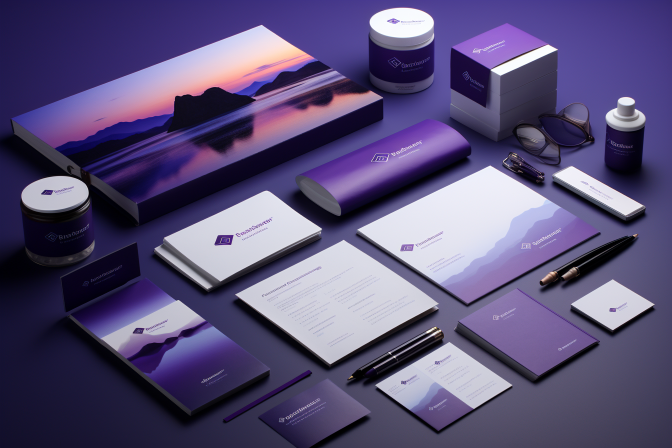
Branding color psychology is a complex and subtle science, and the usage of purple in branding is no exception. Purple can be a powerful tool for organizations trying to build a distinctive and memorable corporate identity, because to its associations with luxury and creativity, as well as its versatility in evoking diverse moods and emotions. In the following section of this article, we’ll look at some of the most successful uses of purple in branding, as well as what makes these brands so powerful.
Purple in Branding: Successful Case Studies
To better understand how businesses might successfully utilize purple in their branding, see these examples of firms that have strategically and effectively incorporated this color into their identity.
![]()
Hallmark is well-known for its usage of the color purple in its branding. To create an air of elegance and class, the brand pairs a rich, deep purple with a warm gold tone. This color scheme appears constantly throughout Hallmark’s identity, from its website to its products to its actual locations. Hallmark is able to generate a sense of luxury and exclusivity that is consistent with the company’s brand values by combining purple and gold.
![]()
Cadbury is well-known for its use of purple in its branding. To convey a sense of joy and playfulness, the brand employs a bright, dramatic hue of purple in conjunction with a distinctive script type. This color scheme is used regularly throughout Cadbury’s branding, from packaging to advertising to social media presence. Cadbury is able to build a brand identity that stands out from its competitors and appeals to a wide spectrum of consumers by utilizing purple in a powerful and distinctive way.
![]()
FedEx is a corporation that employs purple in their branding in a more subtle way. As an accent hue, the organization uses a subtle, earthy shade of purple in conjunction with a more traditional color palette of blue and white. This color scheme appears constantly throughout FedEx’s identity, from its website to its cars to its uniforms. FedEx is able to convey a sense of stability and dependability while also including a hint of inventiveness and innovation by utilizing purple as an accent hue.

Yahoo has utilized the color purple in their branding since its inception. To convey a sense of enthusiasm and energy, the company chooses a bright, dramatic hue of purple in conjunction with a distinctive logo and typography. This color scheme appears constantly throughout Yahoo’s branding, from its website to its advertising to its real headquarters. Yahoo is able to build a brand identity that is joyful and entertaining while also conveying a feeling of invention and creativity by using purple in a bold and distinctive way.
![]()
T-Mobile has employed purple in their branding in a very distinctive way. To create a sense of energy and excitement, the company employs a bright, dramatic hue of magenta (a sort of purple) in conjunction with a distinctive logo and typography. This color scheme appears constantly throughout T-Mobile’s identity, from its website to its advertising to its actual stores. T-Mobile is able to build a humorous and irreverent corporate identity while simultaneously conveying a feeling of innovation and cutting-edge technology by using magenta in a bold and distinctive way.
These examples show how organizations can successfully incorporate purple into their branding in a strategic and effective manner. Businesses may establish a successful brand identity that integrates the power of purple by using purple in combination with other colors, deliberately combining shades of purple, being cognizant of cultural associations, and testing for accessibility difficulties. This color may be a powerful tool for organizations trying to build a distinctive and memorable brand identity, whether it’s a deep, rich shade of purple or a bright, vivid magenta.
The Difficulties of Using Purple in Branding
While purple can be a great tool for organizations trying to establish a distinct brand identity, there are some drawbacks to adopting this color in branding. Here are some of the major issues that firms may have when utilizing purple in their branding:
Overuse is one of the most significant issues with utilizing purple in branding. Because purple is such a popular branding hue, it’s easy for firms to employ it in a way that feels cliched or unimaginative. To overcome this difficulty, businesses must be creative in their use of purple, including it into their branding in a way that feels fresh and original.
Specific industry associations
Purple is frequently connected with specific industries, such as the creative and artistic industries or the luxury goods industry. While this can be beneficial for businesses in these areas, it can be more difficult for businesses in other industries to utilize purple in their branding without appearing out of place. To overcome this obstacle, organizations must discover ways to include purple into their branding while being authentic and relevant to their industry.

Cultural affinities
Another issue with utilizing purple in branding is cultural connotations. Colors have distinct connections in different civilizations, and what is favorable or neutral in one culture may be harmful in another. Businesses that operate across many cultures must be mindful of these cultural links and find strategies to employ purple that are sensitive to these variances.
Issues with accessibility
Another difficulty related with the use of purple in branding is accessibility. Certain tints of purple might be difficult to discern from other colors for people who are colorblind or have other visual impairments. This makes it difficult for these people to interact with websites or products that utilize purple in their branding. To overcome this obstacle, organizations must consider accessibility difficulties and create ways to include purple into their branding that is accessible to everybody.
Tips for Successfully Using Purple in Branding
Despite the challenges of using purple in branding, there are various strategies that firms may use to successfully incorporate this color into their branding. Here are a few pointers:
Purple can be used in conjunction with other colors
Purple in combination with other colors is one of the most successful ways to use it in branding. This can aid in the creation of a more complex and fascinating color palette, as well as mitigating some of the issues related with the use of purple in branding. Purple, for example, can generate a sense of sophistication and elegance when combined with a neutral color like white or gray, yet purple combined with a bright color like orange or green can create a sense of vitality and excitement.

Purple should be used strategically
Another important strategy for successfully using purple into branding is to deliberately use distinct colors of purple. Lighter colors of purple can convey tenderness and gentleness, whilst darker shades of purple can convey richness and exclusivity. Businesses can develop a more complex and fascinating brand identity by using different hues of purple in different aspects of their branding.
Keep cultural associations in mind
As previously said, many civilizations have distinct connotations with various colors. Businesses that successfully incorporate purple into their branding must be cognizant of these cultural implications and develop methods to use purple in ways that are respectful to these variances. Purple, for example, is connected with monarchy and luxury in some cultures, while it is associated with grief or death in others. Businesses can avoid delivering the wrong message with their branding if they are aware of these cultural links.
Check for accessibility
Firms should test their use of purple for accessibility difficulties. This includes testing for colorblindness and other visual impairments, as well as ensuring that their branding is accessible to people with other disabilities, such as screen readers. Businesses can guarantee that their branding is accessible to all by testing for accessibility issues and making any necessary improvements.
How to Include Purple in Your Branding
If you’re thinking about incorporating purple into your branding, here are some helpful hints:
Consider your target audience: Before you start utilizing purple in your branding, think about who you’re trying to reach and whether this color would resonate with them. A bright, vibrant hue of purple, for example, may be more effective if you’re targeting a younger generation, but a more subdued shade of purple may be better suited for an older market.
Consider the message you want to express: Because the color purple may transmit a wide range of emotions and messages, it’s critical to consider what you want your branding to say. Do you want to portray elegance and exclusivity, levity and enthusiasm, or something altogether different? The shade of purple you select will be determined by the message you wish to portray.
Purple can be combined with a wide range of other colors to create a unified and successful branding design. Purple and gold for a sense of richness and refinement, purple and green for a nature-inspired mood, and purple and gray for a more subdued and subtle style are other common color pairings.
Be consistent: Once you’ve decided on a purple shade and complementing colors, make sure to utilize them consistently across all of your branding materials. This will aid in the development of a consistent and recognizable brand identity that people will recognize.

Test for accessibility: Just like any other color used in branding, you should test for accessibility issues to ensure that your branding is accessible to all consumers. This can be accomplished through the use of tools such as color contrast checkers and consultation with accessibility experts.
Purple in your branding may be a strong method to build a distinct and memorable brand identity. Businesses can effectively utilize purple to convey distinct emotions and messages and develop a strong connection with their target audience by following these recommendations and being cognizant of cultural connotations and accessibility difficulties.
Experiment with multiple colors: Don’t be scared to try out different purple tones to find the one that best fits your branding aims and values. A bright and colorful shade of purple may work better for your brand’s personality, while a more subdued shade of purple may better reflect your brand’s ideals.
While purple can be a powerful color to utilize in branding, it is crucial to use it deliberately and purposefully. Don’t just use purple because it’s pretty; make sure it matches with your overall branding strategy and goals.

Consider the competition: Finally, consider how your use of purple in branding compares to that of your competitors. If your competitors are also using purple, you may need to distinguish your brand by choosing a different shade or adding other colors.