The Psychology Of Red
Color is an important aspect of branding because it can evoke different emotions and associations in consumers. The color red is often associated with energy, passion, power, and excitement. It is a warm and vibrant color that can grab attention and make a bold statement.

Red is also a color that can stimulate appetite and increase heart rate, which is why it is commonly used in the food and beverage industry. Think about brands like Coca-Cola, McDonald’s, and KFC, all of which use red in their logos and branding to evoke feelings of happiness, excitement, and hunger.
In addition to its association with energy and appetite, red is also a color that can create a sense of urgency and encourage action. This is why it is often used in calls to action, such as “buy now” or “limited time offer.”
Cultural And Historical Significance Of Red
Red is a color with deep cultural and historical significance in many different societies and civilizations. This vibrant color has been used in a variety of contexts ranging from art and fashion to religious and political symbolism. We’ll look at the diverse meanings and connotations of the color red throughout history and throughout civilizations. Red was connected with good fortune and prosperity in ancient China, where it was one of the first known applications of the color. The color red was thought to ward off evil spirits in Chinese mythology and was frequently utilized in traditional rites and festivals. Red is still widely employed in modern Chinese culture, especially during the Lunar New Year celebrations, when it is used to decorate homes and apparel.
Red is frequently connected with passion, love, and desire in Western culture. It is widely used in romantic circumstances, such as Valentine’s Day, or as a sign of attraction and passion. This relationship is most likely founded in humans’ physiological response to the color red, which is supposed to elevate the heart rate and activate the senses. Red is frequently associated with power and violence, in addition to romantic overtones. This may be observed in the usage of red in political symbols like the communist flag and sports club logos like the Chicago Bulls. Red is used to indicate strength, vigor, and dominance in several circumstances. Red also has religious and spiritual significance in many civilizations. Red is linked with the goddess Durga in Hinduism and is frequently utilized in religious rites and festivals. In Christianity, red is believed to signify Christ’s blood and is frequently utilized in religious artwork and iconography.
Traditional African societies have another cultural association with red, where color is frequently used to represent life and vitality. Red is utilized in traditional apparel and textiles in many African societies, frequently in conjunction with other vivid colors such as yellow and green. It is crucial to note that the significance and symbolism of red can differ based on culture and situation. Red, for example, is connected with danger or warning in some cultures, while it is considered as a symbol of good luck or success in others. Finally, red is a hue with profound cultural and historical significance in many different nations and civilizations. The color red has been an essential symbol and instrument throughout history, from its use in ancient Chinese rites to its current connections with passion and strength. Understanding the cultural context and associations of red can help with branding and design, allowing for greater cultural sensitivity and resonance.
Tips For Using Red In Your Branding
Red is a strong and eye-catching hue that can make a strong statement in branding. However, to avoid overwhelming or confusing your audience, use it strategically and thoughtfully. In this essay, we will discuss how to properly use red in your branding.
Recognize your audience and cultural background
Before incorporating red into your branding, it is critical to understand your target audience as well as the cultural context in which you will use it. As we discussed in the last section, the meaning and symbolism of red vary greatly among cultures and circumstances. Red, for example, may be connected with good fortune and luck in some cultures, while it may be viewed as a warning or symbol of danger in others. Understanding these nuances can help you use red in a way that is meaningful to your audience while avoiding cultural misconceptions.
Make strategic use of red
While red is a powerful branding color, it must be used strategically to avoid overwhelming or confusing your audience. Consider making red an accent color in your branding rather than the dominating hue. For example, you may use red to bring attention to specific components of your design or to highlight crucial information or calls to action. This will help to guarantee that your branding is eye-catching and compelling without becoming overpowering.
Think about your brand’s personality and values
Depending on how it is utilized, the color red can provoke a variety of feelings and connections. When deciding how to use red in your branding, consider your brand’s personality and values. If your brand is bold and energetic, a prominent use of red may be a fantastic choice. If your brand is more quiet or professional, however, utilizing red sparingly or in a more muted tone may be more appropriate.
Red can be used in conjunction with other colors
Combining red with other colors can result in a more balanced and cohesive branding scheme. To produce a visually appealing design, consider utilizing complementing colors like green or blue, or contrasting colors like black or white. This can also aid in reducing the intensity of red and creating a more nuanced and sophisticated branding design.
Iterate and test
Last but not the least,, test and iterate your branding to ensure that it is appealing to your target audience. Consider doing focus groups or surveys to solicit feedback on your branding strategy, and then use that feedback to improve your approach. This can assist you in ensuring the effectiveness and impact of your branding while avoiding frequent errors or misunderstandings.
What Red Means In The World Of Branding
Red is a powerful color in branding that is frequently used to represent energy, passion, and excitement. It is a color that commands attention and is frequently connected with high-impact brands looking to make a dramatic statement. In the world of branding, here are some of the important meanings and connections that red can have:
Excitement and vigour
Red is a vibrant color that can evoke feelings of excitement, enthusiasm, and passion. This is why firms that seek to create a sense of urgency or excitement, such as fast food restaurants, sports brands, and music festivals, frequently use it. These businesses can use red in their branding to tap into the vibrant and dynamic associations of the hue, creating a sense of excitement and urgency surrounding their products or events.
Confidence and audacity
Red is also a strong and confident hue that can represent power and authority. As a result, luxury fashion firms and high-end car manufacturers frequently use it to create a bold and confident statement. These companies can generate a sense of exclusivity and prestige by utilizing red in their branding, while also expressing a strong sense of confidence and authority.

Romance and passion
Red is also connected with passion and romance, which is why color is frequently utilized by corporations seeking to elicit similar emotions. This can include beauty or fragrance brands, as well as dating apps or websites. These businesses can use red in their branding to tap into the passionate and romantic associations of the color, creating a sense of desire and allure around their products or services.
Danger and Caution
It is important to note that the color red can have negative connotations in certain situations. It is frequently used to indicate danger or caution, such as in traffic signs or warning labels. This means that in the realm of branding, red should be used with caution in certain settings, notably when it comes to issues of health or safety.
Industries That Use Red In Their Branding
Red is a common branding color that is used in a variety of industries to express various meanings and connotations. Here are some examples of industries that frequently use red in their branding:
Food and Drinks
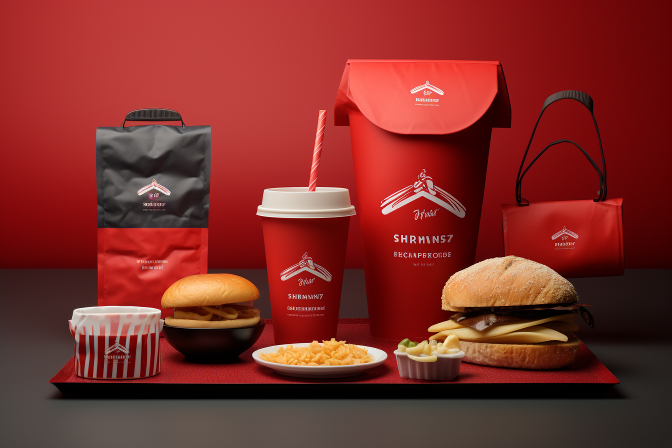
Many fast food restaurants, including McDonald’s and KFC, use red in their branding to convey energy and excitement, as well as to create a sense of urgency about their products. Red is also frequently utilized by beverage businesses, such as Coca-Cola, which uses bright red color to create a sense of excitement and joy around its goods.
Sports and Exercise
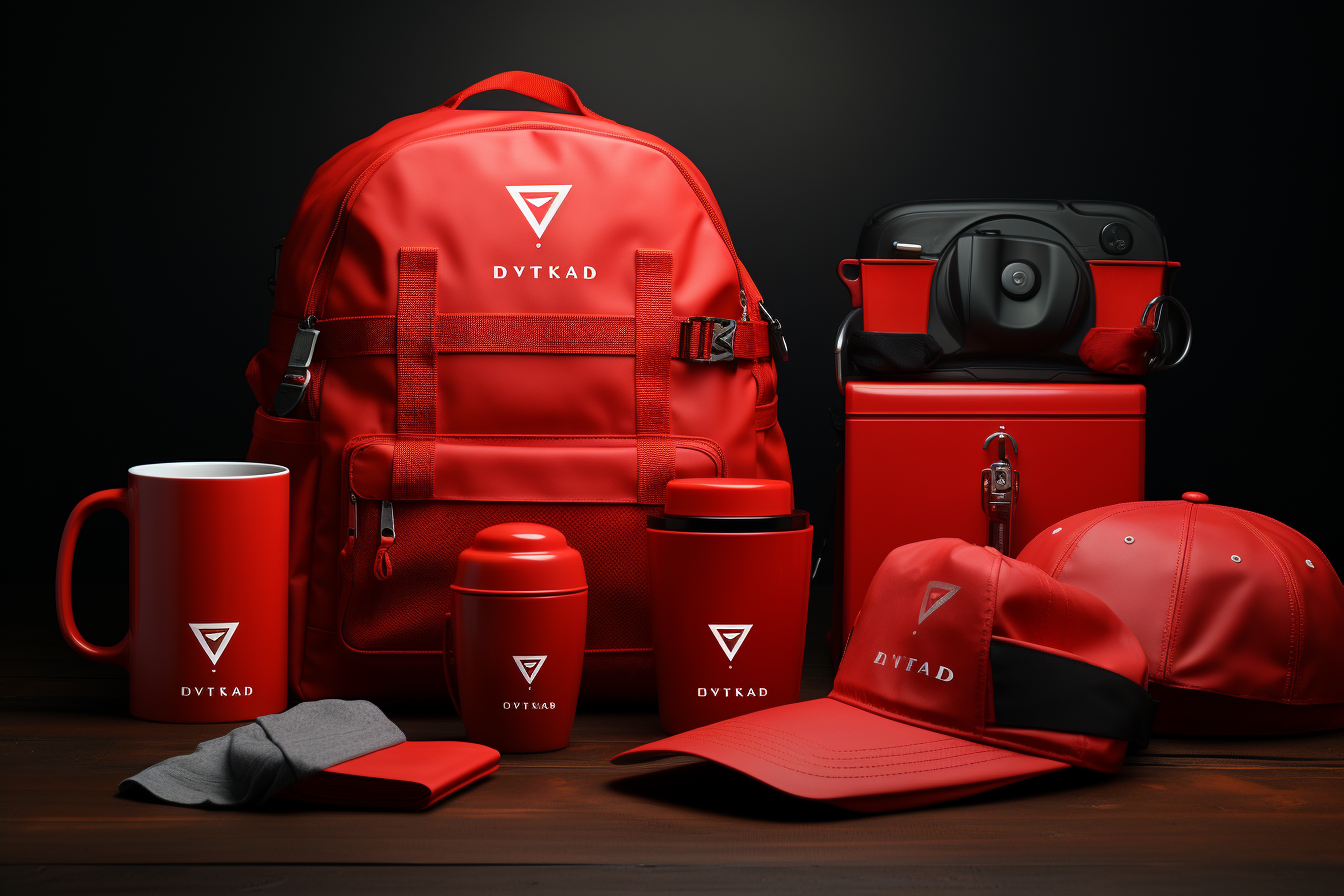
Because red is often associated with physical activity and energy, it is frequently used by brands in the sports and fitness industry. Nike and Adidas, for example, employ red in their logos and branding to express a sense of energy, enthusiasm, and strength.
Technology
Many technology brands use red in their branding to convey a sense of excitement and innovation. Companies such as YouTube and Airbnb, for example, employ a vibrant red color in their logos and branding to create a sense of energy and enthusiasm around their services.
Automotive
Red is a common color used in the automotive industry to portray a sense of power and performance. Luxury vehicle brands such as Ferrari and Lamborghini employ red in their branding to portray exclusivity and class, as well as a strong sense of confidence and authority.
Fashion and beauty
Red is a popular color in the beauty and fashion industries, where it is frequently used to express passion, desire, and romance. Brands in this industry, such as Chanel and Dior, frequently utilize red in their branding to provoke feelings such as want and attraction, as well as to create a sense of elegance and sophistication.
Media and Entertainment
Red is a popular hue in the entertainment and media industries, where it is frequently utilized to instill enthusiasm and energy in movies, music, and other types of entertainment. For example, the film business Universal Pictures’ emblem is a brilliant red globe, which evokes enthusiasm and expectation for their films.

The Function Of Red In Website Design
Color is a vital feature of website design, and red is a particularly potent hue that can be utilized to convey a variety of emotions and connections. Here are some examples of how red can be used in website design:
Attention-Grabbing
Red is a strong and eye-catching hue that may instantly capture the attention of website visitors. This is especially beneficial for websites that want to highlight a certain aspect, such as a call-to-action button or a unique deal. When utilized wisely, red can assist in directing users to the most crucial portions of a website.
Excitement and vigour
Red is frequently associated with energy, enthusiasm, and passion. It can help to create a sense of urgency or enthusiasm about a specific product or service when employed in website design. A website selling concert tickets, for example, might use red to generate a sense of excitement and anticipation about impending concerts.
Branding
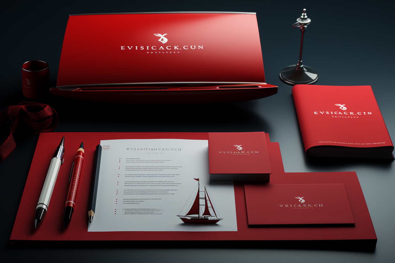
Red is a popular branding color, and using it in website design can serve to emphasize a brand’s identity and values. A website for a sports brand, for example, might use red to represent strength, power, and vitality, whereas a website for a luxury fashion brand might use red to convey sophistication and exclusivity.
Mood and Emotion
Red is a hue that, depending on how it is utilized, can elicit strong emotions and moods. A website selling Valentine’s Day products, for example, might use red to generate sentiments of love and romance, but a charity website might use red to evoke feelings of compassion and urgency.
Hierarchy and Contrast
In website design, red can be used to generate contrast and hierarchy, making it easier for visitors to browse and grasp the content. choosing red for headings and key material, for example, can help them stand out from the rest of the content, whilst choosing a different shade of red for buttons and links can assist to create a clear hierarchy of information.
Successful Companies That Have Embedded The Color Red In Their Branding
Red is a popular hue for branding, and many successful businesses have used it in their logos and marketing materials. Here are a couple of such examples:
![]()
Coca-Cola
Coca-Cola is perhaps the most well-known example of a firm that uses red in its branding. Since the early 1900s, the bright red color has been a key component of the company’s logo and packaging, and it has come to represent the brand’s energy and excitement.

Target is another well-known brand that incorporates red into its logo and branding. The company’s characteristic red bullseye has become a recognizable brand emblem, and it is frequently used in advertising and marketing materials to convey energy and enthusiasm.
![]()
The Netflix logo consists of a basic, powerful red “N” on a black backdrop. To create a sense of excitement and urgency around new releases and future content, the color red is frequently utilized in marketing materials and on the company’s website.
![]()
Nintendo’s distinctive emblem has a bold, red script that has come to represent the company. Throughout the years, the company has used various shades of red in its marketing materials, frequently incorporating the color into packaging and product design to create a cohesive brand identity.
![]()
Another company that has embraced the color red in its logo is the energy drink brand, Red Bull. The company’s bright red and yellow emblem is readily identifiable, and its advertising and marketing materials frequently use vibrant, lively imagery.
![]()
Virgin is a multinational conglomerate that operates a variety of industries ranging from airlines to music stores. The company’s logo uses a characteristic red script type that has come to represent the brand’s vitality, ingenuity, and sense of fun.
![]()
The YouTube logo is a vibrant red rectangle with a white triangle in the center. The color red is frequently utilized in the company’s branding and marketing materials to convey enthusiasm and energy surrounding the platform’s video content.