The Effect of Color on Branding
Color plays a critical role in establishing a brand’s identity and customer perception. Thoughtful use of color intensity and hue is a powerful tool that may significantly influence a brand’s appeal and communication efficacy in addition to being aesthetically beautiful. The nuances of color intensity and hue, explaining how adjusting these elements may enhance a brand’s visual appeal and forge a closer connection with its target audience will be discussed.

Comprehending Hue and Saturation Concepts
It’s critical to comprehend the meanings of color saturation and brightness before delving into their implications for brand aesthetics. A color’s intensity or purity is referred to as its color saturation. While colors with low saturation look dull and subdued, those with high saturation are vivid and striking. Brightness, on the other hand, describes how brilliant or dark a color is. A color’s mood and impact may be altered by adjusting its brightness, going from vibrant and dramatic to soft and elegant.
The Psychological Impact of Brightness and Color Saturation
Colors have the power to elicit feelings, shape perceptions, and motivate actions. High saturation colors are perfect for organizations looking to stand out and elicit strong emotional responses since they are often linked with energy, enthusiasm, and passion. These hues might be especially helpful in markets where companies want to stand out by being vibrant and lively.

Businesses that wish to come off as more trustworthy, competent, or calming could go with less saturated color schemes. A clientele looking for comfort and dependability will find these hues appealing since they convey elegance and strength. Similar to this, the brand’s statement is greatly impacted by the choice of bright vs dark hues. While deeper tones may imply depth, refinement, or seriousness, bright hues evoke brightness and enthusiasm.
Find out more about the psychology of color selections in branding:
The Reasons Behind Branding Color Selections
A brand’s style and perceived message may change when color saturation and brightness are intentionally used. For a brand, this means that in addition to selecting a color scheme that complements its identity, the saturation and brightness levels should be precisely calibrated to convey the ideal emotional tone and personality.
- Identifying the Personality and Core Values of the Brand: Finding the core principles and characteristics of the company is the first step towards utilizing color to fine-tune brand design. To guarantee that colors accurately reflect the brand’s identity and appeal to the target audience, this knowledge will guide color selection and adjustment.
- Trying out different saturation and brightness levels: To find the best balance for effectively conveying their message, brands should test out a variety of saturation and brightness levels. A/B testing of marketing materials may be part of this experimentation to determine which versions appeal to the audience more.
- Uniformity Across Touchpoints: Maintaining consistency across all brand touchpoints becomes crucial when the ideal saturation and brightness levels have been established. Maintaining consistency in a brand’s selection of colors ensures that its emotional and psychological impact endures via repeated exposure.
- Concerning Context and Audience Preferences: Brands have to take into account cultural differences in how people perceive and value color. Color changes may be necessary depending on the audience’s cultural and geographic background since what works in one market might not work in another.

A key component of perfecting brand aesthetics is maintaining strict control over color saturation and brightness. By being aware of the psychological effects of color and making strategic use of this knowledge, businesses may create identities that are more compelling and emotionally meaningful. This makes the brand more visually appealing and strengthens its connection with the target market, making it more compelling.
Real-World Case Studies: Brand Transformations Through Color
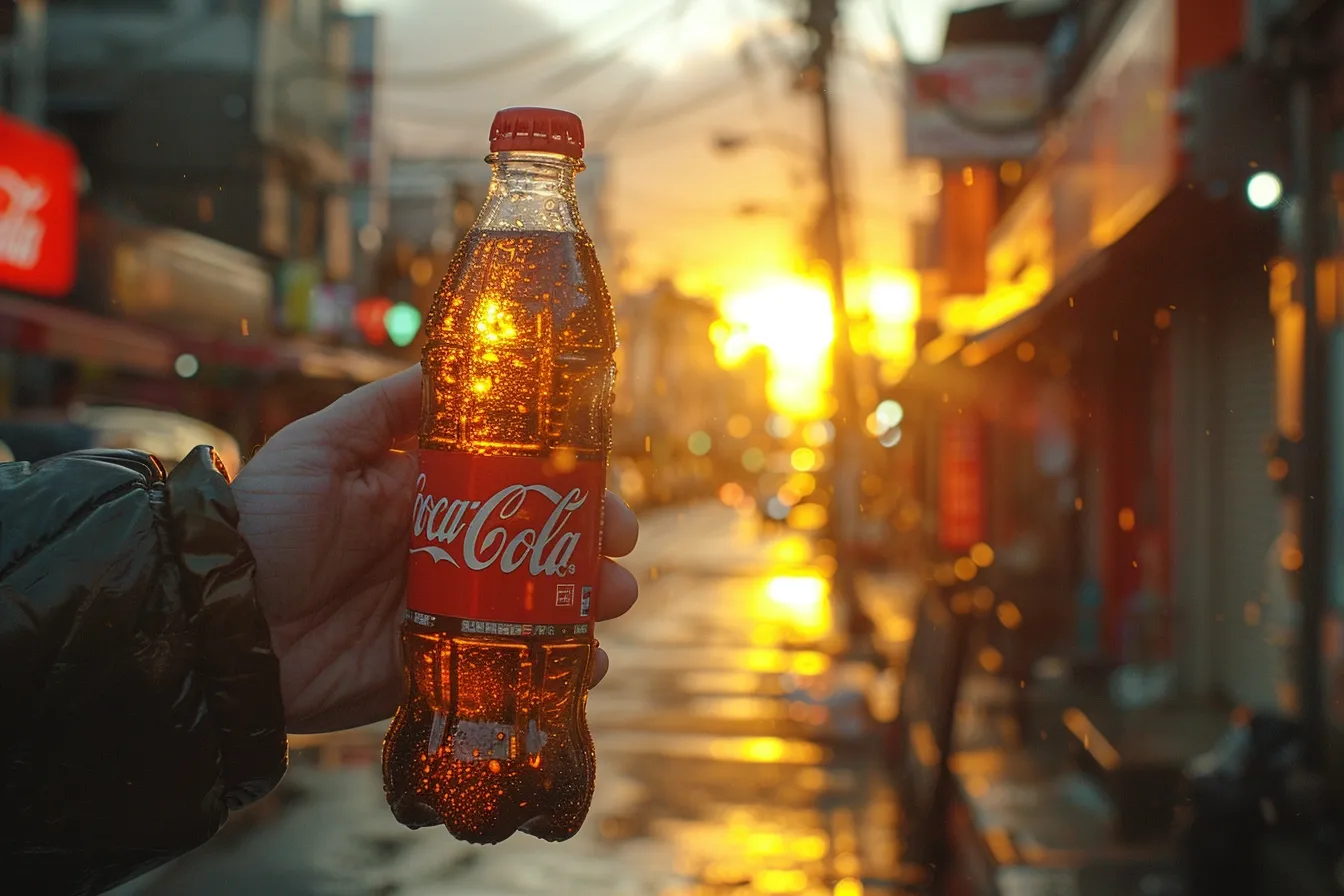
Refreshing Coca-Cola’s Visual Identity: Coca-Cola, a brand synonymous with its classic red, undertook a subtle yet impactful refresh of its visual identity. By adjusting the saturation of its iconic red color to be even more vibrant and making the white typography crisper, Coca-Cola enhanced its on-shelf visibility and brand recognition. This careful modulation of color saturation and brightness reinforced the brand’s energetic and refreshing qualities, further cementing its place in the hearts and minds of consumers worldwide.

Apple’s Shift to Minimalism: Apple’s evolution in branding and product design offers a masterclass in the use of color saturation and brightness. With the introduction of the iPhone 5c in 2013, Apple embraced vibrant, saturated colors to appeal to a younger, more diverse audience. This strategic use of color saturation marked a departure from Apple’s typical minimalistic, monochromatic palette, demonstrating how color can be used to segment the market and refresh the brand image. Over the years, Apple has continued to play with saturation and brightness across its product lines, using color to communicate innovation and elegance.
Read more about the effectiveness of minimalism in branding:
Practical Guidelines for Using Color Saturation and Brightness in Branding
- Understanding the emotional palette: Begin by mapping out the emotions and values that your brand represents, then match them with colors that have historically conveyed comparable ideas. Use saturation and brightness to fine-tune these emotions, intensifying or softening them as necessary to match your brand’s tone.
Discover the factors that evoke emotions in branding:
- Use Colour Psychology: Different colors may elicit a variety of psychological responses. For example, blue might generate sentiments of trust and security, but yellow can represent optimism and enthusiasm. Adjusting the intensity and brightness of these colors may either amplify or mitigate these psychological impacts, giving a strong tool for influencing customer perception and behavior.

- Conduct Audience Testing: Audience testing is quite useful in establishing how your target demographic reacts to various color treatments. Collect input on different saturation and brightness levels to see what works best for your audience. This data-driven strategy guarantees that your color selections are not only visually appealing but also successful in engaging your target audience.
- Maintain Flexibility: While consistency is important in branding, flexibility enables your brand to respond to shifting trends and settings. Create a basic color scheme while also creating a variety of saturation and brightness variants for usage across multiple platforms, campaigns, or markets. This mobility will allow your brand to remain relevant and appealing in a continuously changing market
- Monitor and adapt: Color’s influence on the brand impression is not static; it changes with societal trends and cultural transformations. Continuously assess the efficacy of your color approach and be ready to modify it as needed. This proactive strategy guarantees that your brand is visually and emotionally consistent with your target audience’s expectations and preferences.

The smart use of color saturation and brightness demonstrates the nuances of brand aesthetics. By carefully considering and using these concepts, companies can create a visual identity that not only stands out but also resonates profoundly with their target audience.
Future of Colour in Branding
Technology development and changes in consumer behavior and expectations will completely reshape how businesses utilize color to connect and communicate. Let’s look at upcoming trends and advancements that will influence color in branding going forward and offer advice on how companies may stay ahead of the curve.
New Developments in Colour Strategy
- Digital-first Colors: Marketers are giving priority to color schemes that look well on a variety of screens and devices due to the increasing dominance of digital platforms. Bright, high-contrast colors that stand out and maintain their purity in digital media are the emphasis of this trend. Companies will continue to modify their color schemes as screen technology develops to ensure optimal exposure and interaction in a culture that prioritizes digital media.
- Sustainability and Naturalness: As people’s awareness of environmental issues grows, so does their love of colors that stand for these concepts. Earth tones and muted, natural colors are becoming more and more popular among brands, signifying their commitment to sustainability and authenticity. In addition, color brightness and intensity will now be carefully considered, with a preference for softer, more natural tones.

- Customization and personalization: Thanks to technological developments, businesses can now offer their customers customized color experiences. Personalization is the way of the future for branding, from dynamic brand themes that adapt to user choices or settings to customizable product colors. Businesses will employ color more deliberately as a result of this trend towards customization, adjusting saturation and brightness to suit unique customer experiences and preferences.
- Psychological Precision: Although the psychological impact of color has long been known, data analytics and new studies are enabling marketers to use these concepts with more accuracy. Companies may create more targeted and effective color strategies by using big data and machine learning to predict and measure behavioral and emotional responses to specific colors or color combinations.
- Virtual reality (VR) and augmented reality (AR): Color will become more important in branding in these virtual worlds as these technologies are more deeply incorporated into customer experiences. Whether using color to enhance realism or create fantastical worlds that captivate people in novel and captivating ways, brands need to consider how saturation and brightness translate into immersive experiences.

Getting ready for the revolution in color
For businesses to successfully navigate the future of color in branding, they will need to be adaptable, creative, and have a solid understanding of their target market. Remaining abreast of technological advancements and societal shifts might help organizations effectively adjust their color strategy. Moreover, enterprises will be able to provide their clients with visually stimulating and emotionally impactful experiences if they consistently experiment with color saturation and brightness in addition to doing thorough testing and implementing feedback systems.
In summary, the strategic use of color brightness and saturation is a powerful tool for story, emotional connection, and differentiation in a cutthroat market, and it goes beyond simple brand aesthetics. In the future, companies that recognize the evolving significance of color in the human experience and leverage it to create unique and significant brand identities will thrive.


