Psychology Behind Choosing Colors
Color is a strong tool that can significantly affect human emotions, perceptions, and behaviors. It is much more than just a visual aspect. When it comes to branding, the careful choice of colors greatly influences how customers view and relate to a company. To create a brand identity that successfully conveys the business’s values and personality to the target audience, it is important to understand the psychology underlying color selections.
Comprehending Color Psychology
The study of color psychology looks at how various hues affect people’s feelings and actions. Every hue has its own set of connotations and meanings that can elicit emotions and responses in people. For example, cold colors like blue, green, and purple evoke sentiments of elegance, peacefulness, and trust, whereas warm colors like red, orange, and yellow are frequently linked to energy, passion, and excitement.
Color’s Effect on Brand Perception
Color selections in branding are not random; rather, they are thoughtful choices that have a big impact on how customers view a company. The brand’s personality and image are shaped in part by the colors used in its packaging, website, marketing collateral, and logo. In contrast, a brand that chooses subdued, earthy tones may be viewed as refined, organic, and ecologically sensitive. For instance, a company that uses strong, brilliant colors may be considered youthful, energetic, and inventive.
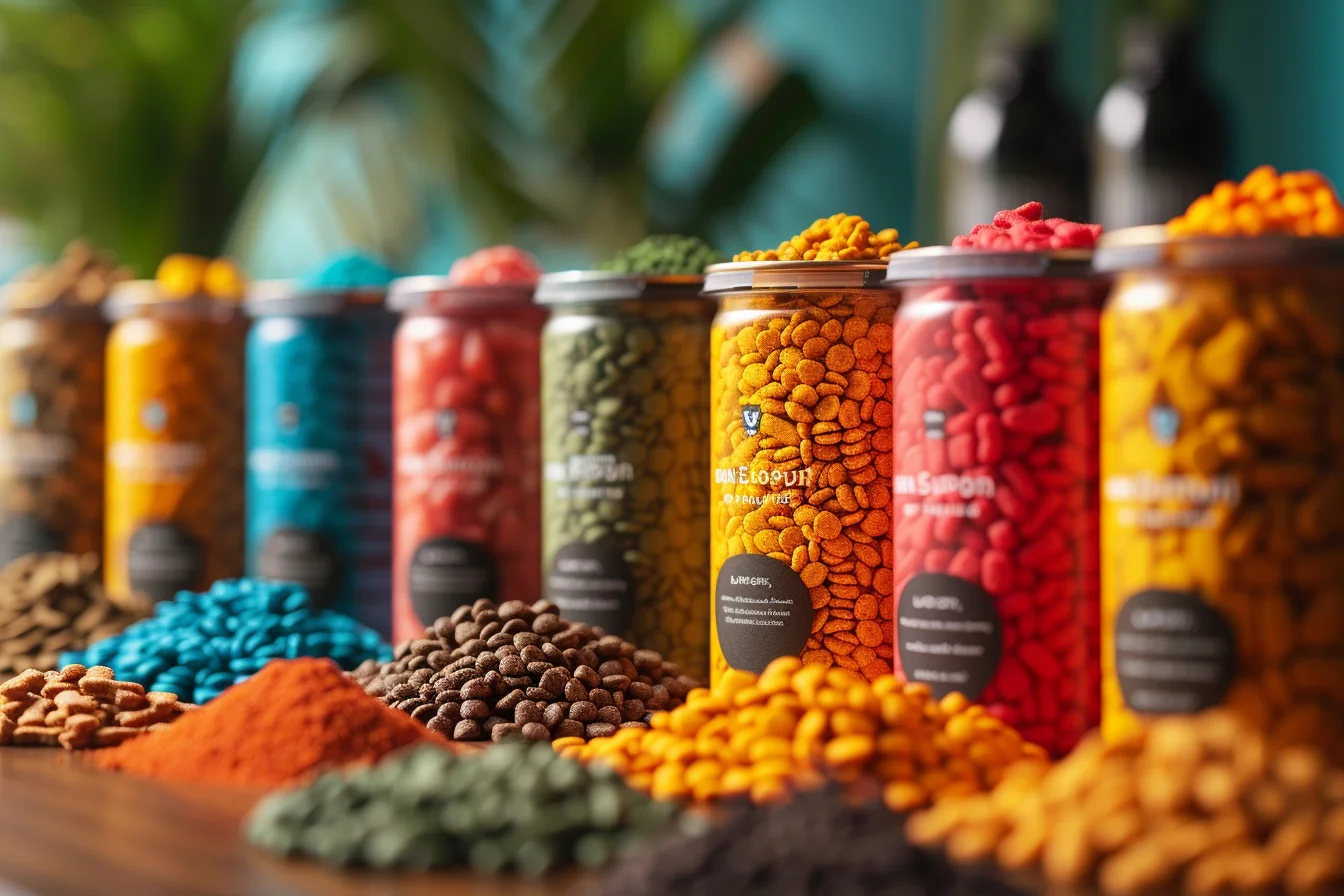
Learn the use of warm and cool colors:
Importance of Color Choices in Branding
- Brand Recognition: Memorability and brand recognition are aided by the consistent use of color in branding. Customers start to identify a specific color with a brand’s identity, values, and goods or services when they see that color used frequently. They get accustomed to this association, which makes it simpler for them to identify and remember the brand in the future.
- Emotional Connection: Colors can arouse feelings in customers and establish subconscious relationships with them. Through the strategic use of color, businesses may establish favorable connotations and strong emotional bonds with their target audience, therefore promoting brand endorsement and loyalty.
- Differentiation: In a crowded market, brands must differentiate themselves from rivals to get attention and take market share. Carefully selecting colors may assist firms in standing out from rivals and developing a distinctive, memorable brand identity that appeals to customers.
- Brand Personality: A brand’s values and personality are strongly communicated via the use of color. Color selections may influence how customers view a company and its products, regardless of whether the brand wishes to be seen as aggressive and dynamic (using colors like red or orange) or calm and reliable (using colors like blue or green).
- Consumer Behavior: Branding colors have the power to affect how consumers act and make decisions. Research has demonstrated that perceptions of product quality, cost, and even purchase intent may be influenced by specific colors. Brands may intentionally choose colors that encourage desirable customer behaviors and boost sales by knowing the psychology underlying color selection.
Examples of Powerful Color Branding
Utilizing color psychology, several prosperous firms have established distinctive and powerful brand identities:
1. Coca-Cola’s Color Branding: A masterful example of using color psychology to establish a strong and enduring brand identity is Coca-Cola’s famous red color branding. The psychology behind Coca-Cola’s usage of red is examined in further detail below:
- Energy and Excitement: The colors red, green, and blue are related to these qualities. It possesses the ability to arouse intense emotional reactions and excite the senses. Coca-Cola capitalizes on these attributes by utilizing red as its major brand color to generate excitement and anticipation around its goods. The vivid red color acts as a visual indication for the thrilling experience connected with the brand, whether it’s the anticipation of cracking open a cold can of Coke or the exhilaration of sharing a Coca-Cola with friends.
- Warmth and Joy: Another hue that evokes warmth and joy is red. It can evoke sentiments of happiness and optimism while bringing forth a sense of coziness and warmth. Coca-Cola’s usage of red upholds its marketing promise to unite people and spread joy. Coca-Cola’s red logo evokes feelings of warmth and excitement in people, whether through endearing commercials or joyful holiday promotions. This appeals to consumers’ emotions.
- Boldness and Confidence: Red is striking, attention-grabbing, and communicates confidence. It can stand out from the crowd and make a statement. Coca-Cola’s usage of red conveys the brand’s audacity and assurance in its messaging and goods. Coca-Cola’s distinctive red branding attracts attention and makes a lasting impact on customers, whether it’s through the large red logo on its container or the eye-catching red billboards that line city streets.
- Timeless and Classic: Red is a color that is always in style. It is both timeless and classic. It is an essential component of Coca-Cola’s history and identity because it has been connected to the brand from its founding. Coca-Cola has become one of the most well-known and adored companies in the world because of its unwavering usage of red throughout the years. Red has a timeless appeal that makes Coca-Cola’s trademark durable and relevant for all ages.
Coca-Cola made a calculated decision to use the psychology of color in their branding by using red to establish a strong and enduring brand identity. Through the effective utilization of the energy, warmth, boldness, and timeless quality associated with red, Coca-Cola has established a brand that captivates customers globally and endures throughout time.
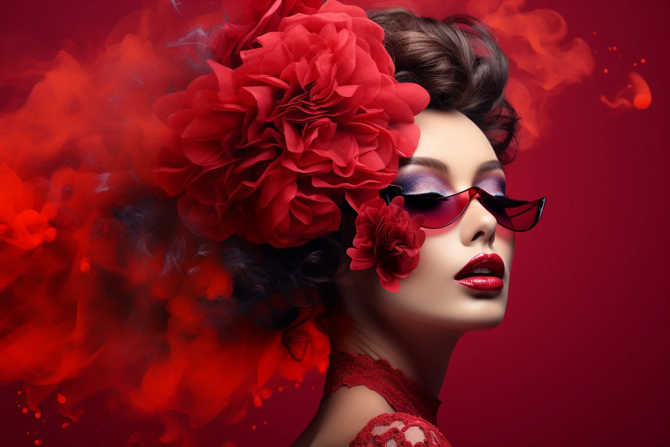
Read more about the use of Red in branding:
2. Macdonald’s Color Branding
McDonald’s, a worldwide known fast-food restaurant, employs strategic color usage in their branding to elicit feelings and provide a memorable brand experience. Here is some information about the psychology of McDonald’s color branding:
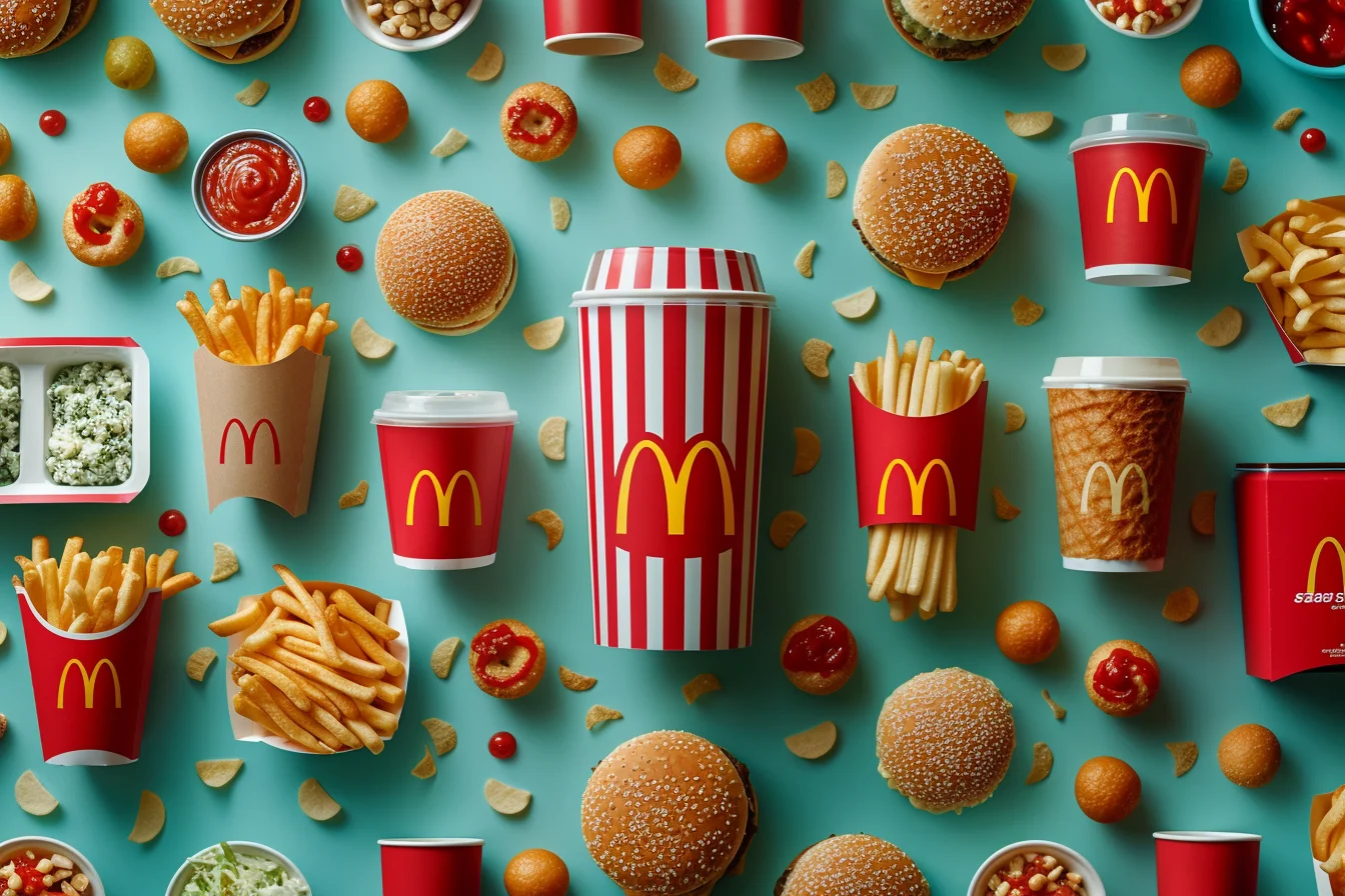
- Yellow: Hope and Vitality: McDonald’s branding makes extensive use of yellow, especially in the Golden Arches emblem. Yellow is linked to positive, vivacious, and joyful emotions. It’s a striking color that draws attention and has the power to improve feelings of optimism. To elicit sentiments of happiness and enthusiasm in its patrons, McDonald’s uses yellow to provide a bright and energetic eating experience.
- Red: Stimulation of Appetite and Urgency: Another prominent color in the McDonald’s logo, red, is well-known for boosting hunger and instilling a feeling of urgency. It’s a color that conveys enthusiasm, passion, and energy. McDonald’s deliberately uses red in their logo to pique consumers’ appetites and make them want to eat their mouthwatering food. Customers are enticed to indulge in their favorite foods by the vibrant and welcoming ambiance created by the mix of red and yellow in McDonald’s trademark.
- White: Clarity and Ease of Use: White is a complementary color that supports the brand’s principles of simplicity and cleanliness, whereas yellow and red are the primary colors used in the McDonald’s logo. White is linked to freshness, cleanliness, and purity. White in its logo to reassure consumers of the quality and freshness of their meals by creating a tidy and hygienic environment in its restaurants. White also gives McDonald’s branding a feeling of simplicity and minimalism, which is consistent with the company’s dedication to providing quick and easy eating experiences.
Learn how to make your brand stand out with color techniques:

- Green: Sustainability and Health: McDonald’s has added green elements to their logo in recent years to highlight its dedication to sustainability and good health. Green is linked to the environment, health, and sustainability. McDonald’s utilizes green to draw attention to its more healthful menu items, such as salads, and smoothies, as well as to showcase its environmental activities, like recycling and eco-friendly packaging. McDonald’s incorporates green into their branding to appeal to people who are concerned about their health and to establish the company as socially conscious.
To arouse feelings in its consumers, pique their desire, and create a warm and appealing environment, McDonald’s deliberately employs color in its branding. Through the strategic use of color psychology, particularly about yellow, red, white, and optional green, McDonald’s has created a powerful and enduring brand identity that connects with people all over the world.
3. Cadbury’s Color Branding
Cadbury, a well-known confectionery company, uses color psychology in its branding to elicit strong feelings from customers, communicate its brand, and provide them with an unforgettable experience. An examination of the psychology of Cadbury’s color branding is provided below:
- Purple: An Opulent and Indulgent Color: Cadbury’s packaging and branding are dominated by purple, especially the company’s signature purple wrapping for chocolate bars. Purple is a color connected to decadence, luxury, and grandeur. It exudes refinement and elegance, which makes it the perfect option for a company like Cadbury, which wants to establish its goods as superior and high-end. Cadbury’s use of purple in their logo creates sentiments of luxury and indulgence, tempting customers to treat themselves to their mouthwatering chocolate goods.
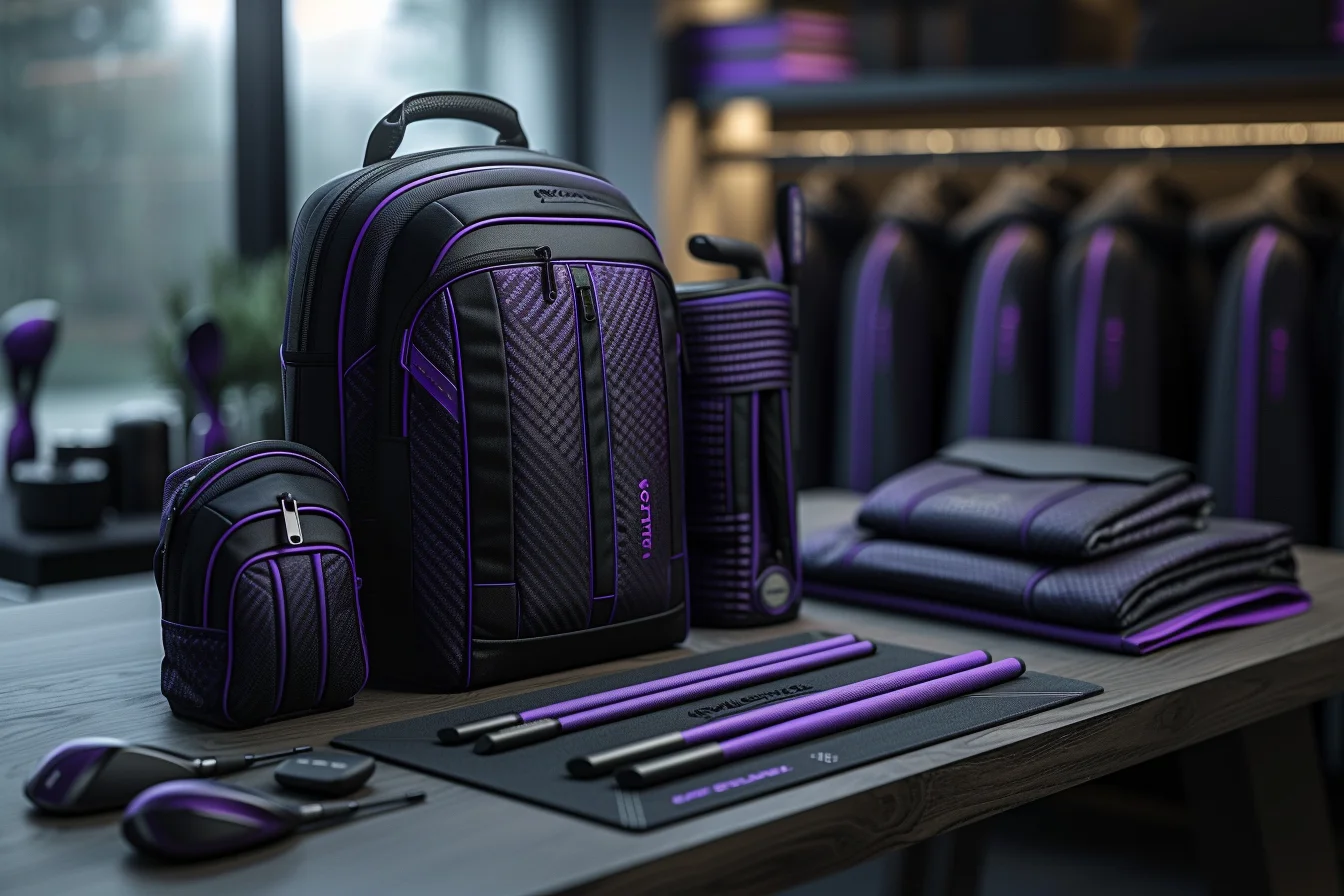
How purple can be used in branding to create an everlasting effect:
- Gold: Prestige and Quality: To give its packaging and marketing materials a sense of wealth and grandeur, Cadbury frequently uses gold as an accent color in its branding. Gold is a symbol of prosperity, excellence, and quality. It represents quality and workmanship, reaffirming Cadbury’s dedication to creating excellent chocolate goods. Cadbury conveys a sense of grandeur and quality using gold in its branding, which leads customers to believe that its goods are high-end and well worth the expenditure.
- White: Simplicity and Purity: Occasionally, Cadbury’s logo uses white to contrast with its distinctive purple and gold hues. White is linked to simplicity, cleanliness, and purity. It gives Cadbury’s packaging an air of purity and freshness, which makes it seem hygienic and welcoming. By using white in its logo, Cadbury conveys a message of purity and simplicity as well as improving the overall visual appeal of its products, assuring customers of the high caliber and freshness of its chocolate offerings.
- Brown: Authenticity and Nostalgia: Because of its inherent color, brown is a color that is frequently linked to chocolate. Brown is occasionally employed in Cadbury’s branding to inspire sentiments of authenticity and nostalgia, albeit it is not as prevalent as purple, gold, or white. Consumers are reminded of the rich and decadent flavor of Cadbury chocolate brown, which represents warmth, familiarity, and comfort. Using brown accents in its branding, Cadbury appeals to customers’ sentimental associations with chocolate, evoking feelings of authenticity and nostalgia that elevate the brand experience in general.
Cadbury employs a purposeful use of color in its branding to elicit feelings from customers, communicate its brand identity, and provide them with an unforgettable experience. Utilizing the psychological effects of hues like purple, gold, white, and brown, Cadbury conveys themes of exclusivity, excellence, purity, and luxury, solidifying its standing as a top manufacturer of high-end chocolate goods.

4. Facebook’s Color Branding
One of the most widely used social networking sites in the world, Facebook, deliberately uses color in its branding to elicit feelings and establish a unique brand identity. Here’s a closer look at Facebook’s color branding psychology:
- Blue: Stability and Dependability: The predominant color utilized in Facebook’s branding, including its interface design and logo, is blue. Trustworthiness, stability, and dependability are frequently linked to blue. It exudes professionalism and honesty, which makes it the perfect fit for a website like Facebook that wants to encourage relationships and communication among its members. Facebook’s usage of blue in its logo helps consumers feel more confident by reassuring them of the legitimacy and security of the site.
How Blue Plays an Important Role in Branding:

- White: Orderliness and Minimalism: In Facebook’s branding, white is commonly utilized as a secondary color, especially in the interface design and website layout. White is linked to simplicity, cleanliness, and purity. It fosters an atmosphere of transparency and openness that makes the material stand out and be simple for consumers to obtain. Facebook’s logo incorporates white as a symbol of the company’s dedication to offering a simple and intuitive interface that improves user experience overall and promotes participation on the network.
- Black: Modernity and Sophistication: Black is occasionally utilized in Facebook’s branding to provide depth and contrast, while it is not as common as blue and white. Black is linked to modernism, refinement, and elegance. It gives Facebook’s visual identity a more polished look and exudes authority and professionalism. Facebook’s branding effectively employs black to create a feeling of depth and refinement, enhancing the network’s overall visual appeal and solidifying its position as a top social media platform.
- Grey: Harmony and Apportion: Another color that is occasionally utilized in Facebook’s branding is gray, especially in the interface and iconography. Grey is linked to harmony, objectivity, and pragmatism. It acts as a background that is neutral enough to let other colors and components pop without overpowering the user. Grey is a color that Facebook uses in its branding to assist in establishing visual hierarchy and organization, which improves the platform’s usability and navigation.
Facebook employs a planned use of color in its branding to elicit feelings and provide a unified and intuitive platform experience. Facebook uses color psychology to convey signals of reliability, refinement, sophistication, and equilibrium. This helps the company maintain its position as the most popular social media network with billions of members worldwide.
Useful Tips on Selecting Colors for Branding
Choosing the appropriate colors for your brand is an important choice that may significantly affect how people view and remember it. This section will cover some useful advice for selecting colors for branding and developing a unified, memorable brand identity.

- Recognize the Character of Your Brand: It’s critical to comprehend your brand’s personality, beliefs, and place in the market before choosing colors for it. When selecting colors for your brand, think about the feelings and connections you want it to arouse. For instance, you may choose to use vivid colors like orange or red if your brand is audacious, inventive, and dynamic. If your brand is composed, reliable, and polished, you might appreciate more subdued colors like blue or green.
- Think About Your Target Audience: When selecting colors for your brand, consider your target audience’s likes, inclinations, and cultural connotations. As various demographic groups may relate to colors differently, it’s critical to carry out research and acquire information about the tastes and habits of your target audience. For instance, you may choose to use strong, vivid colors if most of your target audience is young and stylish. Muted and classic colors could be more appealing to your target audience if they are more conventional and conservative.

- Test and Retest: It’s crucial to test a color palette on your target audience and adjust depending on their input once you’ve chosen one for your brand. Find out how customers see your brand depending on its color selections by conducting focus groups, surveys, or A/B testing. To determine whether your color scheme is working, track KPIs like purchase intent, brand awareness, and brand loyalty. Make any necessary revisions based on the findings to make sure that the colors you choose will complement your brand goals and appeal to your target market.
- Think About Color Schemes: Think about how the colors in your brand will complement one another as a coherent palette when choosing them. Select hues that work well together to give your brand a cohesive visual identity. If you want to give your brand’s visual language more depth and character, think about combining main and secondary colors. To make sure that your color choices are both aesthetically pleasing and simple to read on a variety of media and devices, you need also to consider contrast, saturation, and balance.

- Stay Steady Throughout All Channels: When it comes to branding, consistency is crucial, thus keeping a consistent color scheme across all platforms and touchpoints is crucial. Make sure your brand colors are used consistently throughout all your marketing materials, including your packaging, website, logo, and packaging. This will help to build a cohesive and recognizable brand identity. Maintaining consistency in your brand’s communication helps people recognize it, trust it, and associate it with your values and personality.
The psychology of color selection in branding is an important part of design that may greatly influence a company’s success. Businesses may create memorable and significant brand experiences that connect with customers and promote long-term success by knowing how colors impact human emotions and behaviors and deliberately choosing colors that match their brand identity and target audience preferences.