Introduction to Pattern and Repetition in Branding
Brands compete for customers’ attention in today’s busy marketplace, and a brand’s visual identity acts as a light to direct them to its beaches. Pattern and repetition, two components that are as subtle as they are potent, are at the core of this visual identity. Let’s have a closer look into the meaning of patterns and repetition in the context of branding, their historical relevance, and the psychological foundations that make them essential instruments in the toolbox of brand design.
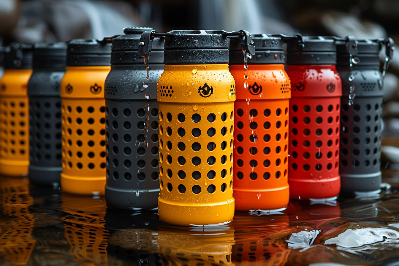
When it comes to brand graphics, a pattern is any recurrent design or theme that shows up across all of a company’s touchpoints, including digital platforms and packaging. To promote brand awareness, repetition entails using these patterns—along with logos, color schemes, and typography styles—consistently. When combined, they provide a visual rhythm that communicates with the listener without using words. It is impossible to exaggerate the significance of pattern and repetition; these are the strands that bind a brand’s visual identity together and make it instantly identifiable, memorable, and different from rivals.
Read about the importance of texture and patterns in design:
Historical Context
It’s not a new idea to employ repetition and pattern in branding. Its roots may be found in ancient societies when traders used certain symbols to designate the origin, quality, or ownership of their commodities. This technique has changed in the present day as companies like Apple and Coca-Cola use patterns and repetition to connect with people and elicit feelings in addition to being recognized. The development is a reflection of a growing awareness of the ability of design to convey the personality and values of a business.
Psychological Impact
Patterns and repetition work because of the way the human brain processes them. Being pattern-seeking animals, we take comfort in the known. A brand is ingrained in our minds and becomes simpler to remember in a sea of information when it utilizes certain patterns and elements regularly. Additionally, emotional reactions are elicited by the visual components’ recurrence, which promotes a sense of dependability and trust. This psychological effect highlights how patterns and repetition may be strategically used to create a brand that connects with consumers more deeply.
The fundamental components of brand graphics are pattern and repetition, which help to ingrain the company’s identity in customers’ thoughts and emotions. Their continuing relevance in branding strategy is attested to by their psychological and historical significance.
Strategies for Implementing Patterns and Repetition in Brand Visuals
Let’s talk about the practical ways for the efficient deployment of patterns and repetition in branding, building on the fundamental knowledge of their importance. A well-implemented strategy fosters a distinctive brand personality that appeals to customers in addition to improving brand awareness. The use of pattern and repetition is both an art and a science, from guaranteeing consistency across platforms to bringing originality into design.
Consistency Across Platforms
A brand’s visual identity needs to work across several channels in the modern digital age, from conventional print media to the always-changing web. The secret to successfully utilizing repetition and pattern is consistency. The patterns and features utilized on whatever platform—website, social media, packaging, etc.—should be part of the brand’s visual language. Regardless of the media, this consistency aids in creating a unified brand identity that customers can quickly identify and connect with. For example, using logos and color schemes consistently across platforms helps customers remember brands and makes it simpler for them to recognize them in a congested environment.
Explore brands that achieved success through visual consistency:
Creativity and Variation
Although it’s important to be consistent, there’s a thin line between monotony and repetition. The difficulty is in preserving brand identification through repetition and pattern while yet ensuring that the images are interesting and captivating. Here’s where creativity comes into play, with businesses adapting their patterns and components of design to fit various settings without losing sight of their core identity. This may be accomplished by utilizing various color schemes that adhere to the brand’s color scheme, altering the pattern scales, or utilizing textures in novel ways. Brands may maintain the dynamic and enticing quality of their graphics while promoting ongoing customer interest and engagement by using diversity within the framework of repetition.

Case Studies
Several companies have become experts in employing patterns and repetition in their graphics with striking results:

- Apple: Known for its clean, minimalistic design style, Apple’s product designs and branding materials have a straightforward yet effective pattern. A dependable and instantly identifiable brand image is produced by the persistent use of simple, monochromatic color schemes, the recognizable apple emblem, and clean lines throughout all touchpoints.
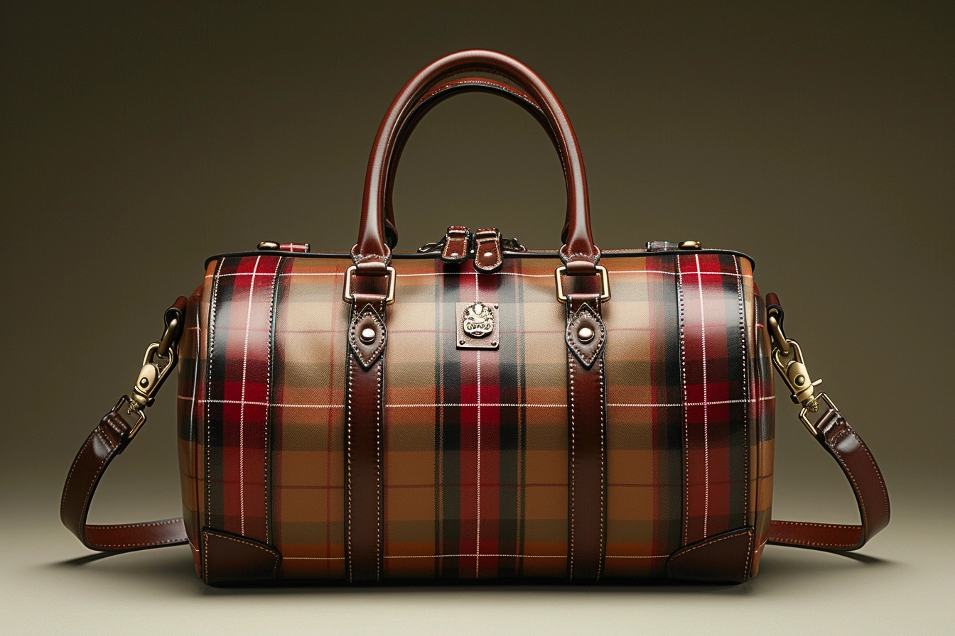
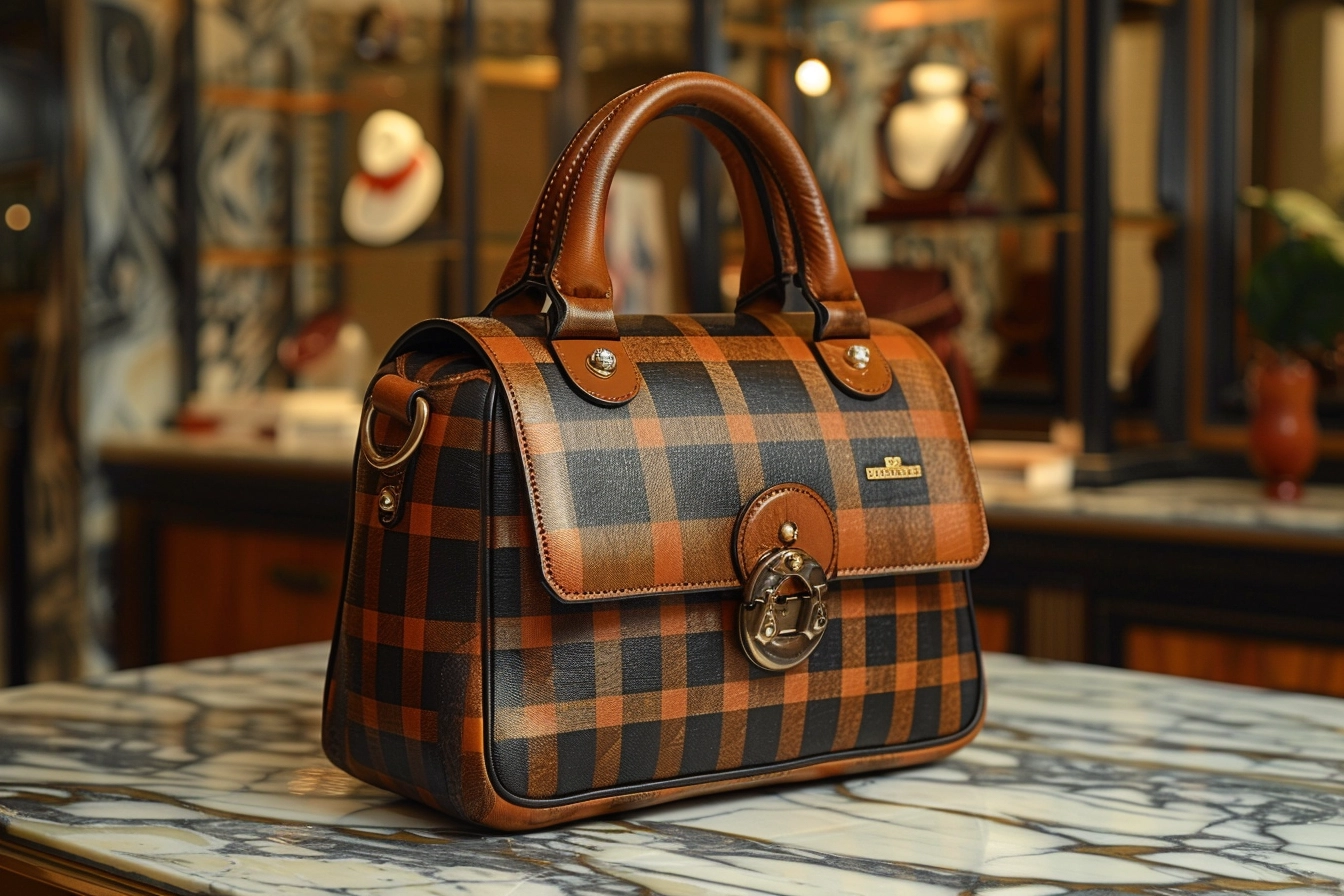
- Burberry: The premium fashion brand from Britain is well-known for its check pattern, a unique design that appears on many of the company’s items. Not only has this pattern repetition come to represent the company, but it also denotes luxury and excellence.

- Starbucks: The company’s green color scheme and emblem are used regularly across the company, from cups to outlets. Its establishments’ distinctive designs combined with the recurrence of these components provide a recognizable, cozy atmosphere that draws consumers from all over the world.
These case studies highlight the importance of repetition and pattern in building a powerful, recognizable brand. These businesses have solidified their place in the minds of customers globally by utilizing the distinctive elements of their visual identity, creating creative variants, and keeping consistency across media.
A careful balance between consistency and originality is struck when strategically implementing patterns and repetition in brand images. Brands may increase their exposure, cultivate brand loyalty, and leave a lasting impact on their audience by using these methods. In the upcoming installment of this series, we’ll examine how to quantify the influence of these design components and anticipate emerging trends in brand imagery.
Learn about the art of contrast and balance in branding:

Measuring the Impact and Future Trends
It is critical to comprehend how to assess pattern and repetition’s influence on brand performance and predict future trends after studying the strategic use of these elements in brand graphics. This last section discusses assessment methods, potential problems for businesses, and developing trends that will influence how patterns and repetition are used in brand imagery.
Assessment Techniques
Analyzing both the qualitative and quantitative facets of brand performance is necessary to determine the influence of pattern and repetition in branding. Sales statistics are the ultimate measure of success, along with brand recognition and consumer involvement. Consumer brand recognition and recall may be measured with the help of tools like focus groups and surveys, which can reveal how successful visual patterns are at forging a memorable brand identity. Social media analytics analyze the frequency with which brand images are shared, liked, and remarked upon, providing a plethora of information on consumer involvement. Sales data may be used to evaluate the effect of visual consistency and innovation on customer purchasing behavior, even though it is a more immediate indicator of success than branding activities alone.
Challenges and Solutions
Effectively implementing repetition and pattern is not without its difficulties. The possibility of visual fatigue, which results from repeatedly exposing consumers to the same patterns and images, is a significant obstacle. For brands to maintain a visually appealing and captivating identity, they need to strike a careful balance between innovation and continuity. Making sure patterns and repetitions are culturally sensitive is another problem, particularly for worldwide businesses for which a one-size-fits-all strategy might not work well. Localized versions of the brand’s visual components offer a way to accommodate cultural quirks without sacrificing the overall character of the brand.

Future Trends
Future trends that might influence how pattern and repetition are used in marketing images include:
- Personalization: As technology develops, companies will be able to provide increasingly customized experiences by utilizing data analytics to adjust patterns and images to suit the interests of specific customers.
- Digital Integration: As augmented and digital reality gain popularity, marketers will look for fresh approaches to use patterns and repetition in their digital experiences to create engaging and dynamic brand interactions.
- Minimalism: Brands will probably continue to use basic, repeating patterns to communicate sophistication and clarity as the minimalist trend continues.
Know the importance of minimalism in design:
- Sustainability: As customers grow increasingly aware of environmental issues, companies will use design to show their commitment to sustainability by incorporating sustainable themes into their visual patterns.

In conclusion, the field of strategically using patterns and repetition in brand graphics is dynamic and ever-evolving, necessitating constant evaluation and modification. Brands may establish visually striking identities that connect with consumers and last over time by comprehending the significance of these design aspects and staying ahead of emerging trends. Pattern and repetition applied creatively and innovatively will surely continue to change the branding environment as time goes on, providing businesses with new opportunities to meaningfully engage with their audience.