In a variety of sectors and industries, visual harmony is essential to a brand’s success. A brand’s ability to transmit a single message to consumers and link together its diverse aspects is largely dependent on its visual harmony. Maintaining consistency in visual components including font, color schemes, logos, and imagery aids in consumer trust-building and brand identification. Consumers are made to feel more connected with a brand when they come across consistent visual cues in a variety of touchpoints, such as digital platforms, product packaging, and advertising materials. Additionally, this consistency helps with brand recall, which makes it simpler for customers to recognize and recall the brand among a plethora of rivals. Let’s have a closer look at 8 brands that achieved success through visual harmony.
Achieving Success Through Visual Harmony
1. The Story of Apple
The value of visual branding in today’s cutthroat business environment cannot be emphasized. The visual identity of a brand communicates values, ambitions, and dependability to customers, acting as the public face of the company. Of all the brands that have effectively used visual harmony to establish their position in the market, Apple Inc. sticks out the most.
Apple’s rise to prominence as one of the world’s most valuable corporations may be due to more than just its cutting-edge products and brilliant marketing techniques. Its ability to combine design aspects with ease throughout its product selection, marketing materials, and retail settings is a key factor in its success.

Apple has continuously placed a high priority on visual coherence in its branding initiatives, from the recognizable apple-shaped emblem to the svelte, minimalist product designs. Every element of the business’s visual identity demonstrates its dedication to simplicity and elegance, which instills in customers a sense of sophistication and reliability.
Explore the minimalistic approach in design:
Apple’s logo, a straightforward yet instantly identifiable representation of the company’s values, is essential to the visual coherence of the design. Rob Janoff created the bitten apple logo in 1977, and it has since come to represent ingenuity and invention. The brand’s dedication to functionality and simplicity is embodied by its balanced proportions and clean lines, while the bite mark lends a whimsical touch that humanizes the otherwise impersonal design.
Apple’s product designs are excellent examples of visual harmony, even outside of its logo. Apple devices are known for their sophisticated designs and user-friendly interfaces, starting with the iMac, which was revolutionary, and continuing with the iPhone. The brand’s reputation for dependability and user-centric design is strengthened by the smooth transition between hardware and software, which results in a unified user experience.
Apple is demonstrating its dedication to visual harmony through its marketing campaigns. Whether in print ads, TV commercials, or internet campaigns, Apple always uses clean, simple design and eye-catching imagery to get its point across. Apple makes sure that its brand identity is powerful and recognizable by preserving a consistent visual language across all marketing platforms.
Apple places a high priority on visual harmony even in its retail locations to create a compelling brand experience. Apple’s retail spaces are designed with a clean, minimalist look that reflects the style of its goods, enhancing the whole shopping experience and bolstering brand consistency. Every element, from the design of the store to the product packaging, is painstakingly chosen to preserve Apple’s visual brand.

2. The story of Nike
Few brands have as much clout and impact in the world of athletic clothing and footwear as Nike. Nike’s success may be primarily ascribed to its mastery of visual harmony, which involves the seamless integration of design elements to represent the brand’s ethos of empowerment, performance, and innovation. This goes beyond the company’s cutting-edge technology and distinctive swoosh emblem.
Nike’s iconic swoosh logo is the centerpiece of their visual identity. Created in 1971 by Carolyn Davidson, a student of graphic design, the Swoosh symbolizes the company’s dedication to motion and velocity. One of the most recognizable logos in the world, its straightforward yet dynamic design embodies Nike’s basic ideals of athleticism and performance.
Read more about the use of black in branding:
Beyond just their logo, Nike’s product designs are excellent examples of visual harmony. Nike shoes are known for their revolutionary features and clean aesthetics, from the iconic Air Max series to the popular Air Jordan sneakers. In addition to improving performance, the brand’s reputation for excellence and craftsmanship is strengthened by the smooth blending of form and function.
Nike’s marketing campaigns serve to further emphasize their dedication to aesthetic coherence. Nike encourages customers to push their boundaries by showcasing the spirit of athletics through impactful advertising campaigns and eye-catching imagery. Nike constantly uses vivid imagery and impactful images to communicate their message of empowerment and resolve, whether in print ads, TV commercials, or social media posts.
Nike always prioritizes visual coherence in their store environments to create captivating brand encounters. Nike’s retail spaces, ranging from flagship stores to pop-up shops, are crafted to mirror the brand’s vibrant and dynamic look. Nike strategically uses displays, signage, and lighting to create an environment that appeals to its target market and strengthens brand loyalty.
Learn about the art of contrast and balance in a brand’s appeal:
3. The Story of Coca-Cola
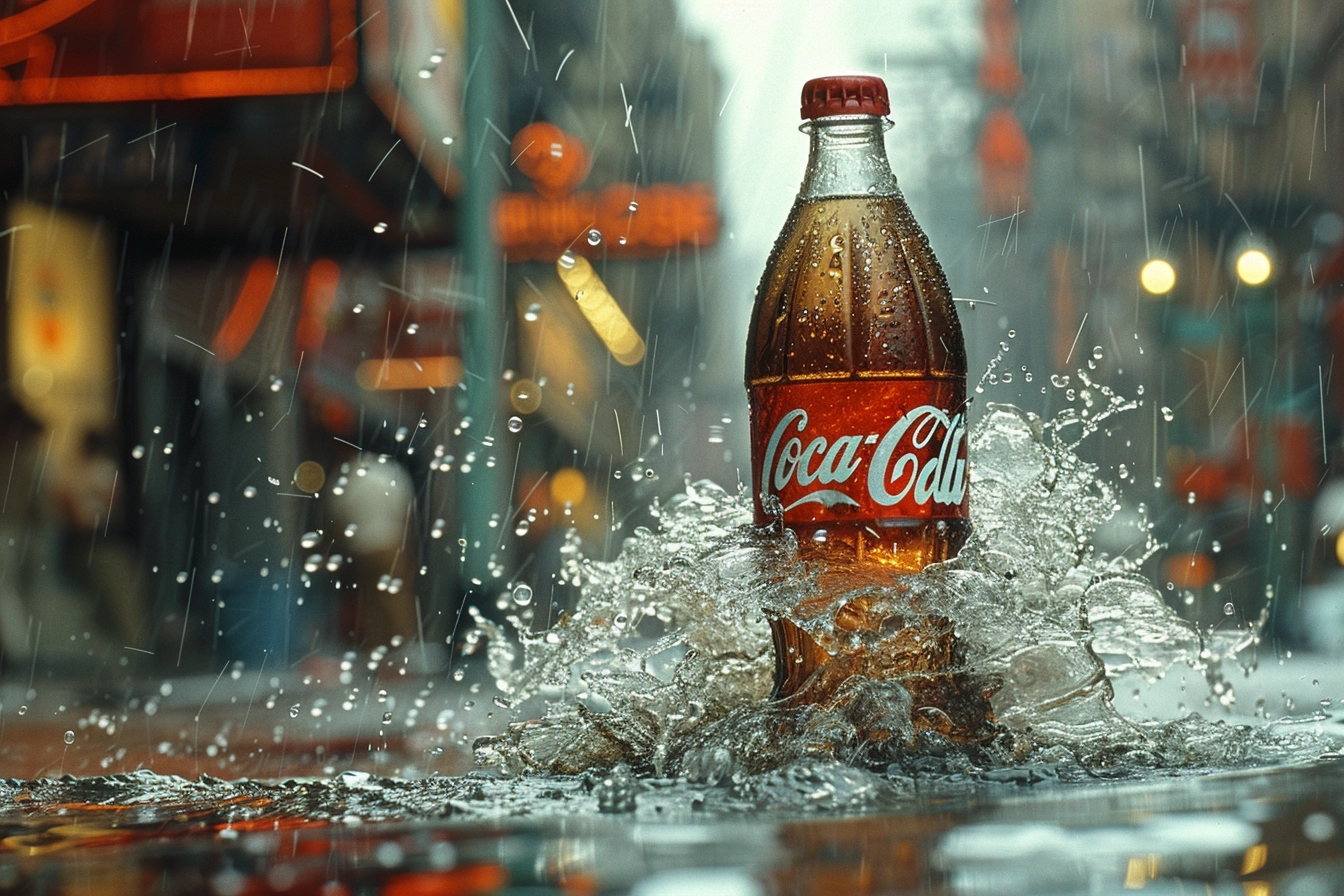
Among the world’s largest beverage companies, Coca-Cola is a timeless representation of happiness, enjoyment, and community. Coca-Cola’s success can be partly ascribed to its mastery of visual harmony, which skillfully blends design components to produce a timeless and universally recognizable brand identity, in addition to its characteristic taste and widespread presence.
Since its creation in 1887, Coca-Cola has maintained a virtually unaltered distinctive logo that is crucial to the company’s visual brand. The flowing font conveys warmth and friendliness, while the red color scheme and Spencerian style generate feelings of heritage and nostalgia.
Explore the importance of Red in branding:
Over time, the Coca-Cola logo has transcended linguistic and cultural boundaries to become one of the most recognizable icons in the world, becoming synonymous with joy and celebration.
Coca-Cola’s packaging design is an excellent example of visual harmony, even without reference to its logo. Coca-Cola packaging is instantly recognizable and continuously upholds the brand’s image of enjoyment and refreshment, whether it comes in the form of a sleek aluminum can, a traditional glass bottle, or a vivid plastic bottle. A symbol of Coca-Cola’s dedication to quality and craftsmanship since its introduction in 1916, the classic contour bottle maintains its visual integrity across all packaging formats.
Coca-Cola’s marketing campaigns reinforce the company’s commitment to visual harmony. Coca-Cola highlights joyful, connecting, and uniting experiences via identifiable advertising campaigns and eye-catching visuals. Coca-Cola frequently evokes emotions and leaves a lasting impact on viewers with its use of vibrant colors and striking imagery in print advertisements, online content, and television commercials.
To create compelling brand experiences, Coca-Cola continues to emphasize visual harmony in its retail environments. Coca-Cola’s retail locations, which range from restaurants with a Coca-Cola motif to branded vending machines, are intended to arouse good feelings and a sense of nostalgia among customers. Coca-Cola strategically employs displays, signage, and branding components to create surroundings that appeal to its target market and strengthen consumer loyalty to the brand.

4. The Story of Chanel
Chanel is one of the most sophisticated and classic companies in the premium apparel industry. Chanel is a well-known brand that is recognized for its excellent craftsmanship, minimalist aesthetics, and iconic designs. Part of the reason for Chanel’s success is its ability to build a compelling brand identity by masterfully mixing elements of elegance, refinement, and innovation through visual harmony.
Chanel’s famous logo, which consists of interlocking Cs that have come to represent luxury and status, is central to the brand’s visual identity. The emblem, which was created by brand founder Coco Chanel herself in the early 20th century, is a representation of classic elegance and sophistication. Its harmony and balance emanate from its symmetry and simplicity, which reflects Chanel’s dedication to subtle elegance.
Read the principles of adapting new design styles:
Chanel’s product designs are excellent examples of visual harmony, even outside of its emblem. Chanel items, which range from the iconic 2.55 handbag to the traditional Chanel suit, are known for their precise tailoring, attention to detail, and clean, simple lines. Luxurious fabrics like lambskin leather, silk, and tweed are used, which further elevates the brand’s image of sophistication and extravagance.
Chanel is committed to visual harmony, which is further supported by its marketing initiatives. Chanel honors the spirit of femininity, empowerment, and individualism via sophisticated advertising campaigns and arresting imagery. Chanel continuously uses elegant images and understated branding to communicate their idea of ageless sophistication, whether through print ads, runway events, or social media content.
Chanel always prioritizes visual harmony in its store environments to produce captivating brand encounters. Chanel’s retail locations, which range from pop-up stores to flagship boutiques, are created to exude exclusivity and elegance. Chanel crafts spaces that represent its brand identity and appeal to its sophisticated customers with painstaking attention to detail, including slick furnishings, moody lighting, and elegant displays.

5. The Story of Tesla
Tesla has become a forerunner in the field of electric cars and renewable energy, upending the auto industry with its cutting-edge innovations and visionary philosophy. Tesla’s success may be ascribed to its mastery of visual harmony, which it employs to smoothly integrate design components to represent its brand ethos of innovation, sustainability, and futurism. This is in addition to its revolutionary developments in electric car technology.
Tesla’s unique logo, a clean, minimalistic rendition of the letter “T” with a stylized crossbar evoking the motion of an electron, is crucial to the company’s visual identity. The Tesla logo, which is energetic yet simple, represents the company’s dedication to advancement and cutting-edge technology. Its innovative and sophisticated design, which emphasizes Tesla’s leadership in the electric vehicle industry, is reflected in its well-proportioned and clean lines.
Apart from its logo, the designs of Tesla’s products are superb illustrations of well-balanced design. Tesla automobiles, which range from the svelte Model S sedan to the futuristic CyberTracker, are known for their avant-garde features, aerodynamic profiles, and striking looks. The brand’s reputation for innovation and sustainability is strengthened by the smooth transition between form and function, which also improves performance.

6. The Story of Ferrari
Few brands are as revered and admired in the fast-paced world of premium sports automobiles as Ferrari. Ferrari is a well-known car brand with a long racing history, unmatched performance, and iconic designs. Part of the reason for Ferrari’s success is its ability to establish a memorable brand identity by masterfully combining elements of exclusivity, speed, and passion.
The insignia of World War I flying ace Count Francesco Baracca, a famed prancing horse, is the focal point of Ferrari’s visual identity. The prancing horse embodies the essence of Ferrari’s racing heritage and is a symbol of strength, speed, and perfection. A sense of motion and energy is evoked by its dynamic posture and elegant lines, which represent Ferrari’s dedication to performance and innovation.
Even when looking outside its logo, Ferrari’s product designs are outstanding instances of visual coherence. Ferrari vehicles, ranging from the cult classic LaFerrari to the famed 488, are recognized for their aerodynamic forms, finely detailed curves, and meticulous craftsmanship. Utilizing high-end materials like exquisite leather, carbon fiber, and aluminum helps to further establish the brand’s exclusivity and luxury image.
Ferrari’s marketing campaigns demonstrate their even greater dedication to aesthetic harmony. Ferrari combines compelling imagery and innovative advertising campaigns to promote the joy of racing and driving. To communicate its message of passion, performance, and distinction, Ferrari constantly uses striking imagery and compelling branding, whether in print ads, television commercials, or experiential events.
Explore the secrets to make your brand stand out:
Ferrari prioritizes visual coherence in its retail environments to create memorable brand experiences for its patrons. Ferrari’s retail locations are designed to inspire exclusivity and excitement, from sleek showrooms to private events. By paying close attention to details, such as elegant furniture, moody lighting, and captivating displays, Ferrari crafts spaces that both enthrall its affluent audience and embody the essence of its brand.
7. The Story of Airbnb
Airbnb is a pioneer in the sharing economy, changing the way people travel and stay. The sharing economy is a dynamic field. Airbnb’s success can be partly credited to its mastery of visual harmony, which involves effortlessly mixing design components to represent its brand culture of inclusivity, community, and exploration. This goes beyond its innovative platform and diversified services.
The unique logo of Airbnb, a stylized mix of the lowercase letters “a” and “b” encased in a lozenge-shaped symbol, is the central component of the company’s visual identity. The Airbnb logo, which is fashioned like a speech bubble, a location pin, and a heart, represents the company’s commitment to connection, adventure, and belonging. The simple design and geometric elements provide a feeling of adaptability and modernity, highlighting Airbnb’s dedication to diversity and innovation.
In addition to its emblem, Airbnb’s branding consists of a wide range of graphic components that represent the distinct individualities and customs of its worldwide host and visitor community. Airbnb’s visual language emphasizes the variety and depth of travel experiences with images ranging from dynamic renderings of local landmarks to colorful photographs of distinctive apartments. Through exhibiting a diverse array of locations, lodging options, and lifestyles, Airbnb fosters an atmosphere of inclusivity and transparency that appeals to tourists from all backgrounds.
Through compelling marketing campaigns and eye-catching imagery, Airbnb encourages visitors to discover new places, engage with the local way of life, and develop deep relationships with hosts and other travelers. To communicate its message of belonging and discovery, Airbnb constantly uses dynamic imagery and storytelling, whether in the form of digital ads, social media campaigns, or experiential activations.
Learn how to engage your audience through storytelling:
Visual harmony is still a top priority for Airbnb to produce engaging brand experiences in both its digital and physical spaces. Airbnb’s visual brand aims to inspire a sense of trust, comfort, and authenticity through several means, including the user-friendly interface of its website and mobile app, as well as the welcoming design of its offline experiences. Airbnb makes sure that all its touchpoints have a consistent visual language, which makes the experience smooth and unforgettable for both hosts and guests.
One reason for Airbnb’s success is its proficiency with visual harmony. Through its branding initiatives that prioritize diversity, inclusivity, and innovation, Airbnb has established a brand identity that appeals to travelers who are looking for genuine and immersive experiences. Other brands would be well to embrace the significance of visual harmony in creating a compelling brand image as they endeavor to imitate Airbnb’s success in the sharing economy.

8. The Story of Netflix
Few brands have had as much of an impact in the constantly changing world of streaming entertainment as Netflix. Netflix is well-known for its ground-breaking content, intuitive user interface, and creative storytelling methods. Part of the reason for its success is its grasp of visual harmony. Through the deft integration of design components, Netflix has established a compelling brand identity that appeals to audiences worldwide.
The distinctive Netflix logo, which consists of a large, red letter “N” placed against a black background, is at the center of the company’s visual identity. The logo’s elegance and modernism are conveyed through its symmetry and simplicity, which reflects Netflix’s dedication to providing top-notch entertainment. Its vivid red hue, which embodies the spirit of the brand’s dynamic content offerings, represents passion, excitement, and inventiveness.
In addition to its logo, Netflix’s branding consists of a wide range of graphic components that represent the depth and scope of its content catalog. The visual language of Netflix is intended to captivate and entice viewers across a variety of platforms and devices. This includes everything from captivating thumbnails and dynamic trailers to immersive promotional artwork and bespoke typefaces. A sense of excitement and expectation is created by Netflix through the integration of storyline, emotion, and cultural significance, drawing viewers into its entertainment universe.
Netflix’s marketing efforts are showcasing its commitment to visual harmony. Netflix highlights the variety of stories and viewpoints that are represented on its platform as well as its original content portfolio through visually stunning advertising campaigns. Whether it’s through social media promos, digital ads, or experiential activations, Netflix constantly uses arresting storytelling and strong images to captivate viewers.
know about the power of social media in brand strategies:
Netflix keeps putting a high priority on visual harmony to create immersive brand experiences in both its digital and physical spaces. The visual identity of Netflix is intended to enthrall and inspire, from the slick layout of its website and mobile app to the immersive displays at events and festivals. By preserving a consistent visual language over all its touchpoints, Netflix gives users a smooth and unforgettable experience while they pursue its enormous library of content.
In summary, the triumphs of these eight firms highlight how crucial visual coherence is to creating a robust and long-lasting brand identity. Every company, from luxury icons like Chanel and Ferrari to tech behemoths like Apple and Tesla, has used visual consistency to express its distinct ideals, arouse feelings, and build strong bonds with customers. By use of unified logos, design components, and promotional campaigns, these companies have become industry leaders and won the respect, allegiance, and faith of consumers throughout the globe. Other businesses would do well to realize the transforming potential of visual harmony in influencing brand perception, generating engagement, and eventually attaining long-term success in the cutthroat industry as they strive to imitate their success.