Why The Color Orange?
Color is an important part of branding since it can influence brand perception and consumer behavior. Each hue has its own psychological connotations and can evoke various emotions and reactions in people. As a result, it is critical for businesses to select the appropriate color(s) for their brand in order to effectively communicate their message and connect with their target audience.
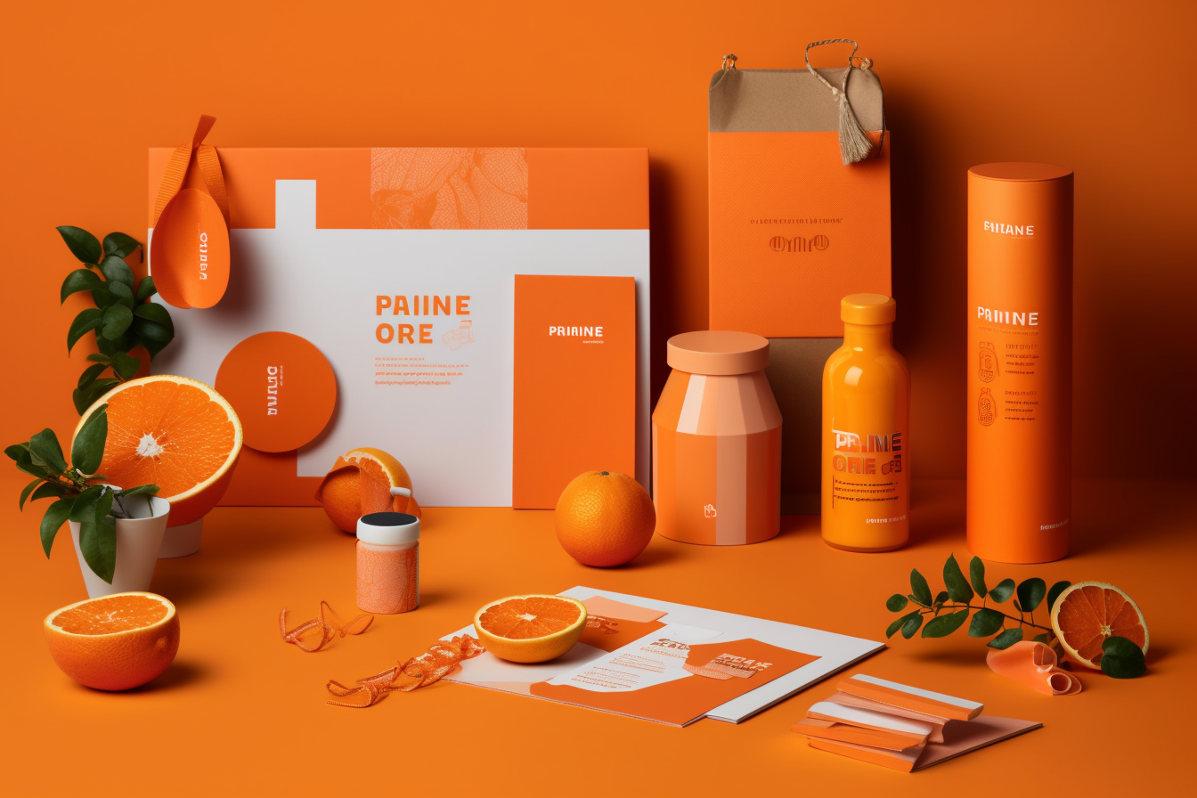
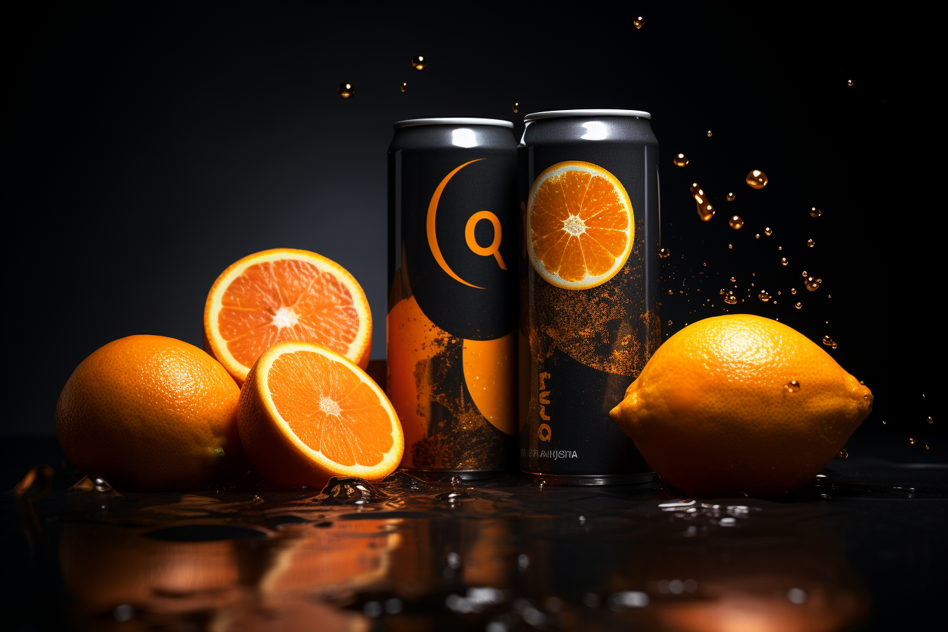
Orange is a color that has grown in prominence in branding throughout the years. Orange is a warm, lively hue associated with zeal, excitement, and inventiveness. It’s a color that can catch the eye and elicit a sense of urgency, making it a fantastic choice for firms looking to stand out in a crowded market. It is frequently utilized by food and beverage manufacturers because it is thought to enhance appetite and promote sentiments of happiness and warmth. It’s also employed in technology and sports branding to express a sense of advancement, innovation, and vitality.
The usage of orange in branding may be traced back to the 1950s, when the hue was first employed in the emblem of a telecommunications company, GTE. Since then, other brands have adopted orange, including Nickelodeon, Amazon, and Harley-Davidson, to mention a few.
The use of orange in branding is an important factor to consider when developing a brand identity. Orange is a prominent hue that can convey excitement, creativity, and warmth. It’s a popular choice in the food and beverage, technology, and sports industries since it’s a wonderful way for businesses to stand out and create a sense of urgency. In the following installment of this series, we will look at the history of the color orange and how it has been employed in branding over the years.
Orange’s Place in Branding History
Orange has been utilized in branding from ancient times when it was used in art and pottery. Because it was connected with purity and enlightenment, the color was often utilized in religious iconography. However, it wasn’t until the twentieth century that orange became fashionable in branding.
GTE, a telecommunications firm, was one of the first to use orange in branding in 1950. To reflect their inventive and progressive attitude to technology, the company utilized a bright orange color in their logo. This was a risky approach at the time, as most corporations utilized conservative hues in their branding, such as blue and red.
 Orange became a popular color in the fashion business in the 1960s, thanks to designers such as Emilio Pucci and Courreges. The colorful and energetic color became associated with the time’s young culture and was frequently employed in psychedelic prints and patterns.
Orange remained prominent in branding and advertising throughout the 1970s, notably in the food and beverage industries. Orange was utilized in the packaging and advertising of brands such as Fanta and Tang to express a sense of joy, vitality, and refreshment. The usage of orange in these companies contributed to the creation of a distinct identity that set them apart from their competition.
Orange was still utilized in branding and advertising in the 1980s and 1990s, particularly in the sports and technology industries. Nike, for example, employed orange in their “Just Do It” campaign to encourage athletes to push themselves to their limits. The hue was also employed by technological companies such as Apple, which used a bright orange color in their iMac computers. Orange is still a prominent branding hue today, with some well-known firms using it across a variety of industries. Amazon, for example, uses a subtly orange tone in their logo to represent optimism and friendliness. It is also utilized in the logos of well-known sportswear companies such as Puma and The North Face.
 How Orange Can Be Used Effectively in Branding
Orange in branding may be a useful tool for companies wanting to establish a strong brand identity. However, color must be used wisely to effectively communicate the intended message and connect with the target audience.
Here are some ideas for how brands might utilize orange effectively in their branding:
Orange can be used as an accent color: Orange is a bright and eye-catching color, making it a good choice for accentuating other colors in a brand’s color pallet. Orange can be used by brands to bring attention to specific branding aspects such as logos, taglines, or calls to action.
Orange can be used subtly: Using a lighter shade of orange or incorporating it into a pattern or texture can be useful for firms who wish to employ orange in a more subtle way. This method can result in a more subtle brand identity that conveys the required message without being too overbearing.
Consider the following: When introducing orange into the branding, it is critical to examine the context in which the brand will be used. A bright orange logo, for example, might not be appropriate for a premium business, but it might be ideal for a sports brand. Brands should also consider the color’s cultural and regional meanings, which can change between markets.
Use orange consistently: To establish a powerful and consistent brand identity, utilize orange consistently throughout all touchpoints, such as logos, packaging, advertising, and social media. Consistency aids in the development of brand identification and makes the brand more remembered.
Brands That Use Orange Effectively in Their Branding
Several brands have utilized orange effectively in their branding to create a distinctive and recognizable identity. Here are a couple of such examples:

Fanta: Since its introduction in the 1960s, the popular soda brand Fanta has employed orange in its logo. The vivid orange packaging and advertising for the brand communicate a sense of joy, vitality, and refreshment. The usage of orange by Fanta has helped to develop a distinct personality that distinguishes it from other soda brands.
![]()
Nickelodeon: Nickelodeon is a children’s television network whose logo is a bright orange splat. Orange in the logo portrays a sense of liveliness, energy, and inventiveness, which is consistent with the network’s focus on entertaining and engaging youngsters.
![]()
Harley-Davidson: Harley-Davidson is a motorcycle manufacturer whose logo and branding employ orange to communicate a sense of adventure, independence, and rebellion. The usage of orange is consistent with the brand’s goal of offering motorcycle fans with a thrilling and exciting experience.
![]()
The Home Depot is a home improvement business that employs orange in its logo to represent warmth, friendliness, and accessibility. The use of orange in the brand’s logo and advertising contributes to the creation of a pleasant and appealing environment for clients.
![]()
Amazon: Amazon’s logo and branding use a modest shade of orange to communicate optimism, friendliness, and innovation. The use of orange corresponds to the brand’s focus on providing clients with a seamless and joyful purchasing experience. ING: ING is a financial services business that employs a vivid orange lion as its logo. The use of orange in the logo symbolizes energy, enthusiasm, and strength, which is consistent with the brand’s commitment to providing creative and dynamic financial services.
![]()
Hootsuite: A social media management platform with a vivid orange owl as its logo. The use of orange in the logo portrays a sense of creativity, joy, and innovation, which corresponds with the brand’s commitment on creating a user-friendly and engaging social media management platform.
The Color Orange in the Future of Branding
The usage of orange in branding is likely to continue to play a prominent role in the future. The following are some prospective trends and advancements in the usage of orange in branding:
As more brands shift to digital and interactive experiences, the usage of orange in branding may become increasingly common. Orange is a color that can evoke feelings of energy, enthusiasm, and invention, which is ideal for the fast-paced and dynamic nature of digital encounters. With an increased emphasis on sustainability and eco-friendliness, firms may utilize orange in their branding to portray a sense of warmth, friendliness, and approachability. Orange is often connected with earthy and natural tones, which can be associated with sustainability and environmental friendliness.
Personalization and customization: As organizations continue to emphasize personalization and customization, orange in branding may become more nuanced and subtle. To establish a more personalized and unique brand identity, brands may utilize multiple hues of orange or incorporate orange into patterns or textures.
With an increased emphasis on diversity and inclusivity, brands may utilize orange in their branding to portray a sense of warmth, friendliness, and openness. Orange has varied cultural and regional associations, making it a versatile color that may be used to build a more inclusive business identity.
Minimalism and simplicity: As minimalism and simplicity remain prevalent branding trends, orange’s application may become more limited and subdued. Orange can be used as an accent hue or integrated into a clean and minimalist logo design.
Possible Obstacles and Considerations When Using Orange in Branding
While orange may be a great branding hue, there are some problems and considerations that brands should bear in mind when using this color. Here are some of the most important challenges and issues to bear in mind:
Cultural associations: Orange, like any other color, can have a variety of cultural associations and meanings depending on the environment. Orange, for example, may be connected with sadness or negativity in some cultures. Brands should be mindful of these cultural implications and utilize orange with caution in different markets and areas.
Overuse and cliches: As with any design element, overuse or cliches can reduce the impact of orange and render it ineffective in branding. Orange should be used wisely and creatively by brands to prevent becoming generic or cliched.

Color pairings: Orange can be difficult to pair with other colors, and poor color pairings can distract from a brand’s message and identity. Orange should be used carefully in conjunction with other colors by brands to ensure that the mix effectively expresses their brand values and message.
Accessibility: Some shades of orange may be difficult to detect or differentiate for people with vision difficulties. When using orange in their branding, brands should consider accessibility and ensure that the hue is used in a way that is accessible to all people.
While orange can be an excellent hue for branding, it is also a common color option for many brands. Brands should carefully examine the usage of orange in their branding to ensure that it effectively distinguishes them from competitors.
Consistency: Just like any other design aspect, consistency is essential for good branding. Orange should be used consistently by brands across all touchpoints, including their logo, packaging, advertising, and internet presence.