Why The Color Blue?
Color has a big impact on what we perceive, including how brands are seen. Colors have a crucial role in brand identification because of their capacity to arouse emotions and trigger associations. One of the many colors used in branding is blue, and businesses across a wide range of industries typically choose it as their branding color. The significance of blue in branding, its psychological effect on consumers, and the reasons why marketers love it will all be covered in this essay.
Depending on the context and the particular hue selected to depict it, the color blue can have a wide range of implications. More serenity, reliability, and trustworthiness are connected with blue the lighter the color. On the other hand, the more blue a color is, the more authority, stability, and professionalism it conveys. Blue is frequently associated with the hues of the sky and water, both of which are known to inspire feelings of serenity, openness, and clarity. Blue appeals to brands that aim to convey a sense of security, dependability, and competence in their goods and services because of these associations.
Blue has become one of the most popular color selections for branding over the past few years. Blue is the color that is used in branding the most frequently worldwide, according to a study by the Pantone Color Institute. It is typical practice across a wide range of industries, including business, medicine, IT, and the fashion sector. Numerous well-known firms, including Facebook, IBM, Samsung, and Ford, among others, use blue in their logos and branding.
However, what is it about the color blue that has prompted marketers to use it so frequently? What qualities make it such a potent color for branding? The psychological effects of the color blue and how they can affect consumer behavior are examined in the sections that follow. Additionally, we will examine some of the most popular blue branding examples to determine what it is about these firms’ use of the hue that makes it so effective.
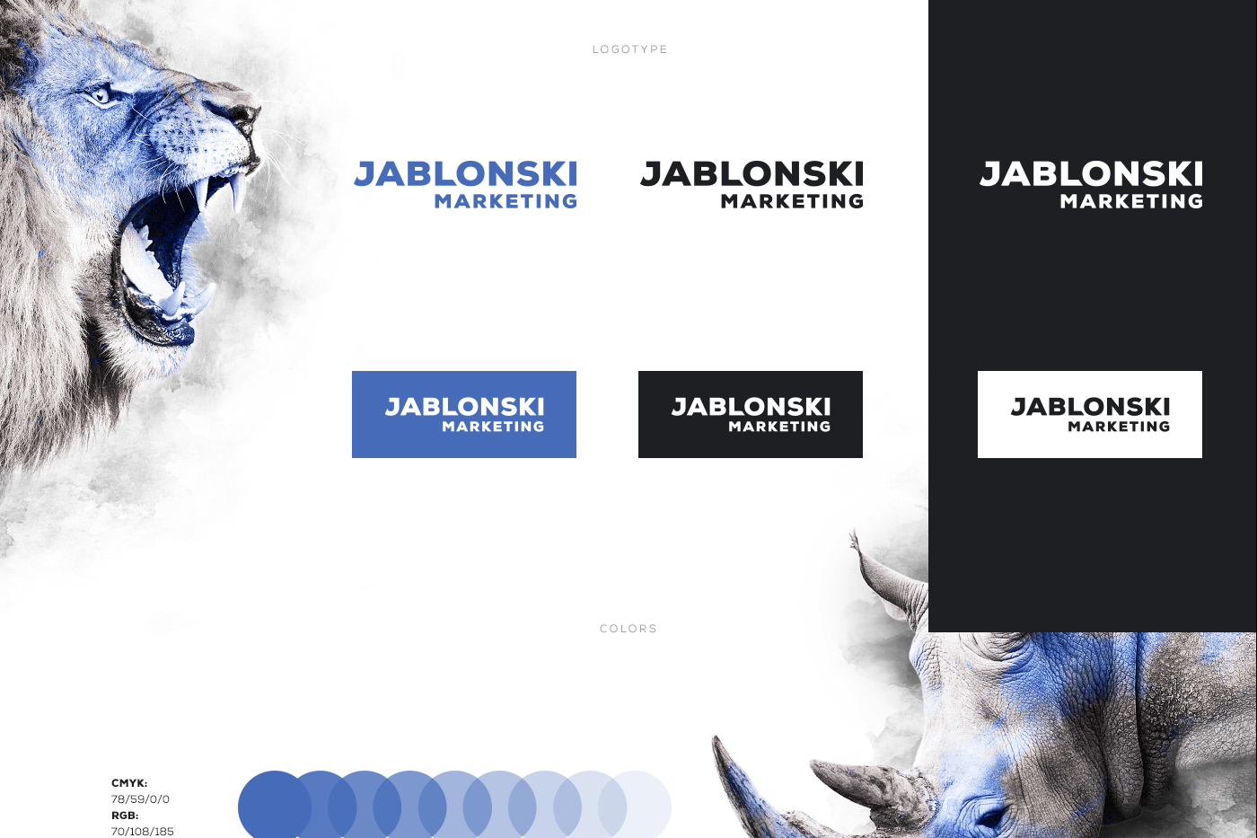
A successful example of Blue Branding for Jablonski Marketing
What Blue Means in the World of Branding
One of those hues with the ability to evoke specific emotions and even alter our behavior is blue. The previous section of this essay covered how the color blue is commonly associated with trust, dependability, and professionalism. As a result, businesses across a variety of industries, such as the healthcare and financial sectors, frequently use this color. But what do these relationships mean in terms of scientific research? What effects does blue have on our emotions and thoughts?
One factor in the popularity of blue as a branding color is its calming effect. It has been shown that blue can make people feel peaceful and relaxed by lowering their blood pressure and pulse rate. Because of this, it is a color that brands find appealing if they want to create a calming and comforting ambiance. Healthcare businesses commonly use the color blue in their branding to convey a sense of tranquility and dependability to their target audience because patients may be anxious or concerned about their health, for example.
Additionally, a sense of authority and knowledge are associated with the color blue. Numerous studies have shown that individuals tend to perceive people wearing blue attire as having higher degrees of knowledge and self-assurance than people wearing other colors. Blue is commonly utilized in corporate branding because to its long-standing associations with authority and confidence. This is due to the seriousness and dependability that the color blue exudes.
The association that blue has with clarity and openness has an additional psychological impact on people. The expanse and limitless possibilities of things like the sky and ocean are commonly represented by the color blue. Blue is a great color option for brands that want to project an air of honesty and openness to their target customers because of its association with openness and clarity. For instance, Facebook, the biggest social networking site in the world, uses a blue color scheme to signify its commitment to openness and transparency.
Despite all of its wonderful associations, the color blue nevertheless connotes a few unfavorable ideas. Darker shades of blue, especially, have been connected to sorrow and depression, whereas lighter shades of blue, such neon blue, have been connected to aggression and a sense of being overpowered. It’s crucial for businesses to choose a blue hue that aligns with their basic principles and the messaging they wish to express to their audience.
Briefly stated, the psychological effects of the color blue in branding are complex and varied. The color blue has the ability to evoke a wide range of emotions and meanings, from openness and transparency to reliability and dependability. Blue is an excellent color choice for brands that want to convey a sense of tranquility while still presenting professionalism and openness because of these associations. To avoid these possible hazards, marketers must also be aware of the potential negative associations related to particular shades of blue and select a color that is consistent with their brand’s values and messaging.

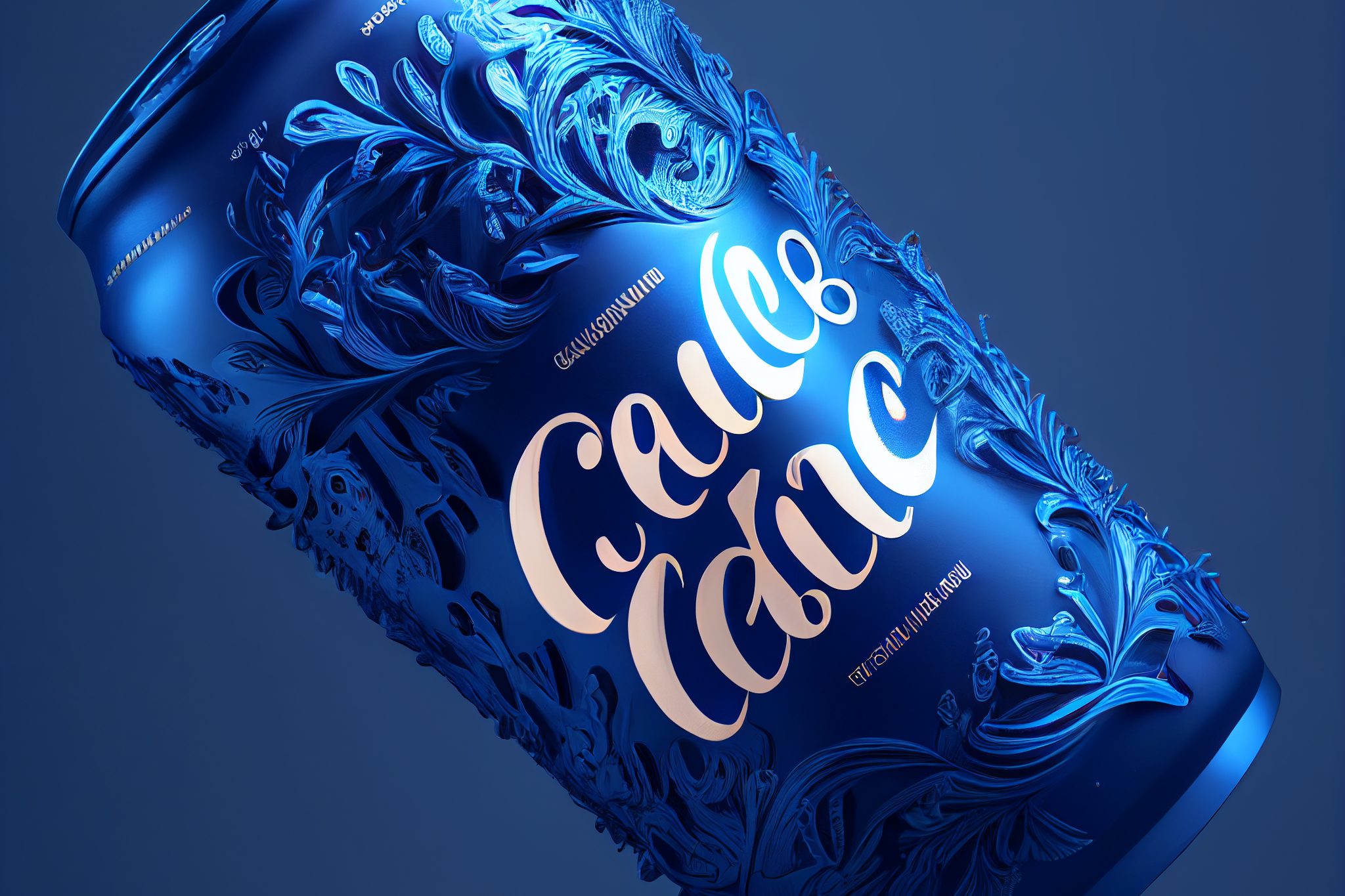
Blue becomes especially powerful when you use it as an accent color paired with a white background.
Successful Companies That Have Embedded the Color Blue in Their Branding
Many well-known businesses have decided to use the color blue in their corporate logos and other distinguishing materials since it is quite popular in the world of branding. This section of the article will look at some of the most popular brands that have successfully branded themselves using the color blue, as well as the factors that contributed to the color’s success.
![]()
For more than a century, IBM has used the color blue to promote itself as a worldwide technology and consulting company. The corporate name is printed in white characters on top of a block of solid blue color to create the instantly identifiable IBM logo. The IBM brand is heavily based on the color blue, which conjures up ideas of dependability, professionalism, and honesty. The company’s concentration on innovation and cutting-edge technology is reflected in the association of the color blue with competence and authority. The company’s dedication to the color blue is also shown in the use of blue.
![]()
Facebook: The social media behemoth uses a blue color pattern throughout all of its branding. The company’s logo features the word “Facebook” written across it in all lowercase letters against a blue background. Facebook’s brand is heavily influenced by the color blue, which serves as a visual symbol of the company’s commitment to community, openness, and transparency. Blue also conjures up thoughts of calm and trust, all of which are essential for a social media site that deals with user messages and personal information.
![]()
In order to convey the idea that the company is at the forefront of technological advancement, Samsung, the largest electronics manufacturer in South Korea, made blue a prominent hue in its emblem. The company’s logo is a blue ellipse with the name “Samsung” inscribed inside it in white letters. Given that Samsung is known for producing products of the highest quality and pushing the frontiers of innovation, the choice of blue in its logo creates thoughts of reliability and confidence.
![]()
Ford: To convey a sense of dependability and power, the American automaker Ford employed the color blue in their branding. The company’s logo is a blue oval with the name “Ford” inscribed inside it in white lettering. The color blue, which is employed in Ford’s branding, conveys assurance and dependability because Ford is known for making vehicles that are renowned for their durability and endurance.
Here are just a few examples of businesses that have been successful and have successfully branded using blue. They not only utilize blue well, but the way they do it is an important part of the all-encompassing branding strategy they have created. When employed well, the color blue can stand in for a variety of traits, including dependability, professionalism, ingenuity, and reliability. However, businesses must take care not to overdo the color or pick a tone that is incongruent with the message they are attempting to express.
Blue also happens to be one of the most liked colors in the world.
Tips on How to Use Blue Effectively in Your Branding
There are a few things you should keep in mind if you are thinking about using the color blue in your branding to ensure that you do it successfully. The following are these principles:
Choose the Right Shade As was already mentioned, different shades of blue can evoke a range of emotions and mental images. The more sad or depressive thoughts a blue color is associated with, the darker it is, and the more hostile or aggressive feelings it is associated with, the brighter or more neon it is. It’s crucial to choose a shade of blue for your brand that is consistent with the ideals and message attached to it while also reflecting your company’s personality.
Use blue as a complementary color Although blue can be used as the main color in a brand’s identity, it usually shines the brightest and has the biggest impact when used as a complementary color. Blue may help you establish equilibrium and harmony when used in conjunction with other colors. It can also help you highlight specific features of your business.
Despite the fact that blue has the potential to be an effective color, it is important to avoid utilizing it excessively when it comes to branding. When you utilize blue in every aspect of your organization, it’s simple to fall into a rut and may hinder your ability to effectively convey your brand’s essential values and important messages. You should consider using blue wisely and finding a balance with other colors in order to develop a consistent and effective branding approach.
Consider Context How people see the color blue can also be influenced by the context in which your branding is seen. A restaurant that specializes in fast food, for example, could not benefit as much from the color blue as a brand linked with healthcare. Consider the industry, the profile of your potential clients, and any other pertinent contextual factors when selecting how to use blue in your branding.
In a summary, we looked into many blue-related branding tactics. We began by discussing color psychology, in particular how the color blue is associated with ideas like trust, dependability, professionalism, and openness. Then, we looked into the ways that blue has been effectively branded across a range of industries, including electronics, technology, social media, and the automobile sector.
Additionally, we discussed a number of methods for successfully integrating blue into brand identification, including picking the right shade, using blue as a complementary color, avoiding blue saturation, and taking into account contextual factors. Following these recommendations will enable brands to leverage the power of blue to communicate their core beliefs and messages to the target markets for which they are developing their products.
Blue is a fantastic choice for many different brands since it is a color that is connected to trust, dependability, and professionalism. Blue is a well-liked hue due to its adaptability and power in branding. If you’re developing a new branding strategy or trying to update your current identity, think about including blue into your color palette to convey trust and dependability to your audience. This is true regardless of whether you are creating a new branding strategy or trying to update your current branding.
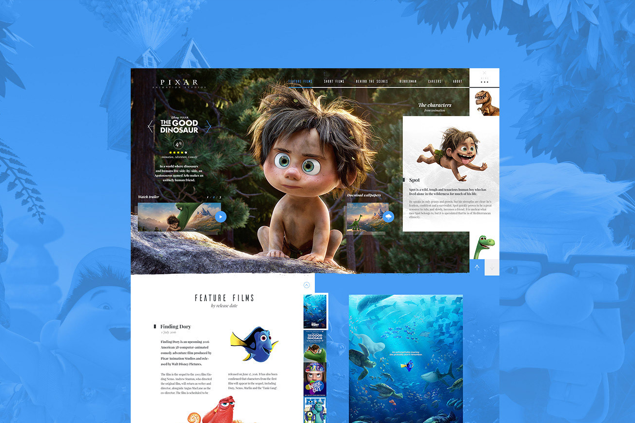
One of the website concepts we made for Pixar. Blue was used to bring more joy and color to the design.
The Function of Blue in Website Design
Blue is a common color choice for branding and is also widely used in website design. Blue is widely used in website design because it has a calming effect on viewers. As a result, websites that stress happiness, health, or relaxation commonly choose the color blue as their primary color.
When utilized in web design, blue may be paired with a vast variety of other colors to create a wide variety of different moods and surroundings. Blue is a fairly adaptable hue as a result. Darker shades of blue used with black can create a sophisticated and high-end atmosphere, while lighter shades of blue used in conjunction with white can create a clean and modern appearance.
It is important to adhere to the same guidelines when using blue in web design as when using it for branding. Choosing the right shade of blue, preserving color harmony with other colors, and considering the context in which the blue will be viewed are some of these advices. If you learn the technique of using blue effectively in web design, you’ll be able to create a website that communicates to your audience the essential principles of your business and the messages you want them to hear.
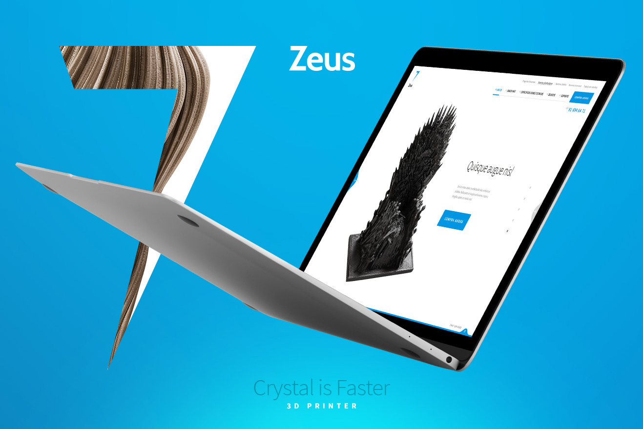
There’s a reason we chose Blue as our accent color when Branding the Zeus 3D Printer
Blue’s chances in the world of branding
Despite the fact that blue has been a popular brand color for a long time, it is important to keep an eye on the changes that are occurring in the field of brand color trends. As new technologies and design trends continue to advance, it’s possible that new color trends in branding will emerge.
On the other hand, blue will probably continue to be a popular choice for brands for a very long time. It is a traditional choice for many different businesses because of the trust, dependability, and professionalism that are associated with it, and because of its versatility, it can be used in a wide range of different company sectors.
New shades of blue may become popular in the not-too-distant future, as well as innovative ways to use blue in branding. For instance, there can be a rise in the quantity of brands that combine blue with other hues to create eye-catching and memorable color schemes.
It is clear that despite whatever the future holds for color trends in branding, blue will remain a fascinating and powerful color option for many brands.