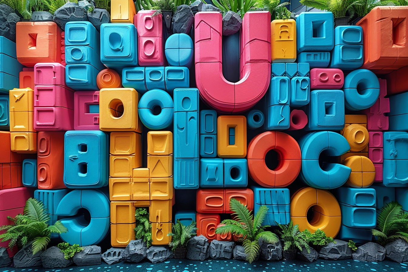
Typography plays a subtle but important role in the complex dance of brand formation and evolution, forming identities and influencing perceptions. Typography is the visual cornerstone that embodies a brand’s voice and can draw in, keep the attention of, and engage customers. It’s not just about picking typefaces. Let’s delve into seven crucial ways that typography affects how people perceive companies and offers guidance to those looking to maximize the power of typographic design.

Typography as the Voice of Brand Personality
Without saying a word, typography communicates the essence of a brand’s personality through silent tones. Whether a company is known for its elegance, originality, dependability, or eccentricity, its choice of typeface serves as a mirror, reflecting these qualities. For example, serif fonts are perfect for companies that rely on authority and tradition since they convey stability and reliability. On the other hand, firms aiming to present a forward-thinking image choose sans-serif typefaces because of their clean, modern lines, which suggest innovation and approachability.
Explore the top fonts used by brands:
Beyond font selection, typography has a profound effect on brand personality. It includes style, weight, and space, each of which refines the voice of the brand. Brands may ensure that their message reaches their target audience at the appropriate frequency by carefully developing these aspects to match their intended personality with their typographic expression.

Improving Brand Identification with Uniform Typography
Brand equity is measured by recognition, and one of the most important investments in building it is typography. A visual shorthand for the brand is created by consistently using a distinctive typographic style across all brand touchpoints, such as logos, packaging, websites, and advertisements. This regularity creates familiarity, which encourages remembering and identification.
Think about the distinctive font used by well-known companies like Apple and Coca-Cola. Even in the lack of logos or color schemes, the brand’s typefaces have grown to be so closely associated with it that they improve identification. Brands may imitate this degree of identification to carve out a place for themselves in the minds of consumers: strategic typographic consistency.
Apart from typographic consistency, learn about visual consistency in branding:
One of the best examples of a brand using consistent typography to improve brand recognition is IKEA. All of the company’s branding assets, including catalogs, websites, in-store signage, and marketing campaigns, use a straightforward, uncluttered typeface. The deliberate choice made by IKEA to utilize the Verdana typeface, which was selected for its readability and clarity on both print and digital media, has greatly aided in increasing brand awareness.
IKEA chose Verdana so that the content will be readable and understandable by a wide range of people around the globe, on all platforms. IKEA’s dedication to customer-centric design and usability is evident in this decision. Because of the typeface’s regular use, IKEA’s communications are instantly recognizable to customers all over the world, contributing to the creation of a unified and recognizable corporate identity.
Setting the Tone: Typography as a Communicator
A brand’s perception is greatly influenced by the tone of communication, and typography is a skillful tone conductor. A brand may influence how an emotional message is received by whispering, shouting, consoling, or cheering through the choice of typography. While a powerful, uppercase typeface might declare strength and confidence, a fun, handwritten font could warmly and authentically attach a business to its audience.
The arrangement of text also plays a part in the tone that typography creates; line and letter spacing, layout, and other factors all influence how a message is understood. Brands can guarantee that their communications are felt as well as seen by matching typographic choices to the intended tone. This fosters a closer bond with the audience.
An excellent example of how typography can be utilized to establish a brand’s tone and establish a closer relationship with its audience is Apple Inc. Clean, minimalist typography is a major component of Apple’s marketing and product design. Since its launch in 2015, the San Francisco typeface has been used exclusively in Apple operating systems and marketing materials. The simplicity, elegance, and inventiveness of Apple’s brand identity are reflected in this selection.
Explore the minimalistic approach in designing:
The San Francisco typeface is made to be as readable and legible as possible on all of Apple’s devices, from the big displays of Mac computers to the small screens of the Apple Watch. This constant use of a straightforward sans-serif typeface contributes to the message of efficiency and accessibility, which is consistent with Apple’s goal of making products that are both capable and user-friendly.
The textual arrangement and space found in Apple’s advertisements and user interfaces also influence the company’s communication style. A lot of white space, which highlights concentration and clarity and encourages readers to interact with the material without feeling overwhelmed, is frequently used to surround the text. The brand’s principles of innovation and user-friendly design are reinforced by this typographic approach, which strengthens customers’ sense of belonging to Apple’s ecosystem.
Apple makes sure that the typographic choices it uses in its communications are both aesthetically pleasing and emotionally relatable to its target audience, all while maintaining an intended tone of innovation and simplicity. This careful consideration of typography improves the user experience overall and greatly advances the brand’s reputation as a leader in design and technology.
Evoking Emotion: The Subtle Power of Typography
Decisions are influenced by emotions, and typography can arouse them. Typefaces have a significant psychological impact; studies show that typography may affect behavior, trust, and even mood. A well-selected typeface may evoke joy, comfort, or nostalgia, turning an indifferent audience member into an active participant in the narrative of the company.
Typography has a subtle emotional impact that is shaped by both individual experiences and cultural connotations. By comprehending and utilizing these emotional undertones, brands can craft captivating stories that connect with their audience on a profoundly intimate level and help them build enduring relationships.
Coca-Cola is one notable example of evoking emotions through typography. The Coca-Cola company has been successful in evoking sentiments of happiness, warmth, and nostalgia with its unique cursive script logo. Even though it hasn’t changed much since it was first created in the late 19th century, the emblem is still recognizable all over the world.
Uncover the factors that help in building emotional connection:
The Coca-Cola logo’s flowing, cursive font invites customers to connect the company with good memories and experiences while also communicating a feeling of tradition. This typeface selection is essential to the brand’s identity since it makes it stand out in a competitive market and creates a cozy, familiar feeling. Coca-Cola is a shining example of how typography can affect feelings and brand perception because it consistently uses its characteristic typeface across a variety of platforms and products, reinforcing its brand message of pleasure and unity.
Making a Mark in a crowded market
In the cutthroat world of branding, uniqueness is essential. Typography provides a creative canvas that helps companies differentiate themselves via distinctive typographic identities. A unique typeface or creative typographic treatment may serve as a brand’s hallmark, setting it apart from rivals and drawing in customers.
Typography-based differentiation is more than just a visual trick; it tells customers that a brand is different in terms of its principles, products, or methods. This uniqueness has the potential to influence customer decision-making, which makes typography a tactical instrument in the fight for brand distinction.

Readability and Usability: Typography’s Functional Aspects
Beyond aesthetics and feeling, legibility and usability have a practical part in how people perceive a brand through typography. In the era of digitalization, where the material is consumed across several devices and platforms, font readability is crucial. User experience may be significantly impacted by a difficult-to-read typeface or a poorly designed typographic arrangement, which can also negatively affect brand perception.
Companies who put readability and usability first when selecting their typography show that they care about their customers’ needs. This focus on detail improves the user experience as a whole, strengthening customer loyalty and improving brand perception. By making the company’s message accessible to everybody, optimizing typography for different media boosts engagement and makes brand interactions easy.
Learn the strategies for building trust in customers:
Google is one of the best examples of a company that prioritizes readability and usability in its typography to improve user experience. Google’s dedication to readability and user-friendly design is demonstrated by the usage of its proprietary typeface, Google Sans, throughout its range of goods and services, such as the Google search engine, Gmail, and Google Maps.
The Product Sans typeface, from which Google Sans is derived, was created to be incredibly readable on computer displays of all sizes. Even on small mobile devices or when presented at different resolutions, the text is easy to read because of its clear, basic lines and open forms. This emphasis on typography helps to make Google’s wide range of services feel seamless for consumers, which strengthens the company’s reputation as an approachable and user-centric brand.
In addition to being aesthetically beautiful, Google prioritizes typography that is useful and widely accessible, showcasing its commitment to offering an inclusive user experience. This meticulous attention to typographic detail highlights Google’s brand values of innovation, efficiency, and simplicity, making it a prime illustration of how the utilitarian elements of typography influence consumer loyalty and brand image.

International Branding and Cultural Awareness
Typography serves as a cultural bridge as businesses grow more global. Language restrictions and cultural quirks must be taken into consideration while selecting fonts and applying them. A cross-cultural impression of a brand might be impacted by a typeface that has distinct meanings in various cultures. Furthermore, it’s critical for global brand consistency that fonts that support several characters, such as Cyrillic, Arabic, or Chinese, work technically together.
Taking a global approach to typography entails learning about and comprehending the cultural environments in which the brand functions. With this method, typographic decisions are supported by global branding objectives and resonate with a range of consumers while upholding a consistent brand identity. Successfully navigating the intricacies of global typography allows brands to establish a genuinely global presence and improve their reputation globally.
Explore the fusion of culture and branding:
Among the many tools in the branding toolbox, typography can significantly alter how a company is seen. Typography has a wide range of uses, including boosting recognition and brand personality, establishing the communication tone, arousing feelings, guaranteeing distinction, promoting readability and usability, and assisting with international branding initiatives. A top-notch branding and design firm understands the strategic value of typography and uses it to create memorable, unified, and culturally relevant brand identities. Brands can create memorable locations in the market, establish enduring relationships with their customers, and interact more intimately with them by grasping the subtleties of typography.

Typography is a strategic decision in the field of brand design, not only an aesthetic one. A brand may be elevated from an ordinary participant in the market to a recognized symbol by carefully considering and implementing it. The function of typography in forming brand perception will remain crucial as businesses negotiate the benefits and difficulties of a constantly changing marketplace. Brands can fully utilize their visual identity and ensure that they not only communicate successfully but also relate emotionally and culturally with their customers throughout the globe by adopting the seven ways typography affects brand perception.