When creating and developing a brand, choosing a font goes beyond just displaying text; it represents the brand’s essence and serves as a strong symbol of its identity. Global businesses strategically choose fonts that are aligned with their ethos, beliefs, and the message they aim to convey. A carefully selected font may enhance brand awareness, evoke emotions, and gently impact customer behavior. Let’s discuss the top 10 fonts used by prominent worldwide businesses, revealing the stories behind these decisions and explaining how they shape the brands’ identities and success in consumers’ minds.
![]()
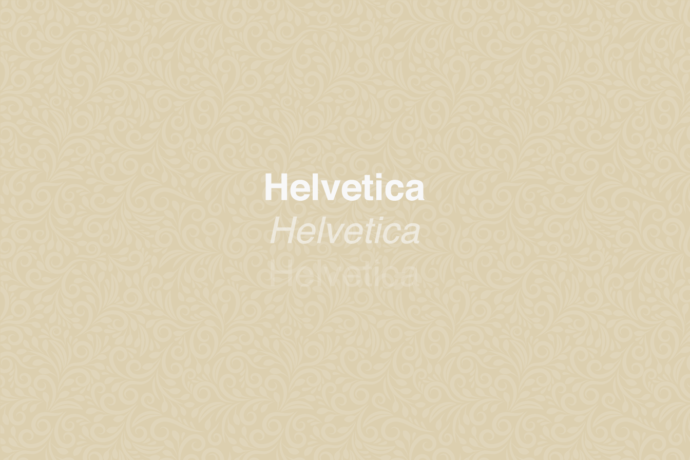
Helvetica – Apple
Helvetica’s adoption by Apple is evidence of the company’s steadfast dedication to elegance, practicality, and simplicity. This font reflects the design ethos of Apple’s product line, from the elegant MacBook to the understated iPhone, with its clear, sharp lines and minimalist look. Helvetica’s timeless appeal and universality make it the perfect fit for Apple’s UI, guaranteeing readability and a consistent user experience across all platforms. This decision upholds Apple’s reputation as a leader in cutting-edge design that seamlessly combines form and function. Helvetica’s ubiquity throughout Apple’s product range and promotional materials strengthens the brand’s coherent identity and helps it stand out in a crowded market. Apple’s deliberate use of Helvetica highlights its design-led philosophy and increases customer engagement and loyalty.
Learn the top 3 secrets to make your brand stand out:
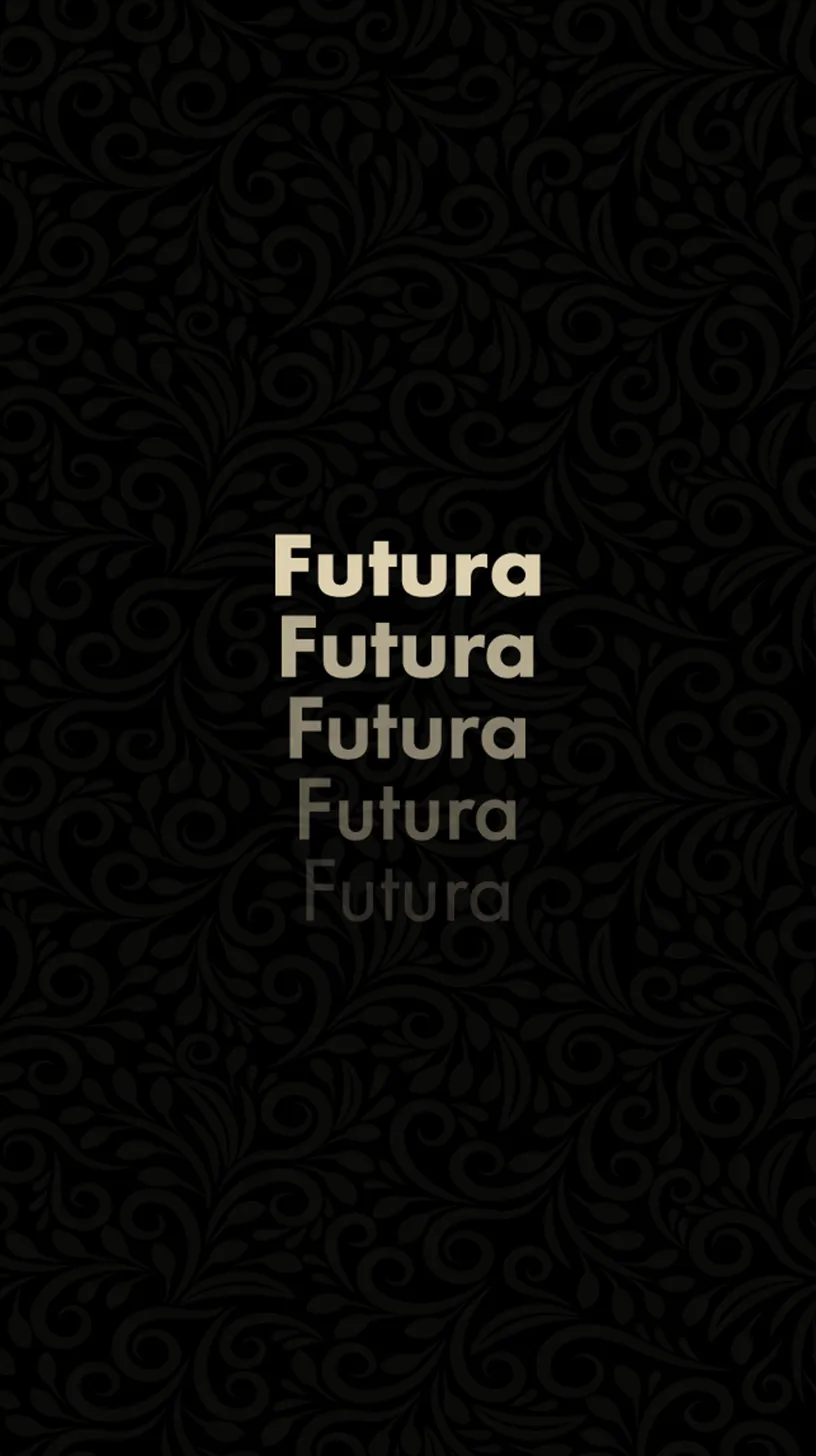

Futura – FedEx
FedEx’s decision to choose Futura for its logo is a calculated move that reflects the company’s three main values: dependability, accuracy, and speed. The font’s balanced proportions and geometric forms exude stability and reliability, which are essential attributes for a worldwide courier delivery business. The FedEx logo’s ingenious use of negative space to create a concealed arrow between the letters “E” and “x” perfectly captures the efficiency and forward-thinking nature of the company. Futura’s confident, authoritative image is conveyed by its powerful, bold lines, which align with FedEx’s dedication to providing answers. FedEx’s guarantee of promptness and accuracy is embodied in this font, which not only improves brand identification but also strengthens client loyalty.
Consumers’s loyalty can also be further strengthened by leveraging consumer psychology in your brand strategy.
Learn more about the consumer psychology in branding:
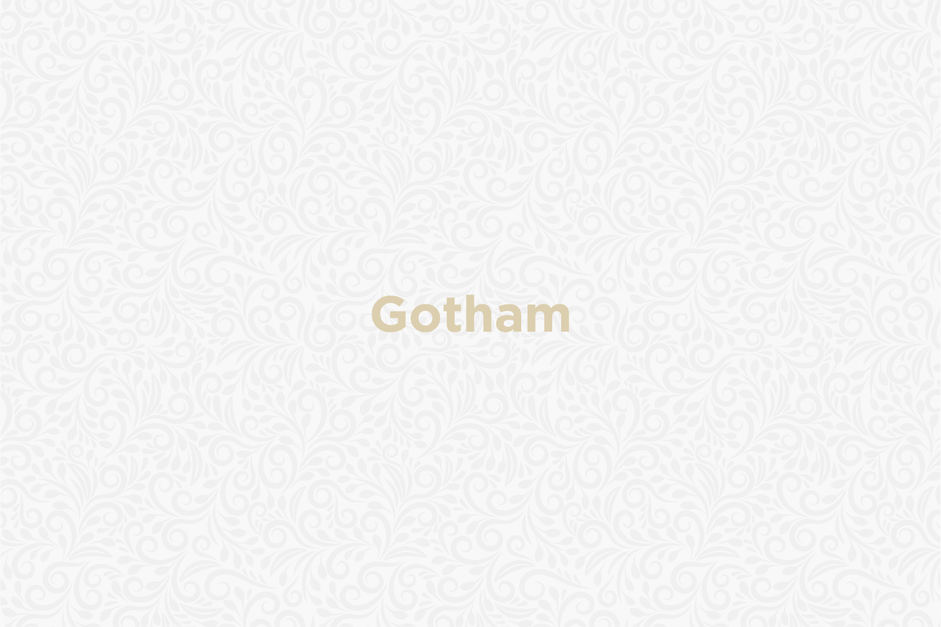
Gotham – Spotify
The fact that Spotify has embraced Gotham says a lot about its positioning as an approachable, user-friendly platform that connects musicians and fans worldwide. Gotham’s approachable, accessible exterior aligns with Spotify’s goal of democratizing music discovery and consumption. Its rounded shape and simple lines appeal to a wide range of people worldwide and represent Spotify’s contemporary, progressive brand image. Because of the font’s strength and adaptability, it is clear in a variety of contexts, from marketing campaigns to app interfaces, which increases user engagement. Spotify’s cutting-edge features, such as social sharing and customized playlists, complement Gotham’s modern vibe and help users feel more connected to one another. Spotify reinforces its position as a pioneer in the music streaming market by communicating its openness and inclusion via Gotham.
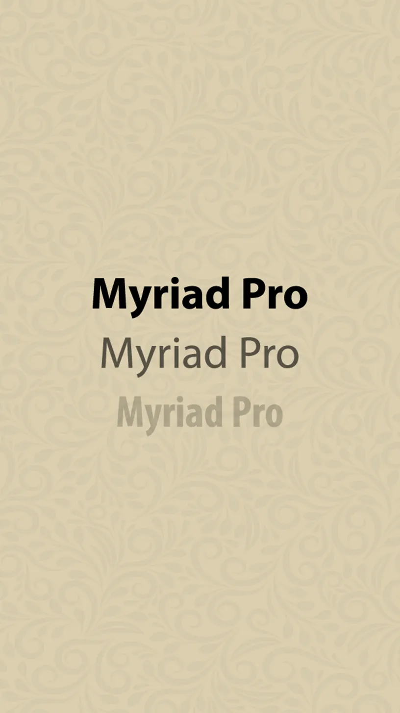
Myriad Pro – Adobe
Adobe’s choice of Myriad Pro for its identity is indicative of the company’s dedication to quality, innovation, and creativity in the digital space. Known for its clarity and readability, this sans-serif font goes well with Adobe’s wide range of products, which includes Photoshop and Acrobat. Attractive to both professionals and creatives, Myriad Pro’s polished appearance fits nicely with Adobe’s standing as a pioneer in creative software solutions. A consistent brand message is ensured by its versatility across print and digital media, which is essential for Adobe’s global presence. The font’s contemporary and friendly vibe complements Adobe’s objective of enabling creativity through a smooth user experience. By selecting Myriad Pro, Adobe strengthens its reputation as an innovator and increases its attractiveness to a wide range of creatives.
Discover the strategies for building brand loyalty:
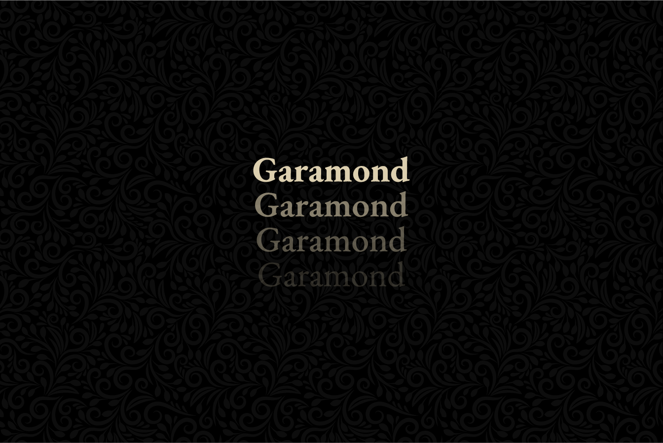
Garamond – Tiffany & Co.
Tiffany & Co.’s branding effectively captures the elegance, refinement, and classic beauty that are associated with the company through the usage of Garamond. With its elegant and flowing lines, this classic serif font honors Tiffany’s history as a supplier of fine jewels and luxury items. Tiffany’s prestigious customers are drawn to Garamond because of its historical significance and visual appeal, which convey a feeling of heritage and workmanship. The sophistication of the typeface adds to the opulent atmosphere that Tiffany strives to create, from its recognizable blue boxes to its painstakingly crafted retail spaces. Tiffany’s tradition as a symbol of beauty and love is emphasized by Garamond’s eternal appeal, which strengthens the brand’s position in the premium market. Tiffany demonstrates its dedication to quality and classic style via Garamond, attracting individuals who are looking for the special.
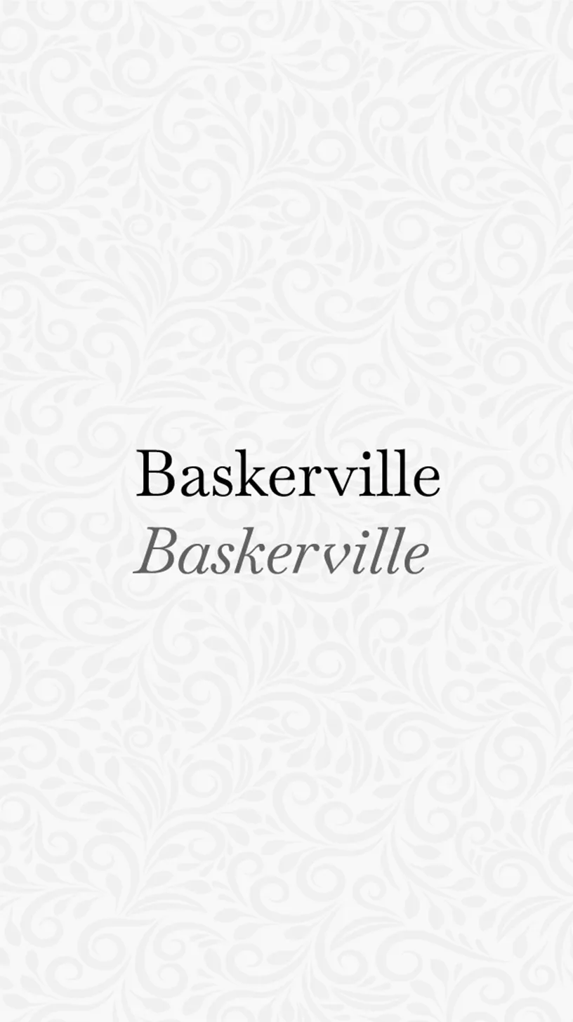
Baskerville – Vogue
Baskerville was chosen by Vogue as a fundamental element of its typographic identity, a nod to the company’s illustrious past and authoritative voice in the fashion industry. Baskerville is a serif typeface that goes well with Vogue’s sophisticated style and high-fashion material because of its crisp and elegant qualities. The sophisticated look and timeless style of this typeface add to the magazine’s appeal by giving its pages an aura of legitimacy. Vogue appeals to a sophisticated audience that appreciates elegance, beauty, and innovation, and its use of Baskerville in editorial and headline language further solidifies the magazine’s position as a trendsetter and cultural icon. Baskerville’s selection embodies Vogue’s dedication to quality in fashion writing and is in line with the magazine’s objective to inspire and enlighten.
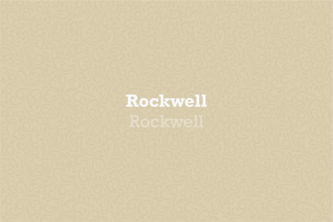
Rockwell – Coca-Cola
Although Rockwell isn’t the main inspiration for Coca-Cola’s famous font, the company does sometimes utilize slab serif typefaces in their marketing collateral, which is reminiscent of Rockwell’s strong, forceful persona. This similarity highlights the rich history and enduring popularity of Coca-Cola. Coca-Cola’s brand language emphasizes joy, unity, and optimism, and Rockwell’s solid, confident style fits right in with that. The blocky form and thick serifs of the typeface evoke a sense of dependability and nostalgia, reflecting Coca-Cola’s enduring status as a popular beverage brand. The Coca-Cola logo is written in a distinctive font, but its usage of Rockwell-esque slab serif features in advertising and display contexts furthers the brand’s message of joy and unity, which connects with a global audience. Coca-Cola’s visual story is strengthened by this clever typographic selection, reinforcing the company’s positioning as a global brand that rehydrates and unites people.
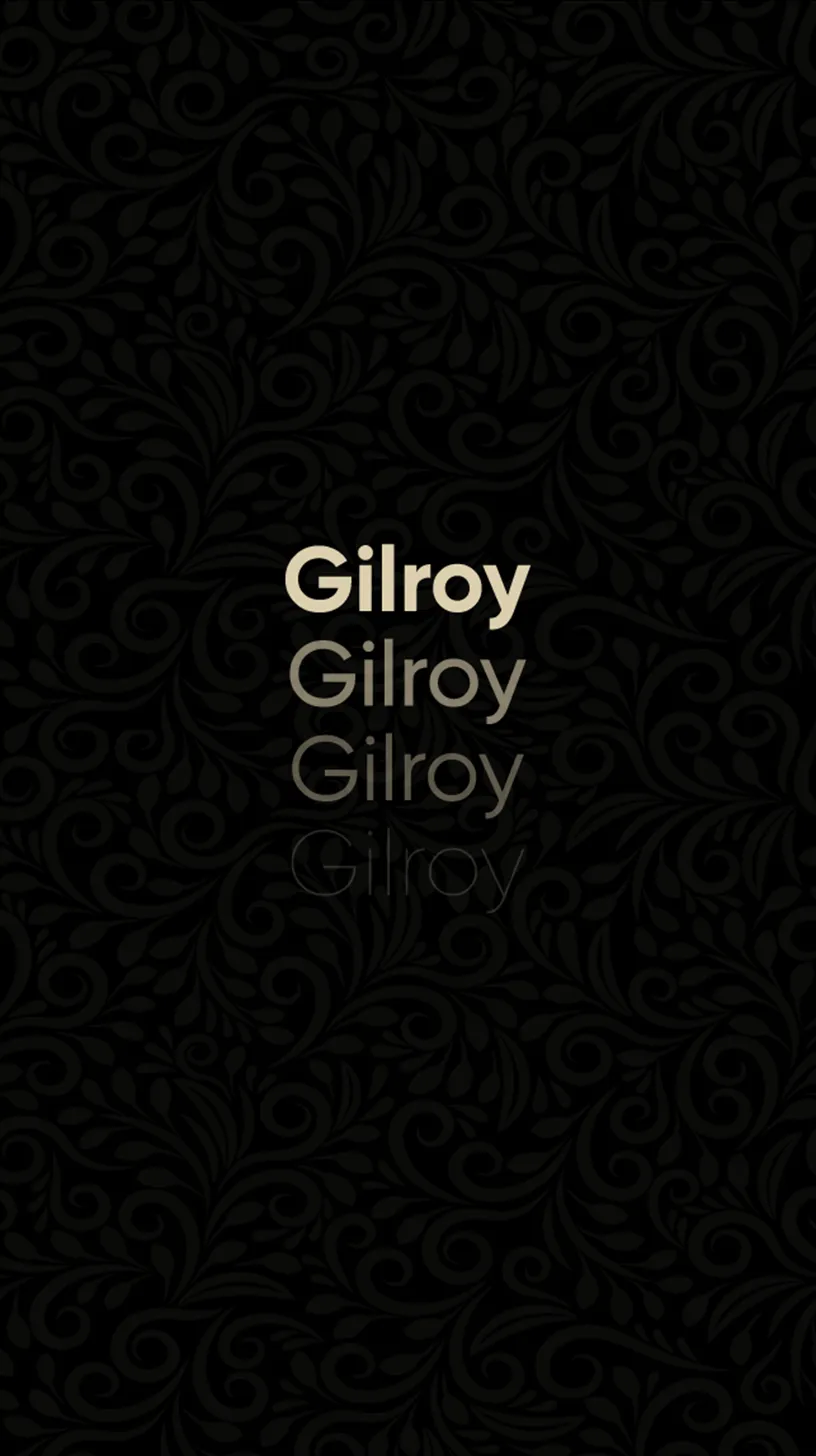
Gilroy – Netflix
Netflix has selected Gilroy for its identity, particularly for its user interface and marketing materials. Netflix is a streaming behemoth that has completely changed the way we consume content. Gilroy is a contemporary geometric sans-serif typeface renowned for its clarity and friendliness. Its choices complement Netflix’s innovative and user-friendly platform, providing a smooth viewing experience to a wide range of international viewers. The typeface’s modern design and straight lines improve Netflix’s interface’s aesthetic appeal, making it easier for users to navigate and engage with. The utilization of Gilroy in promotional videos serves as a great attention-getter and conveys Netflix’s brand values of variety, innovation, and entertainment. In addition to enhancing Netflix’s visual identity, this deliberate font selection highlights the company’s dedication to building a diverse and interesting entertainment environment.
Explore the brands that achieved success through visual harmony
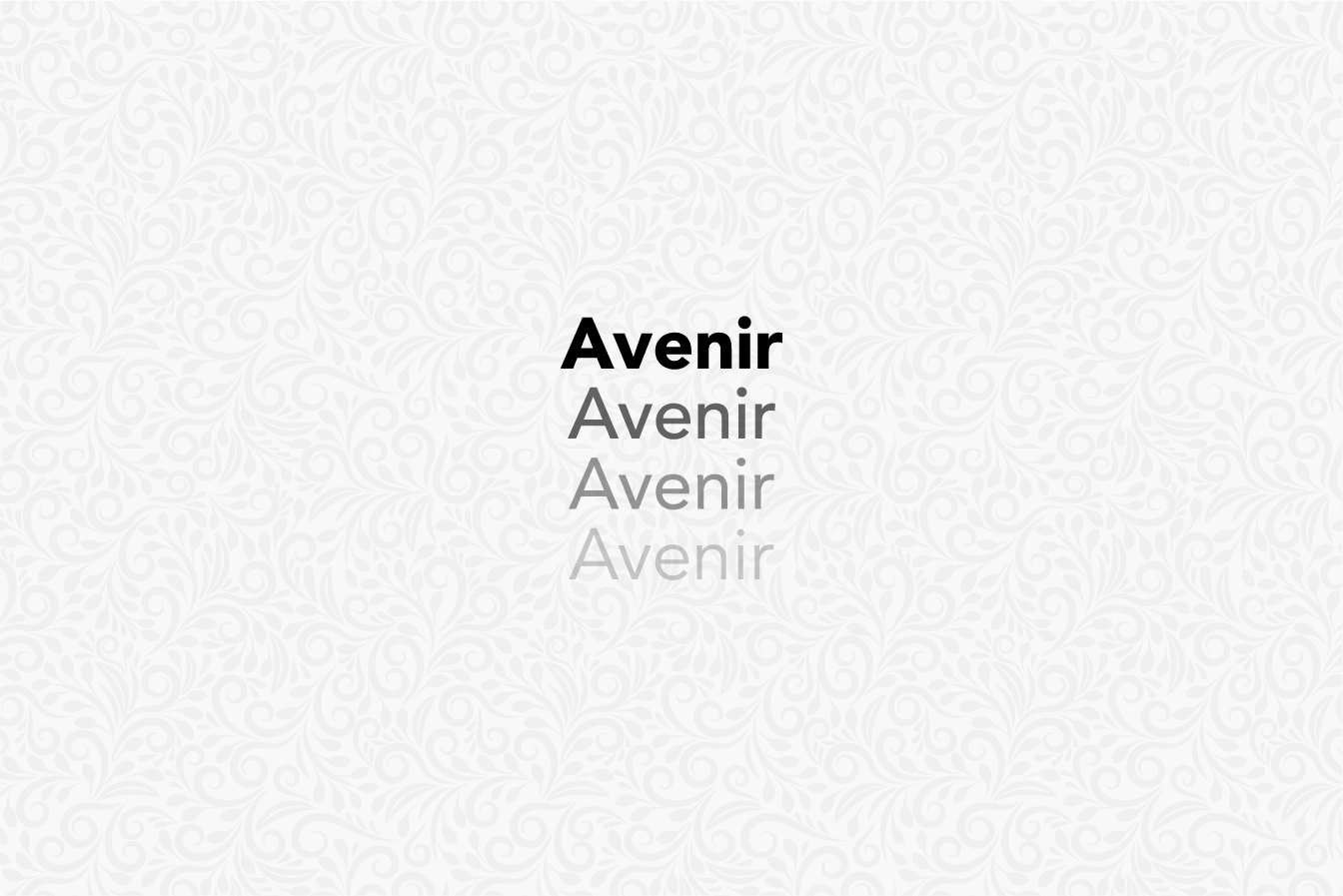
Avenir – Airbnb
Avenir is the primary font used by Airbnb, the innovative community-based online marketplace for travel and experiences. Avenir, which translates to “future” in French, was picked because of its sleek, contemporary design, which reflects Airbnb’s inventive and progressive spirit. Its design, which combines organic curves with geometric patterns, is a reflection of Airbnb’s goal of fostering a feeling of community wherever it is in the world. The affable look of the typeface compliments Airbnb’s brand values of inclusion, openness, and human connection. The adaptability of Avenir in print and digital media improves user experience and guarantees clarity and coherence in Airbnb’s international communications. The font selection demonstrates Airbnb’s dedication to reinventing travel by promoting community and bringing people together from all backgrounds and places.
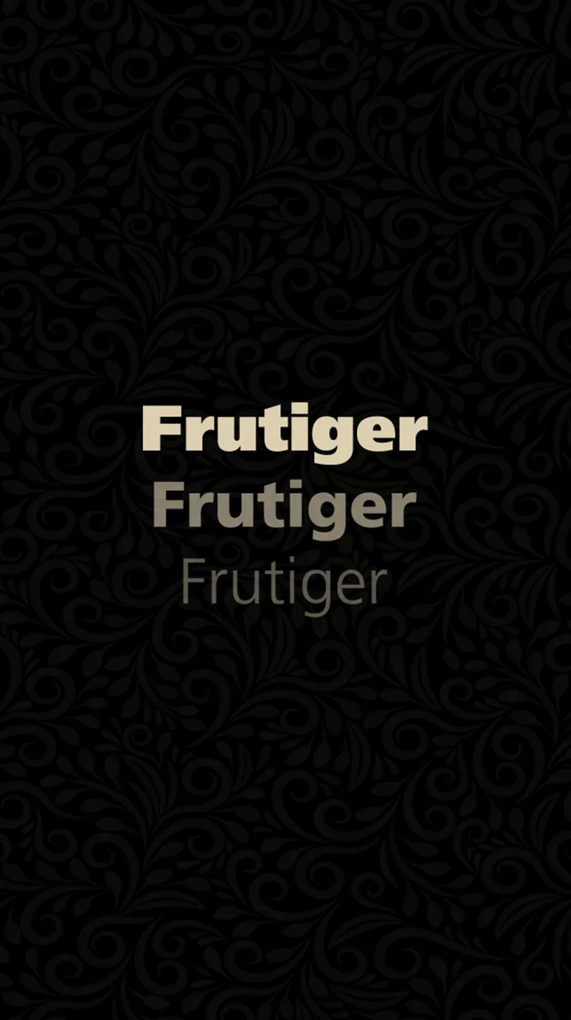

Frutiger – Lufthansa
By using Frutiger as its brand font, Lufthansa conveys a message of professionalism, accessibility, and clarity. With consideration for intelligibility at different distances and lighting situations, Frutiger was conceived especially for Charles de Gaulle Airport in the late 1960s and later adopted by Lufthansa. Its integration with Lufthansa’s identity across digital and signage platforms guarantees that the company interacts with a worldwide audience efficiently, improving user experience and brand identification. The humanist features of the font, with its welcoming look and open counters, represent Lufthansa’s dedication to both safety and customer care. Frutiger upholds Lufthansa’s reputation as a dependable and customer-focused airline by guaranteeing a smooth and cozy travel experience. By making this decision, Lufthansa is demonstrating its commitment to upholding a strong, trustworthy brand identity, further enhancing its standing as a pioneer in the aviation sector, and bringing people together from different backgrounds and places.
Read more about how typography affects a brand’s perception:
These 10 examples demonstrate how world-class businesses strategically choose their fonts, highlighting the significant influence typography has on both company identity and customer perception. Every font selection embodies the values, mission, and personality of the brand, telling a narrative. These businesses have created visual identities that strongly connect with customers via their unique typographic approaches, showcasing the importance of typography in the digital era.