The Significance of Color in Retail Environments
In the highly competitive realm of retail, businesses constantly seek innovative methods to attract consumers, enhance their shopping journey, and boost sales figures. One such strategy that has proven to be exceptionally impactful is the strategic application of color within physical retail spaces. This approach leverages the psychological effects of color perception to sway consumer behavior and buying choices. Let’s delve into the psychology behind color and its application in retail settings, offering perspectives on how businesses can utilize these insights to create captivating in-store atmospheres.
Color and Its Emotional Effects
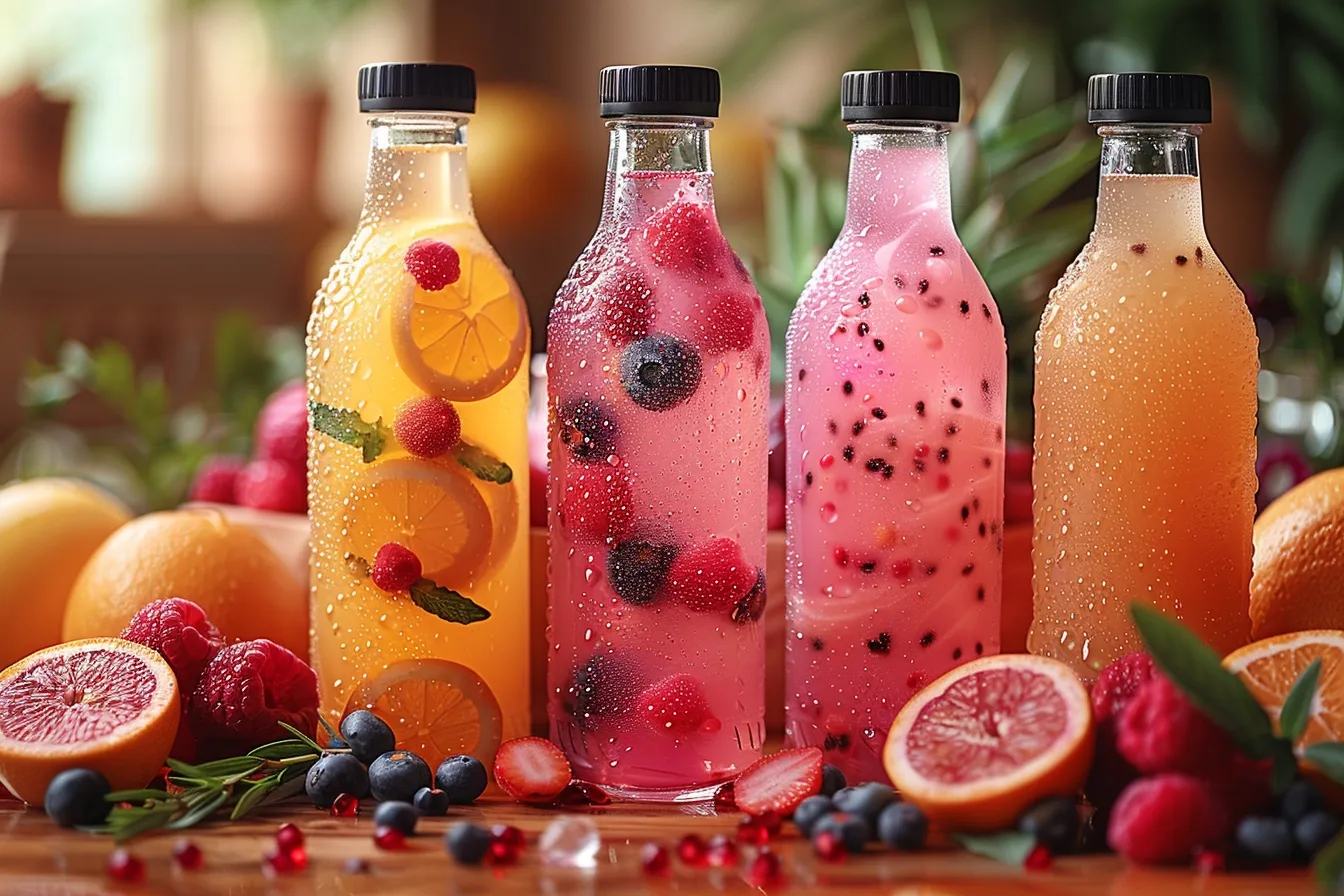
The study of color’s effects on behavior and decision-making processes is known as color psychology. It implies that certain hues may elicit particular feelings, affect mood, and even cause bodily reactions. For example, red is frequently used for clearance sales and promotions to encourage speedy decision-making since it is frequently connected to enthusiasm, passion, and urgency. Conversely, blue is associated with emotions of security and trust, which is why a lot of healthcare and financial firms use it in their logos.
Learn how to employ red in Branding:
Retail companies make the most of these psychological impacts by carefully choosing color schemes that complement their target market, brand identity, and intended emotional reaction. In addition to improving brand awareness, well-chosen color schemes in retail design may also gently influence customer behavior.
Color Strategies for Enhancing Brand Identity
An essential component of a brand’s differentiation in a crowded market is its identity. In a physical retail setting, color is crucial to creating and maintaining this character. Store layouts, signage, product displays, and packaging can all be made to stand out visually and appeal to customers by using a brand’s color palette consistently.
To communicate elegance and exclusivity, a luxury company can, for instance, use a monochrome design with touches of silver or gold. On the other hand, a company aiming to appeal to a younger audience could choose to use bold, contrasting colors to convey a lively, positive vibe. These color selections are not random; rather, they have a strong foundation in the brand’s essential principles and the emotional bonds they hope to build with their clientele.
The Power of Color on Consumer Purchase Decisions
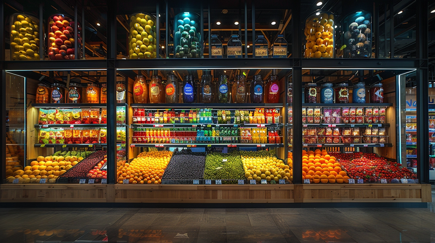
A store’s careful placement and use of color may have a big impact on customers’ decisions to buy. Customers’ perceptions of product quality and value may be influenced by color, which can also be utilized to draw attention to certain goods and direct them around the store. Cooler tones like green and blue can provide a relaxing ambiance that encourages extended browsing hours, while warmer colors like red and yellow might draw attention to high-priority products or promotions.
Explore the science behind the blue in Twitter’s brand identity:
Furthermore, how items are seen can be impacted by the color temperature of the illumination. While cold lighting highlights the freshness of things like groceries or cosmetics, warm lighting may draw attention to certain products by making them look more appealing and welcoming.

Retail businesses also employ color to create seasonal ambiances that suit the tastes and purchasing habits of their customers. For example, using bright, pastel hues in the spring or warm, earthy tones in the fall might elicit seasonal feelings, making appropriate items more current and enticing.
Using color strategically in retail settings is an art form that, when done well, may affect customer behavior and greatly improve the shopping experience. Retail businesses can create captivating in-store experiences that connect with their target audience and drive purchase choices by understanding the psychological impacts of color and implementing this information in a way that aligns with their brand identity and objectives.
Read more about the psychology behind color choices in Branding:
Case Studies of Effective Color Strategies in Stores
Not only is the use of color schemes in retail settings a theoretical topic, but top companies all over the world have adopted this approach. In this part, case studies of actual brands that have effectively influenced customer behavior strengthened brand identification, and eventually increased revenue are presented. These examples highlight the real-world effects of color strategy in the retail industry.
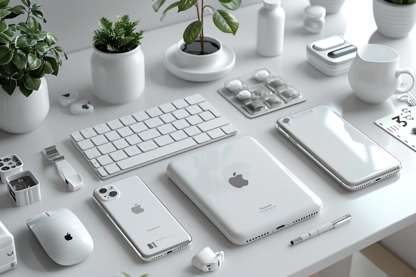
Apple: The Epitome of Minimalism and Innovation
Apple’s retail locations are proof of the ability of color—or, in their case, purposeful lack of it—to establish a unique brand experience. Apple creates a sense of refinement and creativity by using a minimalist color scheme that is dominated by whites, grays, and the occasional usage of black. This purposeful decision highlights the brand’s emphasis on the goods themselves, allowing the vibrant screens of Macs, iPads, and iPhones to stand out against the white background. This strategy’s consistency and simplicity help to uphold Apple’s premium, elegant, and contemporary brand character. You can apply a Golden ratio Technique in your brand’s Design to achieve harmony and consistency.
Read more about the golden ration technique:
Tiffany & Co. Signature Shade of Luxury
One of the best examples of how a certain hue can come to represent a business is Tiffany & Co. The renowned “Tiffany Blue” is not only a color—it is the brand name of the upscale jewelry seller. Its packaging, store interiors, and marketing materials all include this unique Robin’s egg blue, which evokes an opulent and exclusive shopping experience that appeals to consumers all over the world. In addition to improving brand awareness, the choice of this distinctive color arouses sentiments of exclusivity and elegance in consumers, leading them to link the brand with desired, high-quality goods.
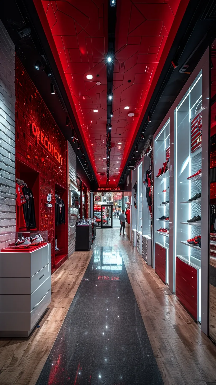
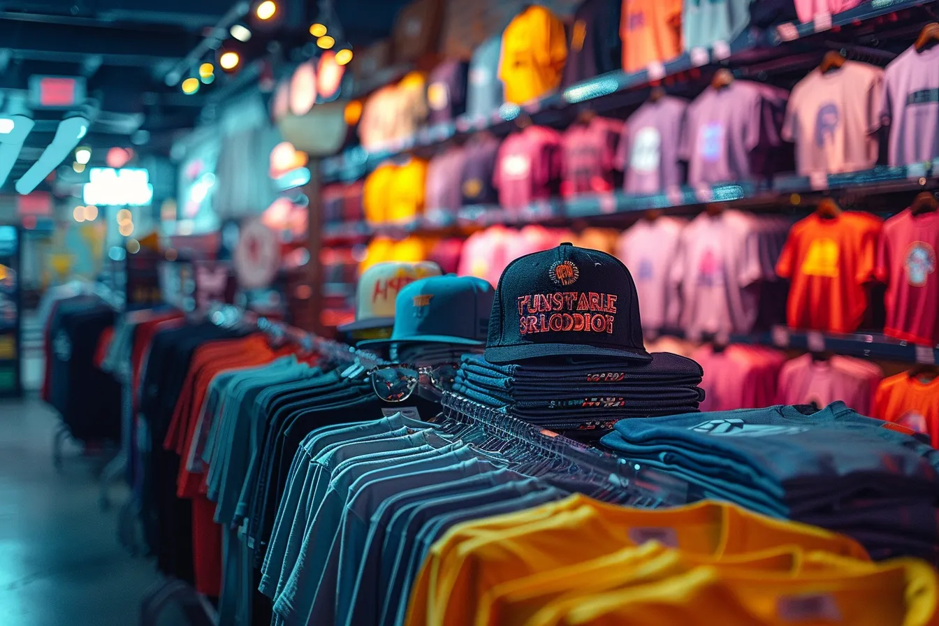
Target: Bold Colors to Guide and Excite
Target skillfully employs vivid hues to create a lively, inviting environment that promotes exploration and shopping. The distinctive red color of the company is widely displayed in all of its retail spaces, from the outside emblem to the aisle signs and shopping carts. Bright, lively colors are consistently used to draw attention and create a sense of enthusiasm. Target also cleverly employs color zoning inside their shops to direct shoppers around various departments, resulting in a user-friendly and entertaining shopping experience. To draw attention to sales and seasonal items and help them stick out to customers, a precise mix of strong and neutral colors is used.
Whole Foods Market: Natural Hues for a Health-Conscious Brand
Whole Foods Market uses color schemes that are consistent with their brand, which is focused on natural and organic goods. The brand’s dedication to sustainability and good health is reflected in the clean, natural atmosphere that is created in all of its locations by the use of green accents and earth tones. The signs, product displays, and even the lighting design all make use of this color palette, which unites to create a unified and welcoming retail space. Whole Foods successfully conveys its identity and appeals to its target audience of health-conscious consumers by matching its color scheme with its brand values.
The various ways that retail businesses may use color schemes to improve in-store experiences, bolster brand identification, and sway consumer decisions are demonstrated by these case studies. These businesses show the strategic importance of color in designing distinctive and successful retail settings, whether via the use of a trademark color, a minimalist palette, bright hues, or natural tones. The most important lesson for merchants to learn is how to design a shopping environment that not only draws in consumers but also keeps them coming back by matching color schemes with target demographics, brand values, and intended emotional responses.
Efficiently Applying Color Strategies in Retail Settings
More than just a strong sense of style is needed to create an effective in-store color scheme; brand identity, consumer psychology, and retail environment objectives must all be thoroughly understood. These are important things to think about and pointers for putting into practice a successful in-store color scheme.
Recognize Your Audience and Brand Identity
Any color strategy starts with having a firm grasp of your target market and brand identity. The brand’s beliefs, personality, and the feelings you want to arouse in your audience should all be reflected in the color selections. To convey its connection to nature, a firm that prioritizes sustainability may choose earthy greens and browns. It’s crucial to comprehend the tastes and perceptions of your audience to make sure that the colors you choose will appeal to them and elicit the right reaction.
Utilize Color Theory
Utilize color psychology concepts to elicit particular emotions and actions from your clientele. Use blue to establish a sense of trust and dependability in your business, or red to convey a sense of urgency during sales. However, as colors can have various connotations in different cultures, it’s important to take these cultural variances in color perception into account. The efficacy of your in-store color strategy may be greatly increased by taking a sophisticated approach to color psychology.
Create a Cohesive Color Palette
To create a unified shopping environment that strengthens brand identification, consistency is essential. Use a primary color scheme that is consistent with your brand throughout the whole store. This covers everything, including the product displays and packaging as well as the walls and décor. A unified color palette may improve consumer loyalty by improving brand awareness and fostering an enjoyable shopping experience.
Utilize Color to Inform and Guide
In a store, color may be a very useful navigational tool. To draw attention to key areas, such as new arrivals, clearance goods, or certain product categories, use contrasting colors. This improves your store’s aesthetic appeal while also making it simpler for visitors to locate what they’re searching for and navigate, which enriches their whole shopping experience.
Discover how brands achieved success through visual harmony:
Observe the Lighting
The lighting in a room may have a big influence on the colors you choose. The purest color will be displayed by natural illumination, while artificial lighting can change the way colors seem. While cold lighting may provide a more calm and contemporary ambiance, warm lighting can enhance the vibrancy and welcoming appearance of colors. To get the desired appearance, take into account the color temperature of your lighting and how it works with the color palette you have chosen.

Experiment and Refine
Putting a new color scheme into practice requires constant improvement rather than being a one-time job. Try out several color schemes in certain areas of your shop and get input from both consumers and employees. Track sales information and consumer behavior to observe how color variations impact decisions to buy. By using an iterative approach, you can gradually improve your color strategy and make sure it stays consistent with your brand and client expectations.
A successful in-store color scheme may completely change the shopping experience by influencing customers’ choices and increasing revenue. Retailers can create engaging, memorable shopping experiences by understanding the psychological influence of color, matching color selections to their brand identity and target demographic, and closely monitoring detail and feedback. There is no denying the impact of color in retail environments, and when used strategically, it can be a powerful tool in the highly competitive retail market. Color will surely continue to play a crucial role in determining how retail design and customer interaction develop in the future as businesses explore and experiment inside their physical venues.