When it comes to branding, color is more than simply an aesthetic decision; it’s an essential part of a company’s identity and communication plan. The correct color scheme may impact consumer behavior, increase brand awareness by up to 80%, and even change how a business’s ethos is seen in general. Let’s first delve into the fundamentals of color theory, including how to comprehend the color wheel and the psychology of color. It also provides practical advice based on real-world brand examples that effectively employ these ideas.

Tip 1: Understanding the Color Wheel – Basics of Color Relationships
An essential tool in color theory for illustrating the connections between colors is the color wheel. With this information, brands may develop visually appealing color schemes that harmoniously convey their intended message.
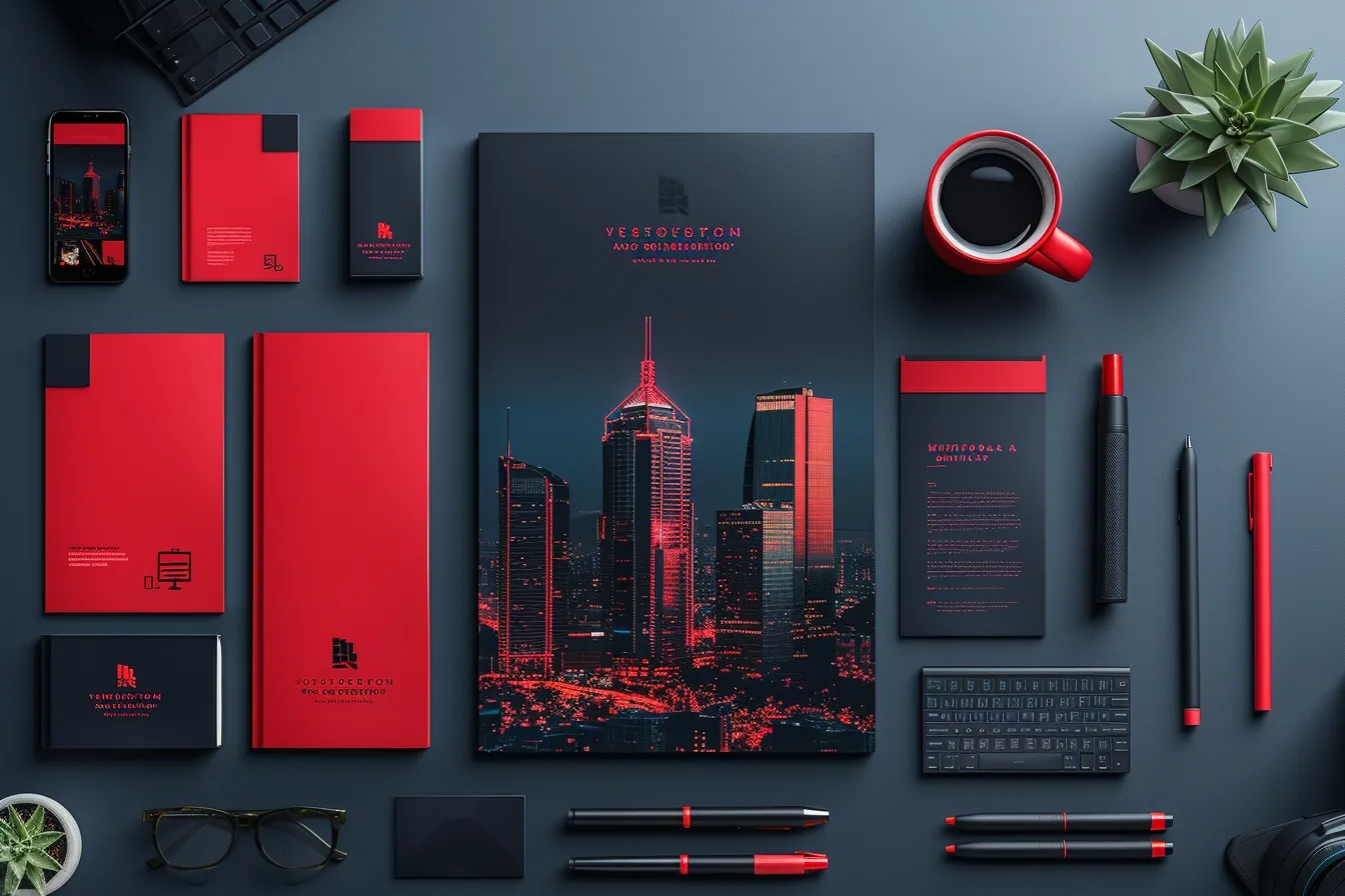
Coca-Cola’s Red and White Palette: Coca-Cola’s trademark red is eye-catching and energetic, grabbing attention right away, while white provides a clear, sharp contrast. This classic example of how knowing fundamental color relationships can help establish a distinctive and eye-catching company identity is the pairing of a main color with a neutral.
Explore the use of red in branding:
Tip 2: The Psychology of Color – How Different Colors Influence Consumer Feelings and Behaviors
Knowing that different colors elicit different emotions may be a useful tool when developing a brand identity. The psychological effects of color may have a big impact on how a target audience views a brand.
Tiffany & Co.’s Tiffany Blue: The particular shade of Robin’s egg blue known as Tiffany Blue is used to convey ideas of exclusivity, luxury, and reliability. The brand has grown so closely associated with this distinctive hue that it greatly raises its status and awareness in the premium market.
Expand your understanding of blue’s significance in branding:
UPS’s Pull from Brown: Even though brown may not appear like a traditional hue to attract customers, UPS has successfully used it in its branding. Brown is associated with integrity, stability, and dependability, all of which are in line with UPS’s brand promise of trustworthy package delivery. This illustrates how knowing a color’s psychological connotations can make even an ordinary color work wonders as a branding tool.
After the discussion of Tip 1 and Tip 2, it is evident that brand identification and customer perception may be greatly improved by the strategic use of color, which is based on an understanding of the color wheel and the psychological effects of colors. UPS’s dependable brown, Tiffany & Co.’s opulent Tiffany Blue, and Coca-Cola’s vibrant red and white palette are all excellent examples of companies that have successfully applied color theory concepts to stand out in their respective markets.
Have a thorough investigation into the psychological motivations behind color selection:

Tip 3: Color Harmony – Principles for Creating Appealing and Cohesive Color Schemes
Color harmony is a foundational principle that ensures the colors within a brand’s palette work together seamlessly, creating an aesthetic that is pleasing to the eye. Harmony can be achieved through various schemes, such as complementary, analogous, or triadic.
Complementary Scheme Example-Pepsi: Pepsi utilizes a complementary color scheme with its iconic red and blue logo. The stark contrast between these colors grabs attention while maintaining balance and harmony. This scheme helps the brand stand out on shelves and in advertising, reinforcing its identity and enhancing brand recognition.
Analogous Scheme Example- Instagram: Instagram’s logo transitions smoothly between warm colors – purple, pink, and orange – demonstrating excellent use of an analogous color scheme. This approach evokes a sense of energy and warmth, reflecting the platform’s dynamic and creative nature.
Tip 4: Contrast and Legibility – Leveraging Color Contrast for Readability and Emphasis
Contrast is crucial for making brand elements pop and ensuring that messages are readable across various backgrounds and mediums. High contrast between text and its background improves legibility, while color contrast can be used to draw attention to key elements.

High Contrast Example-Nike: Nike’s classic “Just Do It” slogan often appears in white against a deep black background or vice versa. This high contrast not only makes the slogan highly legible but also imbues it with a sense of boldness and simplicity, mirroring the brand’s ethos.
Learn about the art of contrast and balance in branding:
Color Highlighting Example- Spotify: Spotify uses its vibrant green not just as a brand color but strategically to highlight important features and call-to-action buttons across its app and marketing. This selective use of a contrasting color guides users’ attention effectively, enhancing user experience and reinforcing brand identity.
Through the examples of tip 3 and tip 4, it’s evident how mastering color harmony and contrast can significantly influence a brand’s visual appeal and communication efficacy. Pepsi and Instagram demonstrate the power of color schemes in creating cohesive and memorable identities. At the same time, Nike and Spotify exemplify how contrast can be leveraged to enhance legibility and highlight critical elements, ensuring messages are not only seen but remembered.
Tip 5: Maintaining Color Consistency in Digital and Print Formats- Keeping Color Consistency Across Media
Retaining color coherence is essential for brand identification. It guarantees that the brand is easily identifiable anywhere it appears. This constancy contributes to the consumer’s perception of dependability and trustworthiness.

Digital and Print Example-Coca-Cola: The distinctive red color of Coca-Cola is used consistently in various media, including print ads and internet marketing. The brand’s identity is strengthened and customer memory is raised by this consistency in color usage. The particular shade of red that Coca-Cola uses is so strongly linked to the brand that it’s sometimes called “Coca-Cola red.”
Apple is an example of cross-platform color consistency. Cross-platform color consistency is best demonstrated by Apple’s usage of white and simple color schemes throughout its product line, website, and physical shops. This strategy communicates the company’s principles of beauty, simplicity, and innovation while also improving brand awareness.
Tip 6: Emotional Targeting Through Color: Selecting Schemes to Resonate with Your Audience’s Emotions”
Color’s psychological effects make it a potent branding tool that helps businesses emotionally connect with their target market. The target demographic can be persuaded to feel and act in the ways that are wanted by using the appropriate color scheme.

PayPal is an example of trust and security. PayPal has a blue color scheme, which is frequently connected to dependability, security, and trust. These are important feelings and ideals for a company handling money transactions, and the usage of blue consistently in their logo helps people feel the same way.
Fanta is an example of energy and excitement. Fanta makes use of the color’s connotation of joy, vitality, and youth by using bright orange in their branding. This is exactly what Fanta wants to project—a bright, humorous image that fits in well with the brand’s target audience.
Have further insights into the utilization of orange in branding:
Some key takeaways from tips 5 and 6 are that Coca-Cola and Apple demonstrate how a brand’s image may be strengthened and awareness increased by using consistent color across several platforms. PayPal and Fanta, on the other hand, show how color can be used to effectively target particular emotions and ideals within an audience, increasing connection and engagement.

Given that color can evoke emotions, it’s worth noting that there are additional factors influencing emotions in branding.
Discover more about these factors:
Tip 7: Utilizing Color Trends Wisely – How to Incorporate Current Trends Without Losing Brand Identity
Color trends can offer fresh inspiration and relevance for brands, but they must be adopted in a way that aligns with the brand’s core identity and values.
Trend Adoption Example-Apple: Apple’s use of color in its product lines, such as the iMac and iPhone, showcases how a brand can stay relevant to color trends while maintaining its minimalist and premium aesthetic. The introduction of new colors with each product release—such as the vibrant colors of the iPhone 12 and iMac 2021—demonstrates Apple’s adeptness at integrating trends (like pastels and bold colors) to appeal to consumer preferences and stand out in the technology market.
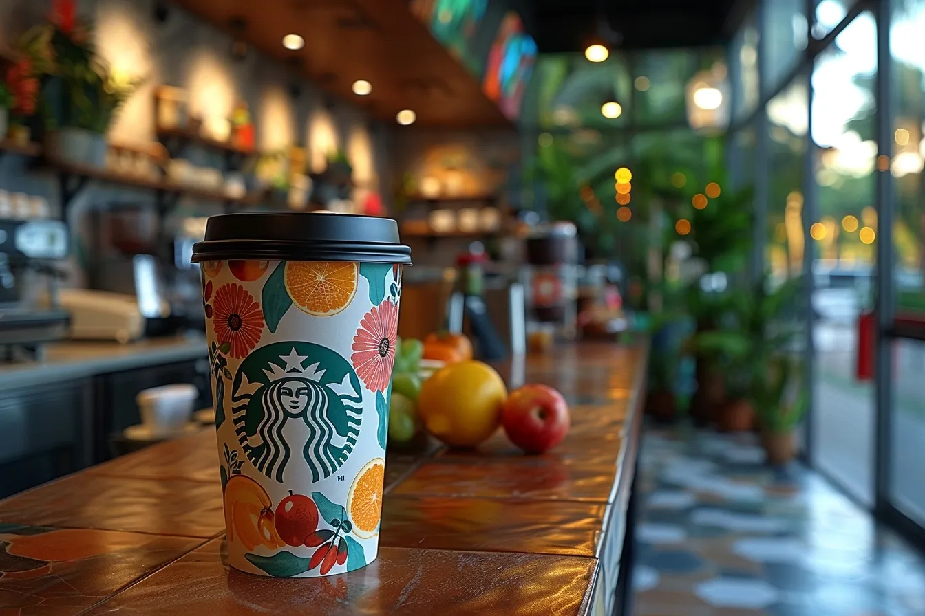
Seasonal Trend Example- Starbucks: Starbucks leverages seasonal color trends in its limited edition cups and packaging, using colors and designs that reflect the mood and festivities of the season. This approach not only rejuvenates the brand’s visual appeal regularly but also creates anticipation and excitement among customers, enhancing the brand experience without altering the core brand identity.
Tip 8: Custom Colors and Brand Identity – The Benefits of Creating a Unique Color or Palette for Brand Recognition
Developing a custom color or a unique color palette can be a powerful way to differentiate a brand and foster instant recognition.
Custom Color Example- Tiffany & Co: The iconic “Tiffany Blue” is a prime example of how a custom color can become synonymous with a brand. This unique color, registered as a trademark by Tiffany & Co., immediately evokes the brand’s luxury, quality, and exclusivity. It’s so distinctive that the color alone can signal the brand without the logo or name being visible.
Unique Palette Example-FedEx: FedEx employs a unique color palette with its combination of purple and orange, which is unusual for the logistics and delivery industry. This strategic choice not only differentiates FedEx from its competitors but also leverages color psychology—purple conveys excellence and quality, while orange adds a touch of warmth and energy, aligning with the brand’s messaging of fast, reliable service with a personal touch.
Taking into consideration the information presented in points 7 and 8, it is apparent that incorporating color trends and creating custom colors are strategic decisions that can significantly impact a brand’s market presence and consumer perception. Brands like Apple and Starbucks demonstrate how to stay relevant and engaging by embracing color trends thoughtfully. In contrast, Tiffany & Co. and FedEx illustrate the lasting impact of custom colors and unique palettes on brand identity and recognition.

Tip 9: Interactive and Dynamic Colors – Using Color Dynamically in Digital Experiences to Engage Users
Innovative brands are increasingly using color in dynamic and interactive ways within digital experiences to captivate and engage users, making their brand more memorable.
Interactive Color Example- Google: Google’s Doodles are a prime example of using dynamic colors to engage users. The changing logos not only celebrate various events and anniversaries but also incorporate vibrant, engaging colors that draw users’ attention and encourage interaction. This dynamic use of color enhances user engagement and keeps the brand fresh and relevant.
Dynamic Color Example-Spotify: Spotify’s use of dynamic color palettes in its playlists and user interface—where colors change based on the album art of the music being played—creates a unique and immersive listening experience. This innovative use of color not only strengthens the brand’s connection with its users but also elevates the user experience by making it visually engaging and personalized.
Tip 10: Sustainability in Color Choice – Considering the Environmental Impact of Color Choices in Branding Materials
Sustainability is becoming increasingly important in branding, with color choices playing a significant role in a brand’s environmental impact.

Sustainable Color Example-Patagonia: Patagonia’s commitment to sustainability is evident in its color choices for products and packaging. The brand often opts for natural and earth-toned colors that reflect its environmental values and commitment to using recycled and organic materials. This thoughtful approach to color reinforces the brand’s dedication to conservation and sustainability, resonating with its eco-conscious customer base.
Eco-Friendly Packaging Example- Lush: Lush Cosmetics uses minimal packaging with earth-friendly colors, emphasizing its commitment to reducing waste and environmental impact. The use of natural colors and recycled materials in its packaging not only minimizes harm to the environment but also aligns with the brand’s ethos of ethical beauty, enhancing customer trust and loyalty.
Discover the importance of minimalism in branding:
Considering the details outlined in points 9 and 10, it becomes clear how strategic color choices can significantly influence brand identity, user engagement, and market differentiation. From the psychological impact of colors and the principles of color harmony to the innovative use of dynamic colors and the importance of sustainability, brands like Google, Spotify, Patagonia, and Lush exemplify the power of color in creating memorable, engaging, and responsible brand identities.
It’s apparent that understanding and applying color theory is not just about aesthetics—it’s a crucial aspect of branding that can drive recognition, convey brand values, and create an emotional connection with the audience. By thoughtfully incorporating these ten color theory tips, brands can craft standout identities that not only capture attention but also resonate deeply with consumers, setting the foundation for lasting success and relevance in the ever-evolving landscape of brand design.