An Introduction to Color Psychology in Branding
Colors in branding and design do much more than just look good; they communicate. Color psychology is significant in how a brand is perceived since it impacts customers’ emotions, behaviors, and decision-making processes. The complex interaction of color and perception is what contrasts with warm and cool colors so significant for businesses seeking to establish a certain atmosphere or identity.

Color psychology asserts that different colors may evoke varied feelings, emotions, and associations. Warm colors, like red, orange, and yellow, are typically associated with life, excitement, and joy. They attract attention, induce warmth and comfort, and may even stimulate appetite. Cool colors, such as blue, green, and purple, are connected with calmness, dependability, and professionalism. They have a relaxing effect and foster a sense of security and reliability. Understanding these nuances is crucial for businesses because the colors they pick open up a direct communication channel with their target audience, slightly influencing how their message is viewed and interpreted.
Read more about the psychology behind color choices in branding:
Color is highly significant in branding. It is one of the first things people see, thus it is a crucial part of brand recognition. According to a study, color may increase brand recognition by up to 80%, indicating its importance in a crowded market. Furthermore, color’s psychological impact extends to consumer behavior, with specific colors influencing purchasing decisions. For example, a corporation that employs red in its logo or packaging may convey a feeling of urgency, making it a popular choice for clearance sales, but a brand that uses blue may be perceived as more reliable and trustworthy, as seen in banks and healthcare organizations.

However, the use of color in branding is not a one-size-fits-all solution. The brand’s personality, the feelings it aims to elicit, and the activities it desires to inspire its customers should all influence the choice of warm or cool colors. This selection must also account for cultural differences in color perception since colors might have various connotations in different cultures. For example, while white is commonly linked with purity and cleanliness in Western cultures, it may also represent grief and death in some Eastern traditions.
Warm Colors for Branding: Features and Applications
Warm colors such as red, orange, and yellow are connected with the sun and fire. They inspire a variety of emotions, such as comfort, warmth, excitement, and passion. Understanding and using these colors in the context of branding may have a significant impact on how a brand is seen and experienced by its target audience.

Warm Color Characteristics
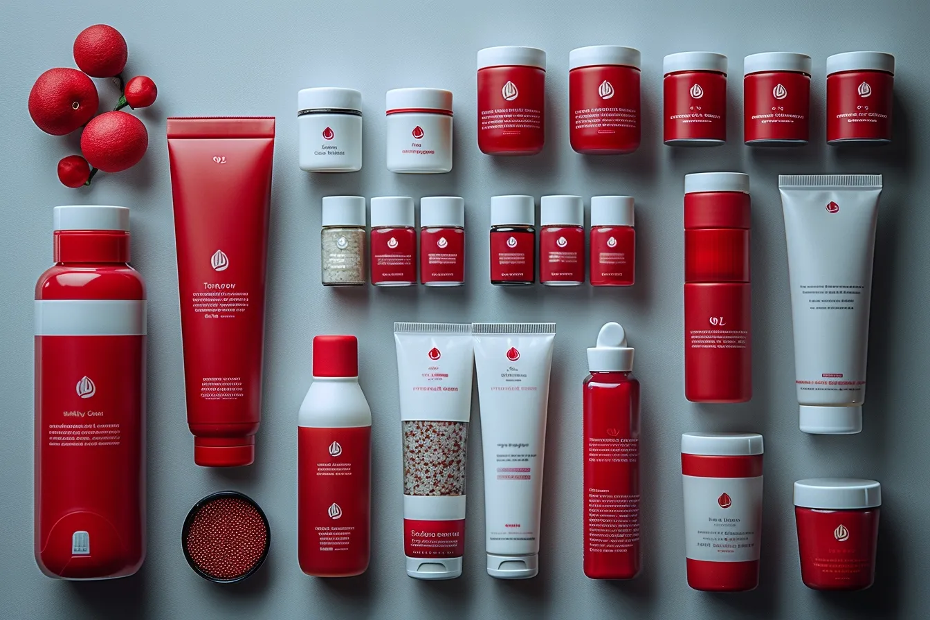
Warm colors are recognized for their ability to capture attention, making them an effective tool for companies looking to stand out. Red, for example, is frequently linked with vitality, enthusiasm, and activity. It commands attention and may even cause physiological responses like increased heart rate, making it an excellent choice for marketers trying to elicit excitement or urgency.
Discover the use of Red in branding:
Orange mixes the intensity of red with the brightness of yellow, conveying a sense of warmth and approachability. It is frequently employed by businesses that wish to look joyful and vibrant while avoiding the severity that red portrays. Yellow, the most vibrant and energizing of the warm colors, is associated with pleasure and optimism. It may brighten a brand’s design, giving it a lively, approachable, and young feel.

Applications in Branding
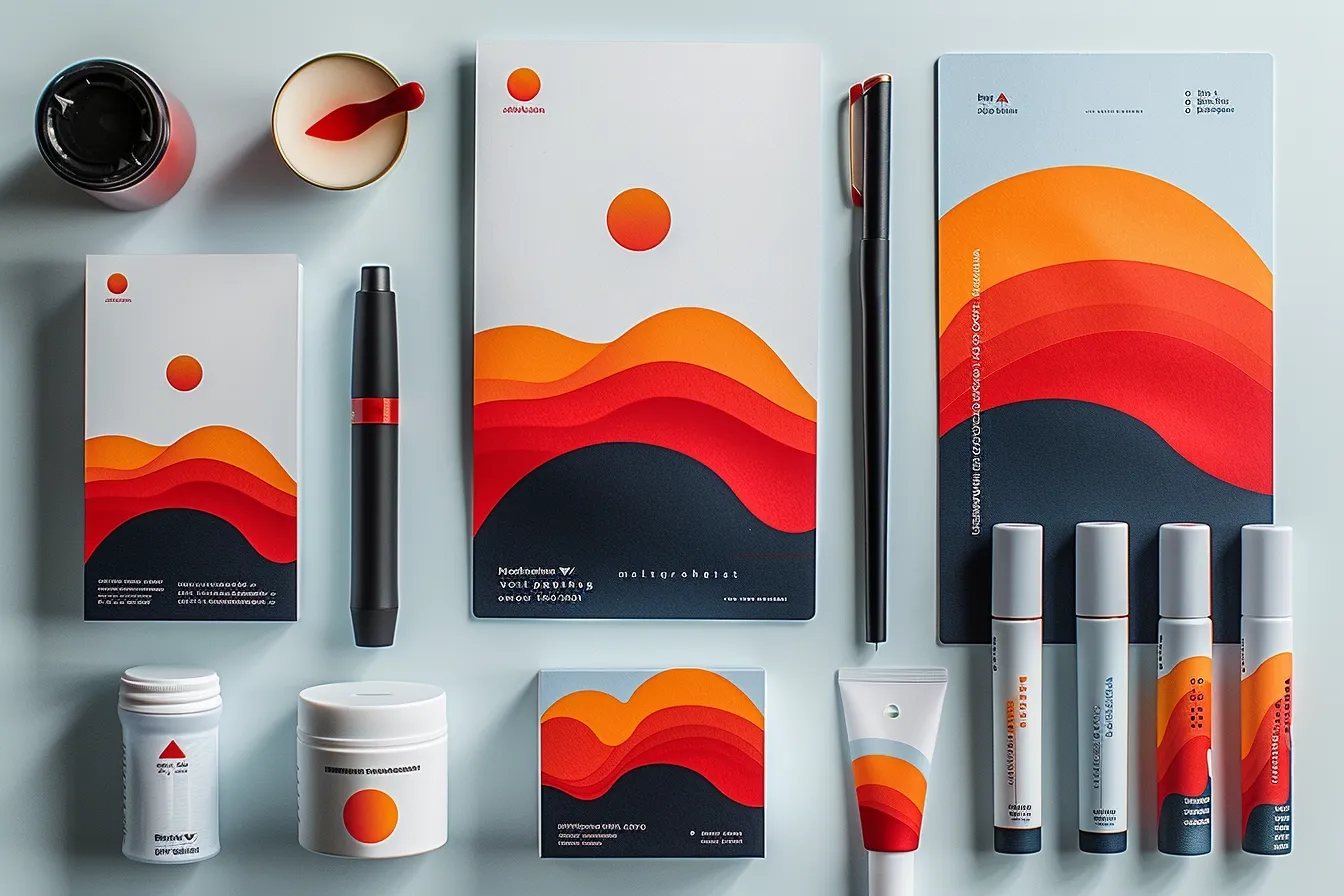
The purposeful use of warm colors may have a major impact on customer behavior and brand impression. Fast food businesses, for example, typically use red and yellow in their logos, interiors, and packaging. These colors can increase hunger, produce a sense of urgency (which encourages speedy decision-making), and stand out in the visual scene. Technology and entertainment firms may use orange to convey innovation, inventiveness, and affordability.
Explore the use of Orange in branding:
However, using warm colors presents certain complications. Overuse can cause emotions of aggressiveness or tension, particularly in big volumes or in certain tints. The key is balance; pairing warm colors with neutrals or cold colors will reduce the negative impacts while preserving their brilliant appeal.

Case Studies
- Coca-Cola: one of the world’s most recognizable companies, Coca-Cola uses red in its branding as a textbook illustration of how warm colors can elicit sentiments of excitement and enthusiasm. The red color is not just eye-catching; it also conveys a robust and dynamic brand identity that has been continuous for decades.
- Netflix: Netflix employs a bright red to portray enthusiasm and passion, which mirrors the brand’s promise of unlimited entertainment. The color red is especially good at attracting attention in a congested digital scene, making it an ideal option for the brand’s logo and user interface.
- Fanta: Fanta’s bright orange logo represents joy and liveliness. The color scheme complements the brand’s image as a fun, young beverage alternative, setting it apart from competitors and establishing a strong visual identity.

Incorporating warm colors into a brand’s identity necessitates a careful examination of their psychological influence and cultural implications. Brands must examine their target audience, the message they want to communicate, and the emotions they want to elicit. When applied wisely, warm colors may create a vibrant, engaging brand presence that connects with customers and stands out in the market.
Cool Colors for Branding: Features and Applications
In contrast to the vivid intensity of warm colors, cool colors provide a sense of calm, trust, and knowledge. Cool colors, like blue, green, and purple, may offer a brand a calm and soothing presence while also influencing perception and behavior in unique ways.
Cool Colors’ Characteristics
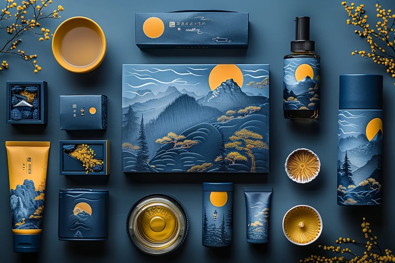
Cool colors are commonly associated with the natural world, evoking feelings of calm, peace, and renewal. Blue is the most commonly used cool color in branding, symbolizing trust, stability, and professionalism. It is a popular choice across all demographics, making it a reliable alternative for businesses trying to instill a sense of authority and confidence. Green, because of its intimate relationship with nature, signifies growth, health, and sustainability. It’s especially beneficial for businesses that prioritize health, organic products, or environmental issues. Purple, a color traditionally associated with monarchy and luxury, lends elegance and mystery to a business. It is versatile and appropriate for both creative enterprises and products that reflect elegance and exclusivity.

Applications in Branding
The use of cold colors in branding tactics is as diverse as it is effective. Financial firms and healthcare companies frequently use blue to convey trustworthiness and dependability. Green, because of its relationship with nature and sustainability, is a popular choice for organic and eco-friendly firms seeking to demonstrate their dedication to environmental care. Purple, a less popular branding color, may help companies stand out and provide a refined edge to their visual identity.
Case Studies
- IBM (International Business Machines): Also known as “Big Blue,” IBM uses blue in its logo and branding to emphasize its dependability, efficiency, and authority in the technology industry. The color underscores the brand’s reputation as a reliable leader in a fiercely competitive field.
- Whole Foods Market: Whole Foods Market uses green in its branding to emphasize its dedication to natural and organic items. The color appeals to the brand’s ecologically sensitive and health-conscious clientele, enhancing the message of quality and sustainability.
- Twitch: The streaming network Twitch utilizes purple heavily in its branding, distinguishing itself from competitors. The color conveys originality and individuality, appealing to its target demographic of gamers and broadcasters seeking a different, community-focused experience.
Learn more about the use of Purple:

Cool colors used in a brand’s identity may assist in expressing qualities such as trust, tranquility, and refinement. However, color selection should be consistent with the brand’s primary message and target demographic. For example, a firm looking for a youthful, dynamic image may find cold colors too dull on their own and may want to balance or emphasize with warmer tones or colorful accents.
Cool colors may strategically develop a brand’s impression as dependable, competent, and calming—an important factor in businesses that value trust and peace. The subtle use of these colors, taking into account their psychological influence and cultural associations, may considerably improve a brand’s capacity to connect with its audience on an emotional level.
Strategically Selecting Warm and Cool Colors for Your Brand
The choice between warm and cool colors is more than just an aesthetic preference; it’s a strategic decision that may have a substantial impact on brand image, consumer engagement, and market placement.

-
Understanding Your Brand’s Core Identity
The first step in selecting the appropriate color scheme is to thoroughly grasp your brand’s essential identity. What are the main emotions, values, and messages you want to convey? Warm colors may be appropriate for companies seeking to inspire enthusiasm, passion, or warmth. They are ideal for firms that want to look friendly, lively, and enthusiastic. Cool colors, on the other hand, are perfect for firms seeking to convey professionalism, dependability, and peacefulness. They are ideal for businesses looking to build credibility and authority in their area, as well as to promote peace and sustainability.
-
Consider Your Target Audience
The tastes and cultural circumstances of your target audience are important considerations when choosing colors. Different demographics may have different reactions to colors depending on cultural, social, and psychological reasons. For example, younger audiences may be drawn to lively, warm colors, but older audiences may prefer the refinement and quiet of cold colors. Consider the cultural implications of colors in your company’s locations, since this might affect audience reception and brand impression.
-
Analyze the Competitive Landscape
Examining your rivals’ color selections might provide significant insights. Selecting a color scheme that sets your business apart from competitors might help you stand out in a competitive market. However, it is crucial to stick to your industry’s color standards to some level, since diverging too much may confuse your target audience. The challenge is achieving a balance between distinctiveness and conformance to industry standards.

-
Experimenting and Testing
After deciding on a color scheme, it is critical to experiment with different hues and combinations within that palette. Color’s influence varies considerably depending on its hue, saturation, and context. A/B testing on marketing materials, packaging, or digital platforms may offer specific feedback on how your target audience reacts to various color schemes, allowing you to fine-tune your brand’s visual identity.
-
Carefully Integrating Colors
Consider how your chosen colors will be used across all brand touchpoints. Consistency is essential for developing a strong brand identity, but adaptability is also crucial. For example, a brand may use a warm color for its major branding to suggest energy and enthusiasm, while using cooler colors in the backdrop or secondary pieces to balance and soften the overall impact.

Case Example: Rebranding Strategy
Consider a hypothetical rebranding of a technology business that seeks to transform its brand impression from traditional and dependable to inventive and dynamic. The original logo made extensive use of cool blues to convey dependability. The rebranding plan may use warm accent colors like orange or yellow while keeping a cold basis to retain trustworthiness and infusing warmth to offer dynamism and creativity.
Choosing between warm and cool colors is a strategic decision that affects all aspects of a brand’s identity and perception. Brands may choose a color palette that not only connects with their audience but truly expresses their brand’s essence by carefully examining their core identity, target demographic, and competitive environment, and undertaking extensive testing. In the ever-changing world of branding and design, color remains one of the most effective tools for creating the perfect atmosphere and engaging with customers on a deeper level.


